What makes an excellent design? Even amateurs and who consider themselves totally non-designers can create effective compositions by prioritizing their content. what’s the foremost important element of your design? What does one want audiences to note second or third?
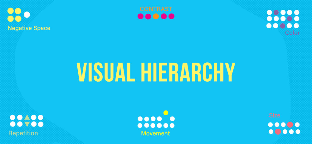
Visual hierarchy is a method of organizing design elements based on its importance. You can tell that it’s a set of principles that influence the user eye to the the order in which we notice what to see.
These golden rules help us compose designs that are aesthetically pleasing and attract the proper attention.
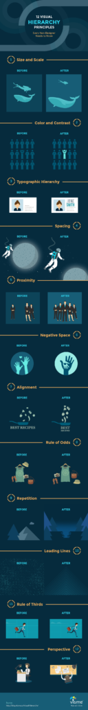
Utilizing certain hierarchy principles that help even non-designers create successful visual presentations that are completely efficient and effective. While there is no precise number of hierarchy principles but it varies greatly depending on the source, we’ve divided them into the following 12 concepts.
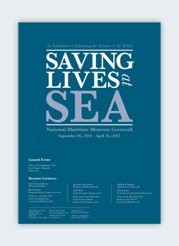
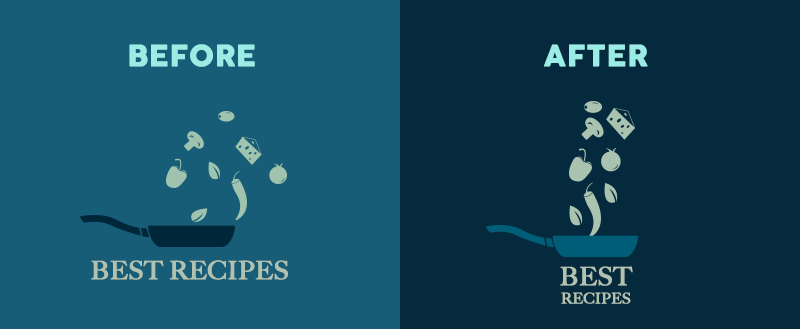
1- Size impacts visibility.
Bigger is better, right? While the classic adage is still up for debate, size is arguably the most effective way to emphasize visual elements. Simply the larger elements get greater attention than smaller elements.
that’s why newspaper headlines appear in larger fonts, and major stories often have even larger headlines than the rest of articles in the same page. In any design, larger elements (whether they be words or images) not only will be most noticeable, but also will carry the strongest message.
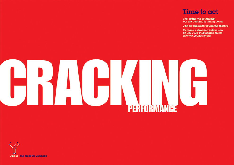
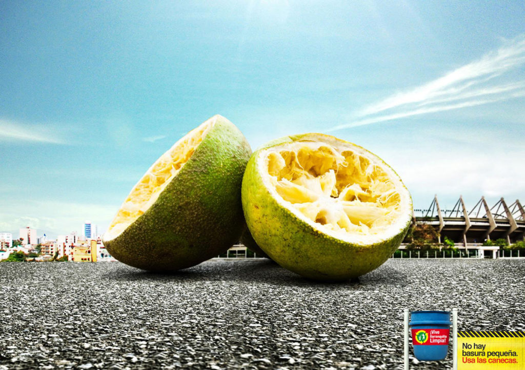
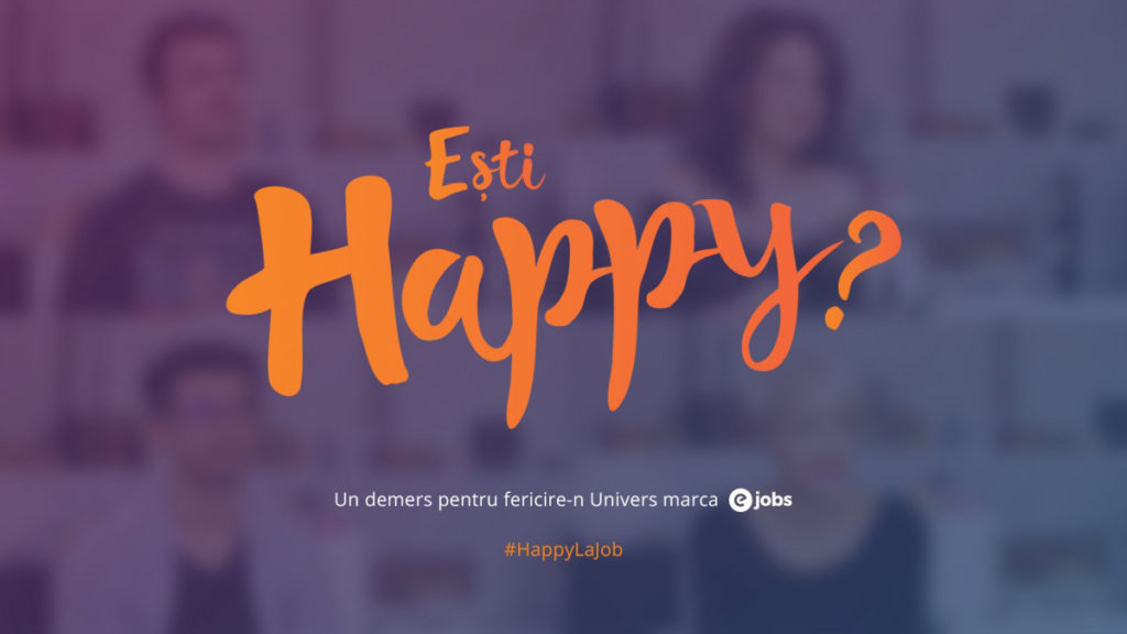
In the above example the largest word is also the most noticeable. Readers are much more likely to quickly notice the word, “cracking” than the second-largest word “performance.” The design wouldn’t be the same effective if both words were the same size or if another word on the design such as “act” or “time” were a little bit larger.
Another important principle associate to this concept is scale, which is the size of an object compared to other objects at the same design. A single object, no matter how large or small, has no scale until it’s compared to another. It allows us to create a balance in a design and pay attention to the main elements. The greater the scale, the greater the attention.
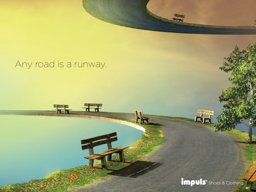
2- Perspective creates an illusion of depth.
By adjusting perspective, designers can create an illusion of depth starting from a few inches to several miles. Because we usually see similar illusions within this world, we generally perceive larger objects as being closer than similar smaller objects, and that’s why they typically command attention before any other object on a scene.
For example, an image of a road will typically be wider at its lowest point and gradually grow narrower the higher it stretches across the horizon. same as an object closer to the viewer will always appear larger than the same object farther away.
Proper perspective will utilize both scale and proportion of accuracy to communicate appropriate distance. A drawing of a seven-mile stretch of road will recede far more sharply than a two-mile stretch drawn on the same size canvas.
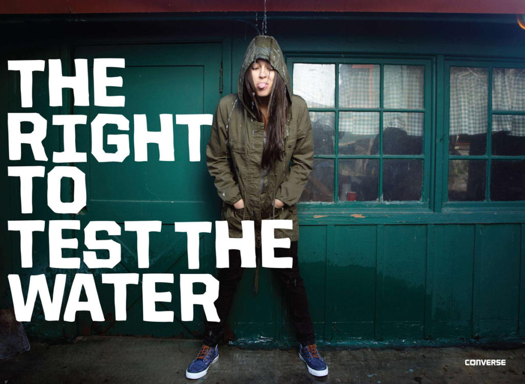
3- Color and contrast draw attention.
Just as larger elements are perceived as more important than smaller elements, bright colors typically attract greater attention than boring hues. For example, if a single word in a block of text is highlighted with a brighter color, it immediately catch readers’ attention.

For example the above design. See how it grabs greater attention when the natural tones were highlighted to lighter colors? The color scheme is known as a duotone, a popular web-design trend. The effect, which lays a pair of contrasting colors over an image, tends to striking designs that extremely pop off the page or screen.
Basically contrasting colors can also emphasize specific elements than a spectrum on a more gentle scale. Placing a red object in front of a green or black background will get more attention than the same red object on an orange or purple background.
The color combinations used in a design, and how they relate to each other, are known as its color scheme. A designer’s selection of color scheme can create unity, harmony, rhythm and balance within a creation, but it can also create contrast and emphasis.
In order to understand how to make a stunning color scheme, you need to check the below posts.
5 Types of Branding Color Palettes That Reign Supreme
The DNA of a branding color palette
3 Ways to Create a Color Palette That’ll NEVER Fail You
A design that uses much contrasting colors will often appear unorganized and in-cohesive. The same can be done to designs that use a color scheme that doesn’t follow color theory. But choosing the best color palette gives more harmony so much more than randomly choosing a monochromatic, complementary or dull combination.
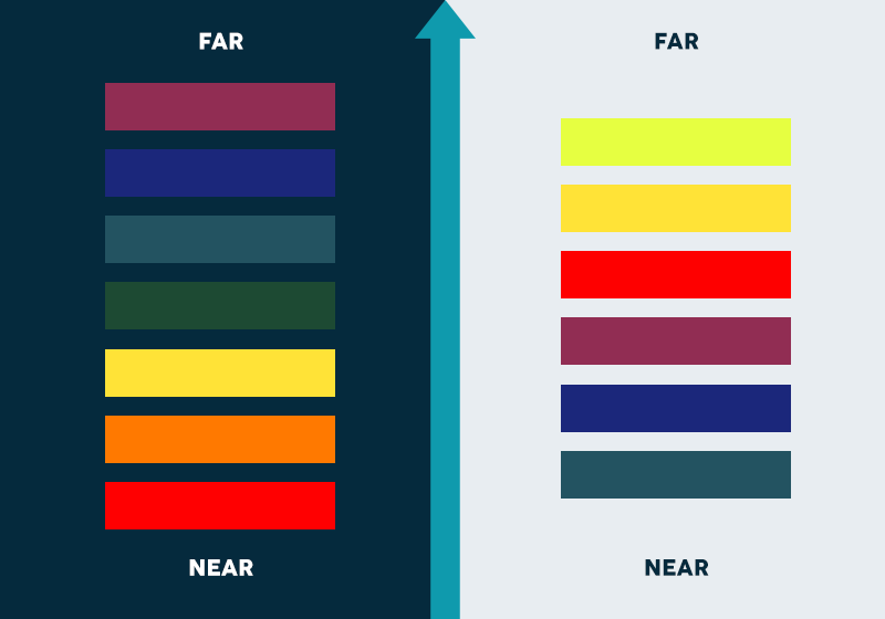
Similar colors are often used to group of related elements in a design, and color choice can even suggest weight and distance. Warmer colors like red and yellow, advance into the foreground of a design with a dark background, while cool colors like blue or green usually recede into the background. The opposite happens with a design over a light background Cool colors such as blue and green appear closer than warm colors. It’s just how the human eye perceives it.
Therefore, color choice can completely influence viewers’ ability to identify a figure from the background within a design. Combining warm and cool colors can create depth, just like perspective.
Effective color combinations stand not only on each hue’s position on the color wheel, but also its warmth and contrast with surrounding colors.
4- Fonts organize design.
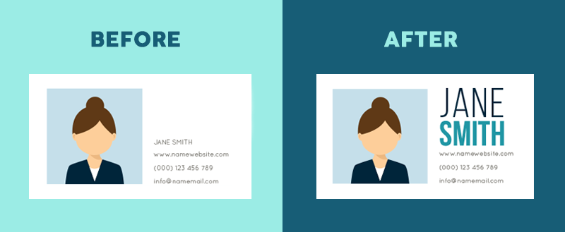
Think about a business card, a resume or a table of contents. Generally, each is equipped of several sizes of type, with main headings in a larger font size than smaller details. Using a variety of type sizes not only focus on what’s important, but also organizes the overall design of the document.
Typeface hierarchies can be achieved with text of various sizes, weights and spacing—or a combination of each element. Even if a single font is used throughout a design, varying its size and weight not only grabs attention to more important elements, but also emphasize an overall composition that is easy to read and understand.
Just imagine a resume that uses larger, bolder font for education than for the applicant’s name. It might not only appear weird , but it would likely cause a huge confusion for those quickly scanning a tons of applications.
A design that add a series of type that is all the same size, font and weight won’t effectively draw attention and focus to much of anything – a challenge that has to be get quick attention of many audiences spending split-seconds looking at your design.
It’s for this reason why most web-design software offer not only a manual selection of typeface attributes, but a preset hierarchy consisting of title, subtitle and gradual heading fonts, additionally to basic paragraph text.
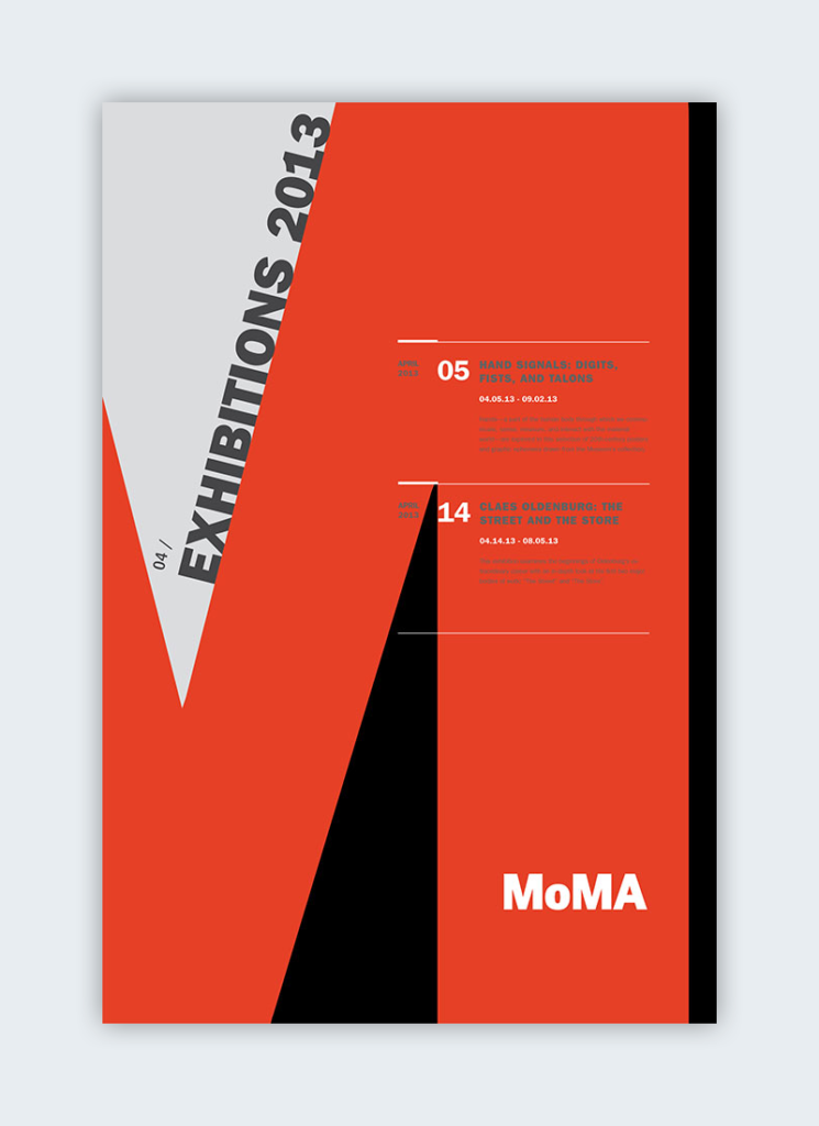
The above design is an ideal case of an organized and easy to read poster when they applied a hierarchy principles.
Do you want to understand more of using of typography? make sure to check below posts to know everything you need in this topic.
Typography: The Anatomy of a Letter
Typography: The Different Types of Fonts, When to Use Them, and How!
5- Space provides emphasis and movement.
Rule of space
One of the most basics of visual composition principles is what you leave out of your design. According to the Rule of Space, an aesthetically-pleasing design requires its sufficient share of clutter-free negative space, as known as “white space,” regardless of the design’s actual background color.
Arranging the elements of a composition, designers can use the space around the content to grabs attention to specific elements—think of a single element on a blank page to send an entirely separate visual message.
Strategic spacing can even draw viewers’ eyes across the page in a targeted sequence, by arranging the page-scanning patterns.
Page-scanning patterns
Readers tend to scan pages based on specific patterns, observable through their eye movements. When designers want audiences to notice elements in a specific order, they often use one the most common patterns.
Native English speakers, for example, read from left to right. Therefore, they typically present a similar scanning pattern when faced with a page of text. Arabic, on the other hand, is written from right to left. Those accustomed to reading that language are more likely to scan pages in this “opposite” direction. Designers should keep these differences in mind when creating content for global audiences.
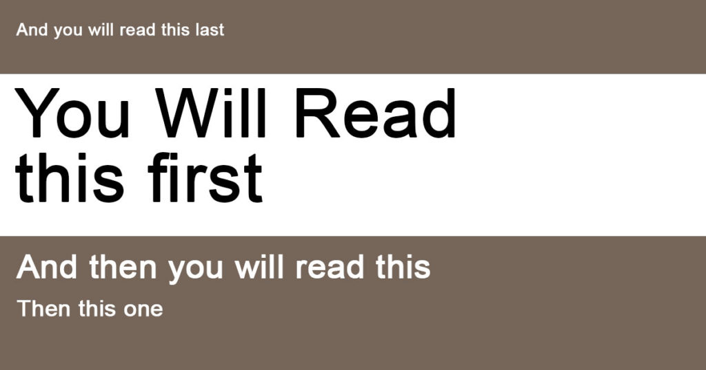
F-Patterns
This is the most common eye-movement pattern of English readers. Why? Because that’s how we read a book, a letter or a web page. We scan the page from left to right along the top and repeat for each line of text until we reach the bottom of the page.
due to this fact, designers most often use the F pattern when composing websites and other designs that depend heavily on text. Because reading in some other direction is just uncomfortable because we’re already used to.
Z-Patterns
Designs that depends more on images are often tend to use a Z pattern. Because the brain processes images faster than text, readers can scan the page quickly by looking at the top from left to right, then down the page in a diagonal line before completing the scan by crossing left to right (or right to left if the audience reads in that direction).
Designers can assert specific elements of a composition by placing them along this common “Z” eye-movement patterns. consider a heading, a picture and a subheading.
6- Proximity suggests relationship.
Proximity, or where elements appear in relation to each another, is one of the most basic principle of composition. Simply, placing related elements close together ensure readers that they are actually related.
Imagine a white board with a group of five dots on one side and a single dot on the other side. Our first assumption is going to be that the five are, indeed, a group.
Placing elements close together can send other messages as well. For example, placing elements in certain locations on a map can provide audiences with an assumption of distance, whether near or far. Of course, this also depends on the size and scale of the map. An inch isn’t always a mile.
By placing elements within specific proximity of each other, added images and messages can be made. Think of how often you see two dots and a line positioned in a way to suggest the shape of a happy or sad face? The image then often gets more attention than the individual elements. Do you see a happy face, or do you see two dots and a line?
7- Negative space emphasizes.
Just as combining items near each other check their relation, including white space around elements mix them out as separate groups of data. Negative, empty space not only makes information easier for viewers to understand by grouping it into elements, but it also creates focus as it helps eyes focus in on individual items. Plus it sparks the creativity of your idea.
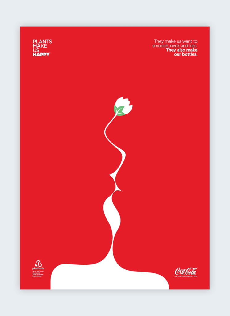
Compositions lacking ample negative space may result during a jumbled, confusing and chaotic design. In other words, less is more. Savvy designers can even utilize the space to suggest a further visual message. Just consider the “arrow” implied within the middle of the famous FedEx logo, or the CocaCola design, above.
To see more practical cases and understand more of the negative space. Check the post Negative Spaces in Logos: A How-To Guide.
8- Alignment directs eyes.
Alignment is a component of the structure by which elements are placed within a design. It dictates that visual components, whether or not they be text or images, aren’t positioned arbitrarily throughout a composition. For example, a typical page of text is aligned to the left, in order that objects share a left margin.
Many visual elements are centered or justified in the design, which means they are spaced across a page so they share both left and right margins. If words were just throw randomly across a page in every direction they would be quite confusing.
In F-pattern objects are mostly aligned to the left, while Z-patterns often employ a combination of left, center and right alignments, like the above example.
Simple visual elements mostly aligned in the center of the design, a format that gives balance and harmony, and is also visual-pleasing.
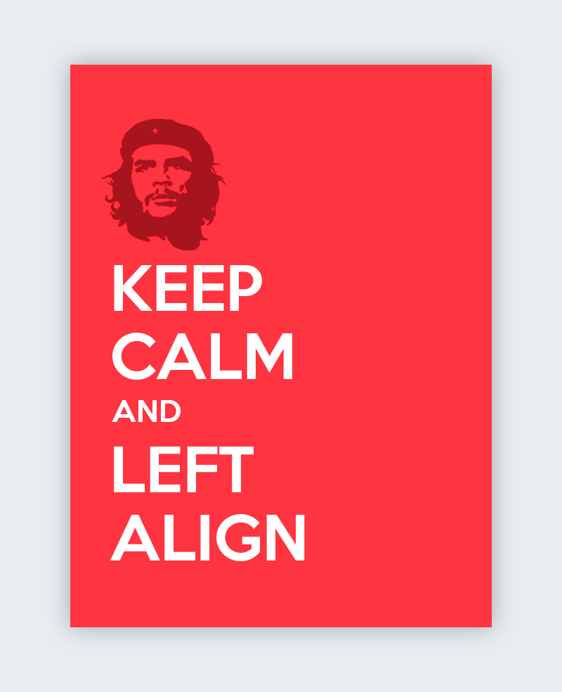
Most Western readers are tend to read from the left to the right size of a page. thus, designs includes text are often aligned to the left margin in the same design.
Right alignments are often used to provide balance to the whole design when more visual elements on the left side. So, left alignments can bring the same effect in the reverse scenario.
9- Odd-numbered groups create focus.
The Rule of Odds allows designers to influence specific images by placing them in the center of a group. By placing an equal number of elements on each side of the main focal point—thus creating an odd-numbered group—the result to the most important of this visual element, located in the center.
For example, a group of three or five elements is more appealing than a single pair. So, groups consisting of an odd number of objects are always considered more interesting and vidually-pleasing than even-numbered groups. Why? People feel more comfortable with balance.
10- Repetition unifies a composition.
Just as contrast emphasizes and draws attention to design elements, repetition creates uniformity, which increase the understanding and recognition.
Think of most newspaper and magazines. The page designs are organized in a way that body text is all one font, chapter headings are another and footnotes are a third different font—all consistent throughout the entire page. This style repetition creates a cohesive design, recognized as a whole.
For a unified design, repeat some element—whether it’s font, color, shape or size—throughout the whole composition. Consistent styles help define the visual hierarchy of any design.
For example, the infographic design in the conclusion of the post featuring the 12 visual-hierarchy principles. Repeating the same fonts and styles throughout the design clearly unifies the list and tells viewers that each item is part of a whole.
Repetition can also provide elements with a new meaning. How often do you see blue underlined text stand out on a webpage? Enough that you instantly recognize the text as a hyperlink, right? Repeating this style in a design tells your readers where to click for more info. What other popular tricks can give your design additional meaning?
11- Lines suggest movement.
Movement is one of the most effective ways to draw viewers’ attention, especially when it’s used within a still design. Lines are obviously efficient in pointing to items of focus —just think about an arrow—but they don’t have to physically appear on the page to do the work.

Leading lines can be used through the repeated elements—think of a row of dots—the proximity of objects, as well as the relationship of positive and negative space. For example, by placing an object up or down, lines can be created that suggest movement.
12- Grids organize a design.
The most effective designs are created through some type of grid. The most typical grid is the classic composition of crossing vertical and horizontal lines.
Artists, photographers and graphic designers have long employed the rule of thirds to enhance the overall balance of their compositions. The rule involves mentally dividing a composition into a grid composed of two horizontal and two vertical lines—or nine separate sections.
Important visual elements are placed along the lines, within the four points where the lines meet. Off-center compositions are generally considered more aesthetically pleasing when compared to designs in which the main focal point is placed in the center of the frame. The rule supports the use of negative space, good proximity of elements and effective alignment.
Not only is it generally common, but the modular grid is the most legible design. But still sometimes the best way to create a style is to break the rules.
Alternative Grid Designs
Instead of the classic modular vertical-horizontal grid, designers might choose a diagonally-directed grids to ensure their creation stands apart on a page and draws viewers’ attention.
Breaking the Grid
Some designers will go to break the grid entirely, randomly placing visual elements everywhere in a page in order to best stand apart from the gridlocked text around it. That surrounding text can be in the same design or on a surrounding pages.
Don’t be fooled by the concept of randomness. Randomly scattering elements across a background according to no specific reason or strategy isn’t going to miraculously turn into a masterpiece. When breaking the grid, every choice still must be calculated and with goal and purpose.
Conclusion:
Visual-hierarchy principles are some of the most effective strategies for emphasizing elements of a design and clarifying a visual message. But as with much of life, you can have too much of a good thing.
Designers must wisely choose what principles to employ, or risk diluting any emphasis and breaking down the visual hierarchy. If everything stands out, then nothing stands out.
if you’re not sure that your hierarchy is effective? Then test it. stare at the design in front of your page or screen, allowing the actual design to fade into the background until it becomes a blur of shapes and colors. What still standing out?
Or, to save yourself from going cross-eyed, you can use the blur test by taking a screenshot of your design, opening it in Photoshop and applying the Gaussian Blur filter. that will be an easy test to see the main elements standing after everything is blurred.
If the main attraction is still the element(s) you planned to focus on, your visual hierarchy is effective.
Your Turn
Now it’s your turn to apply this visual hierarchy principles into your next design. practice and tell me which principles that we talked about are you planning to use in your design and which one amazed you the most in the comments below.
Finally I summarized the above content in the below inforgraphic.
Resources:
visme.co