It’s not as easy to create a color palette as it may seem. Most solopreneurs simply pick a bunch of colors they love and call it a day. Those are the same solopreneurs that end up changing their color palette 42 times.
Fuck all that madness.
Let’s skip that giant suckage of time and make sure you have all the knowledge bombs you need to put together a color palette that will NEVER fail you, the first time around.
In the first part of this color series, we talked about the 5 types of branding color palettes that reign supreme and how each one works, and in the second part we broke down the entire DNA of a branding color palette, including how many colors you need and exactly how to use each color in your palette, so make sure to check back and give those both a look in case you missed so there are no gaps in your understanding of color and how to use it in your brand identity.
In this last part in the blog color series we’re going to tackle three, actually FOUR since I threw in a bonus for you, ways to create a color palette that’s totally failproof.
But before we keep going to those, let’s go through how to define a color and the differences between online and print colors, so you know exactly what to look for when you’re choosing the colors for your palette.
How To Define A Color
Ask 5 different people to choose a blue paint swatch and I guarantee you’ll end up with 5 very different shades (or tints) of blue. Even if you got more specific and asked them to choose a sky blue swatch, you’d still end up with 5 different shades. It’s the nature of color and how differently we perceive it. That’s why there are ways to define specific colors, it takes out the guesswork and keeps everything consist.
There are 4 methods for defining a specific color. There are two definitions that are used for web based projects and two definitions that are used for print based projects.
The reason for having a variety of ways to define every color is so you can achieve the same color, regardless of the medium. Web browsers display colors different than a print machine produces colors, so you need these different definitions to fit these different modalities.
With that said, make sure you have at least one web definition and BOTH print definitions for each color in your palette, that way you’ll always have all your color bases covered.
Method 1: A Hexadecimal Code
A hexidecimal code (or hexcode as it’s also called) is a 6 digit number that’s preceded by the ‘#’ sign, and is used to define web based colors.
The first two numbers describe the red additive of a color (meaning, the intensity of red present in that color), the 2nd pair describes the green and the third pair of numbers describes the blue additive.
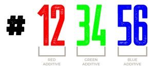
Basically, it defines how much of each of the three primary colors you need to create the exact color you want. For instance, if you want a true red, the hexcode would be #ff0000, if you want a true green it would be #00ff00, and if you want a true blue it would be #0000ff.
Every web color shade of tint has its own special hexcode, which is the easiest way to define web based colors.
Method 2: RGB
RGB is actually stands for the initials of the primary colors (red, green, and blue), the same colors we just discussed during with hexcodes.
Same as the hexcode, the RGB color system generates web based colors by combining the primary colors in different degrees.
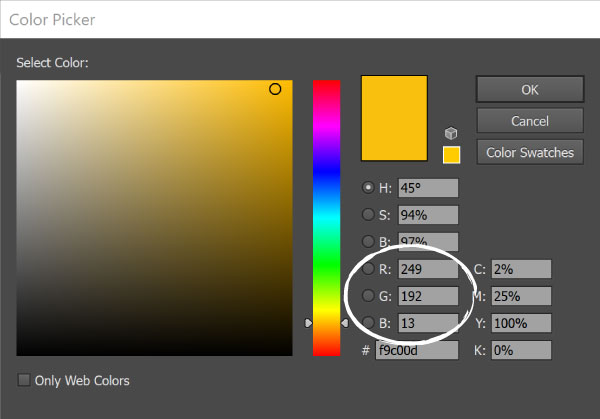
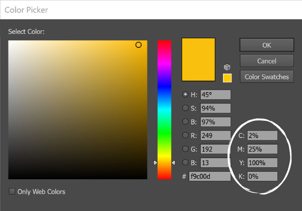
In RGB definitions, each letter is represented with a number between 0 and 255, which represents the intensity of that specific color (0 being the lowest intensity and 255 being the highest intensity). Meaning a true red would be 255, 0, 0, a true green would be 0, 255, 0 and a true blue would be 0, 0, 255.
When all three of the colors are displayed at their full intensity (255), the result is pure white, when all three colors are combined at the lowest intensity (0), the result is pure black.
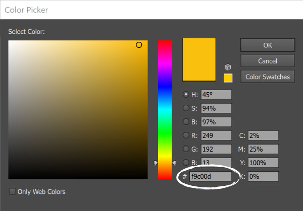
If you look at the screenshot below you’ll see the RGB parameters circled, and right below that you’ll see the hexcode for the yellow displayed. Both of these definitions will net you the same web based color, so choose whichever system you prefer and make sure you have the definitions for all of the colors in your palette.
Method 3: CMYK
Now let me show you how to define your colors for print based projects, like business cards, stationary, or even merchandise.
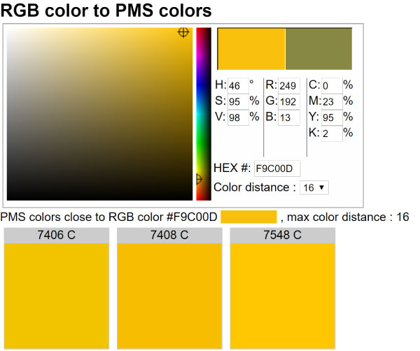
The first method is the CMYK system, which stands for cyan, magenta, yellow and black, which are the primary ink colors used in print. Each letter is represented by a percentage which specifies how much of that particular ink should be added to create the specific color you want.
In the screenshot below you’ll see the CMYK parameters for the yellow we’ve been working with, along with the web definitions we’ve already talked about.
Make sure that you have the CMYK values for every color in your palette, as you’ll need to use those in your print files or give to your printer.
METHOD 4: PMS
While the CMYK system is made for print based projects it can still yield a lot of variation in the final color that is produced because of discrepancies in the ink used by different printers. In other words, you’re not guaranteed to get the same final color from one printer as you will from another, even if they are printing the same project.
The best way to ensure you’re getting the exact SAME colors in your print projects (even years down the road, no matter what printer you go to) is to define the PMS for each color in your palette.
PMS stands for Pantone Matching System, and it’s a proprietary system that was created to standardize print colors across industries, printers and locations, so print color is NEVER left to chance.
Unlike the previous 3 color defining methods, PMS colors are not represented by additive percentages or intensities, though those parameters are used to find the PMS equivalent of a hexcode, RGB, or CMYK definition.
To find the PMS equivalents for the colors in your palette you can use a color converter like this one, which allows you to enter any of the other three color definitions mentioned to find the PMS equivalent.
Now, that we have that out of the way, let’s get to the fun stuff! Here are four ways to create a color palette that will NEVER, and I mean never EVA, fail you.
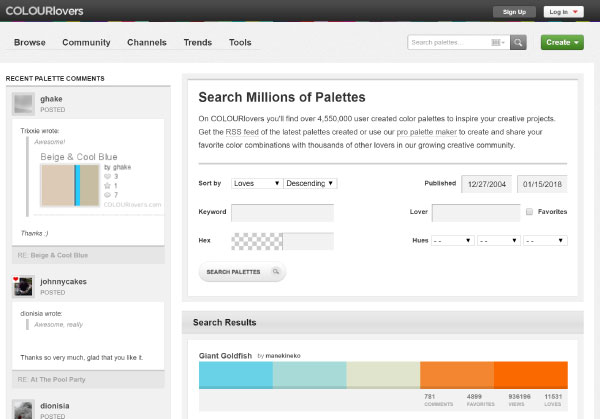
1. COLOURLOVERS
COLOURLovers is a community where color lovers create and share colors, color palettes and patterns. At the time of writing this there are a mind blowing 4,550,061 color palettes to inspire you. So trust me, there’s no shortage of palettes to drool over!
Whether you’ve got absolutely no clue what colors you want to use, you just need some help finding the PERFECT shade or tint of a specific color, or you’re some where in between, there are endless ways you can find what you’re looking for on COLOURlovers..
Once you land on their homepage, click ‘Browse Palettes’, which is in the menu on the far top left corner. That’ll open their palette search page. From there, click the black ‘Search’ button, which will open a new box loaded with search filters.
There are 3 ways you can use COLOURLovers search filters to find the colors for your palette.
Keywords
Use descriptive words that describe your brand or represent characteristics of it. For instance, if I was creating a holistic coaching brand I might search for keywords like zen, soothing or meditation.
This’ll give you a great starting off point if you’re looking for a creative direction to take your palette.
Specific Hexcode
If you already have a specific color you know you want to use, you can enter the hexcode in their search filter and browse all the palettes they’ve got with that specific color in it.
This is a great way to get some inspiration for your palette, when you have a starting point but you’re lost as to how to round out your theme.
Pair what you have learned about color relationships in the first part of this series with the inspiration on COLOURlovers and you’re going to have a failproof palette in a no time.
Generic Colors:
If you have the general colors you think of in your palette you can use their ‘Hue’ filter to choose up to three different base colors. For instance, if I continue with the holistic brand from before, I might search palettes that feature blues and greens.
Once you select the colors you want, you’ll be able to browse all the palettes they’ve got with those colors.
2. ADOBE COLOR CC
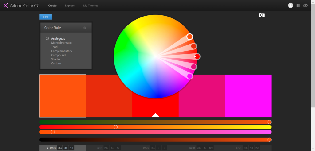
Adobe Color CC is a complete color finder and palette creator that has tons of features.
When you land on their homepage you will find a color wheel with each of the palettes we talked about in the first part of this color palette series listed to the left (see screenshot below).
Once you define the type of palette you want to create, it will manipulate the color wheel so that only color combinations that fit into your scheme are generated. You can then drag the points to different areas of the color wheel, all while it maintains the palette type you chose and provides you with the rest of colors matching your palette type.
As you drag the points around the color wheel the colors will be updated in the 5 swatches below. Once you find the desired color, you can click on that square and grab the RGB and hexcode for that specific color.
You can even slide the controls for each of additives (red, green, and blue) on any specific color to get the shade/tint just right.
Can you say COOL AF?! And this is just the beginning of what you can do with Adobe Color CC.
Using a Photograph
Often times you can find a photograph that, while unrelated to your brand, really captures the essence of your brand, or maybe just the essence of the style you’re going for, but how do you take that photograph and build off of it?
You turn that photograph into a color palette, that’s what you do!
Here’s how to do it…
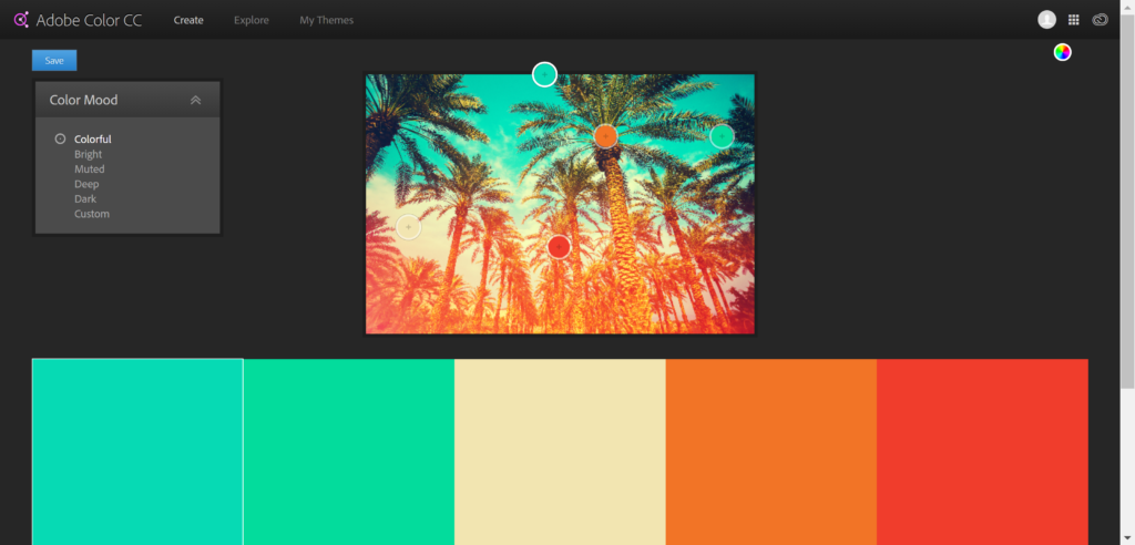
Upload your photograph to Adobe Color CC using the camera icon in the top right corner. Once that’s uploaded you’ll see your photograph with 5 palette swatches below it. You’ll also see a box on the left side that has 6 prompts: colorful, bright, muted, deep, dark, and custom. When you click on one of those prompts it will update the swatches based on your selection.
Now you can click on any of the swatches, which will allow you to drag that point (which is represented by a circle in the color of that swatch, with a plus sign in it) in the photo to change the color of that specific swatch.
Once you get a palette or a single color that you look to grab, you can click the color wheel icon (which is in the same location the camera icon was) to get back to the color wheel screen where you can grab the RGB and/or hexcode for the below swatches using your photograph.
It’s really skies the limit here! This tool can turn a little productive play time into a failproof palette faster than you’ll ever be able to do in your head.
3. COLORZILLA
Colorzilla is a Firefox and Chrome browser extension that’ll help you swipe the specific hexcode and/or RGB values from anything on the web, including whole webpages.
That means, no more seeing an image with that PERFECT shade and having to wonder what the color is.
The Colorzilla extension comes with a couple cool features for color swiping so let me show you how it works.
Once you load the extension in your browser, you’ll have a color picker icon available on your browser bar. When you click that icon it’ll open the menu you see below.
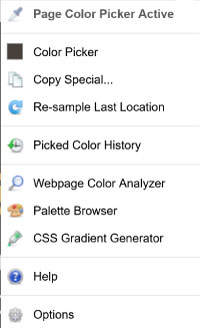
If you choose the ‘Page Color Picker’ option a black bar will appear at the top of your screen, like the one you see in the image below.
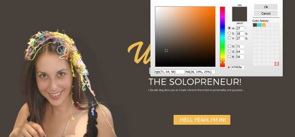
You can then hover the crossbar that appears over the color you want to swipe. Once you click on what you want the color will be saved to your clipboard and to the extension, and the black bar will disappear.

Then, you can either paste the hexcode that’s saved to your clipboard to a document, OR you can click the color picker icon and choose the ‘Color Picker’ option, which will open the window you see in the image below. Where you can save your swatch and grab your RGB values.
You can also click the eye dropper icon and select ‘Webpage Color Analyzer’ and it’ll pull in every color used on the current page you’re on.
Yep, that’s my palette that you can now swipe. But you better not…you don’t want to poke this bear. RAWR!

As promised here’s the bonus method…
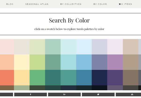
4. Design Seeds
If you’re more of a no fuss kinda solopreneur and would rather opt for more of a done for you approach, boy have I got the resource for you, it’s called Design Seeds.
Jessica, the founder of Design Seeds, turns gorgeous Instagram photos into inspiring color palettes (see an example below) and offers them up for grabs.
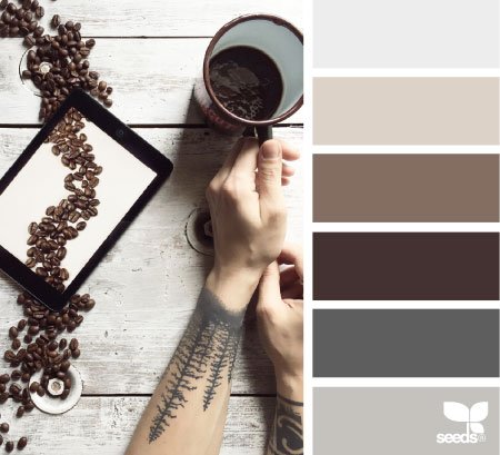
You can search her color palettes by color (see a screenshot of her color page below), or by collection, which includes categories like The Seasons, In Nature, and Edible Hues, which is where I snagged the coffeelicious palette above.
Tell me you’re not inspired. I DARE YOU!
Wrap Up
While each of these methods will work like gangbusters on their own, that doesn’t mean you have to choose only one. They work great in tandem too, so don’t be afraid to use a mix and match approach.
What matters above all else is that your palette meets the criteria of one of the superior palettes I showed you in the first part in this series, and that it has all the color versatility I showed you in the second part in this series.
If you need a refresher the links to the first two installments are above for you to revisit.
Talk about ruling the world! The web is truly your brand playground now, go forth and color it how you see fit!
Resources: www.thebrandedsolopreneur.com