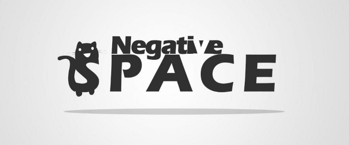
I am a huge fan of negative spaces in logos. They don’t just make the logos look clever but also leave a lasting impression to your viewer’s mind. After all, it’s one of the characteristics that make a logo stunning. Before starting this article, let me remind you this article is not going to make you a master of negative spaces. But I am sure you that after reading this article you will know exactly how to direct your creative thoughts while you are planning to design a logo using negative spaces. So let’s start…
What is a Negative space?
DEFINITION
Negative space clear definition is when the space around a subject, not the subject itself, forms an interesting or artistically relevant shape, and such space usually is give an illusion of the “real” subject of an image. The use of negative space is a key element of creative idea.
I know definition always make every interesting thing boring especially for artists. So what is negative space? We are artists so let’s talk with pictures.
so let’s take a classic and simple example.
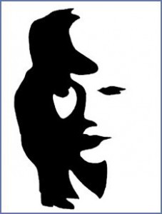
This is the first example and it’s very easy and simple one and I consider it very basic like not much trick on it. Let’s consider the black color as the positive space. This positive space make a musician with his tool. well now concentrate on the space around this black color (positive space), for me I can see a female face. And that’s what we call negative space.
Does any actual famous logos use negative space?
That’s a very good question…
Yes.. actually there are a lot of them just search in google. But right now I’m only going to mention just one and it’s the most famous one so far.

Let me see.. did you find it?
If you look closely between letters ‘E’ and ‘X’…You could see an arrow… Yup that’s very clever as it match with the company goal of shipping and moving forward.
Okay that’s it for the introduction now let’s jump into the interesting part
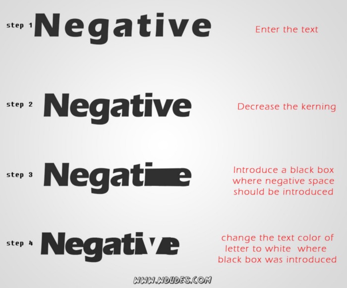
How to design a Negative Space Logo
The tips I’m going to explain now only helps you know how to direct your creative thoughts, and this is not a step by step tutorial on creating a logo. This is going to be a list of tips and tricks to find the hidden gems in negative spaces of shapes. And how to use them to create a creative and clever logo.
When you start designing a negative space logo, the first question which come to your mind will be where to start
Where to start??
Believe me that’s not a hard question at all, negative space can be used in all types of logos. Typeface based logo or symbol/shape based logo. Whatever retro, modern, vector or 3D logo. Grab a pencil and a paper and write down the components of your logo and try to do some combinations. And here is some examples how to find cool ideas.
Finding Clever negative spaces With shapes?
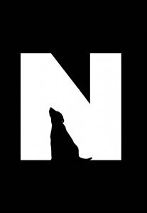
Shapes are designers best friends. This fact applies in negative spaces as well. As both together can make a stunning logo. As per the example below, we wrote down the letter “N” then we looking around the letter for the negative space and what it hides and how we can use it to make another element.
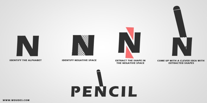
I know that’s not a good logo. But you get the point right. if you are using alphabets in your logo first you must look for the negative space and extract that shape out of the letter and draw it in a separate example. now it’s time come up with the thing with that shape you have extracted. Keep trying different stuff related to your main idea of the logo and once you find it build up on the negative space to get to your final result.
The same method applied to finding the shape in picture based logo as well. Such as the below examples.
Negative spaces And Overlapping
The most difficult task while trying to use a negative space trick trick in your logo is finding the possibilities of introducing clever negative space. So now we are going to understand the different ways to find or create this negative space. overlapping objects might be the easiest and fastest opportunity to introduce this negative space in your logo. So let’s assume we have several objects in our logo that might be shapes or letters, when they overlap then we can make one object the positive space and the other one is the negative space. We can find some good examples in the below images.
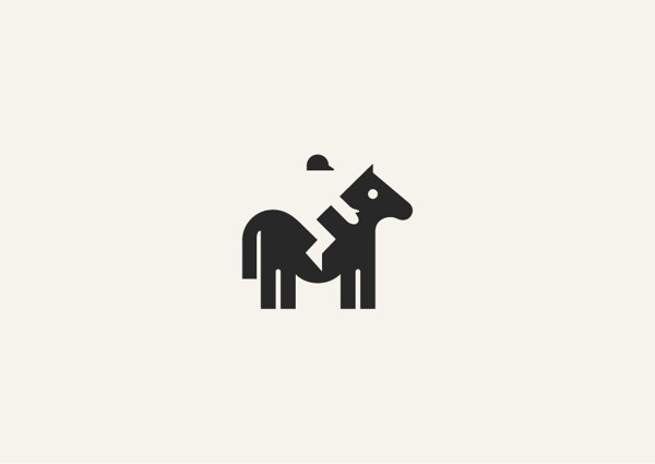
In the logo above, the designer used the jockey which is overlapped by the horse as the negative space while keeping the horse as the positive space. So now even if the designer didn’t complete the jockey illustration, the illusion of negative space will give you the feel to complete the whole scene in your mind.
Always try to surround three sides of the negative space with the positive space. then only the illusion meant by the negative space will be clear to the viewer’s eye.
It’s not necessary to follow this theory all the time but. it’s good to keep that in mind

Let’s have a look on the above example. Here the designer used 2 hugging bears to introduce the negative space to one of them and the positive space to the other one. While surrounding the 3 sides theory to the negative space. If you look closely to the black bear arm which represent her the negative space, you will see it’s surrounding by the positive space “the while bear” from the 3 sides (above, below and one side).
Overlapping in not only possible with images but it can also be done using typeface only. let’s look at the following examples.


This overlapping technique is the most used technique in negative space logos in typeface based logos. Let’s show you a very quick trick on how to do it.
Shadows and Negative Spaces
Using shadows to introduce negative space is also a very clever way to achieve it. And to get an idea let’s imagine any 3D object and draw it on a paper, imagine a single light source from any direction. Now one side of the object will be illuminated and other part will be shadowed. Let’s apply the negative space to the shadow part and the positive space to the illuminated part or vise-vers. and here you are.
Let’s take some examples of using shadows to get a clever negative space.

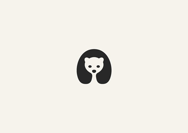
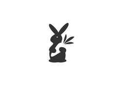
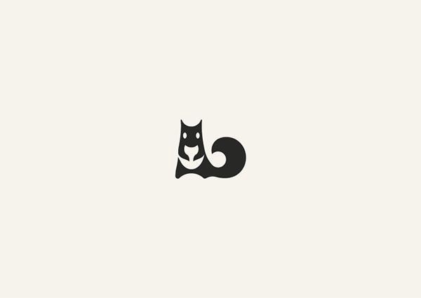
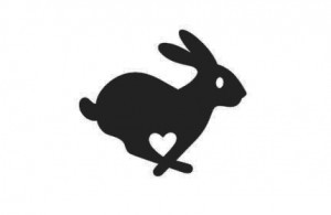
Animals and Negative Spaces
Animals are the best objects to achieve negative spaces. Animals are so flexible and you can manipulate with its shape to achieve the best look to reach your desired negative space. Here we’re going to introduce three simple methods to get this negative space from animals.
Method 1
step 1-draw the front view of the animal
step 2-make the body and eyes positive space
step 3-make the head Negative space
this method works with: birds, four-legged animals
examples
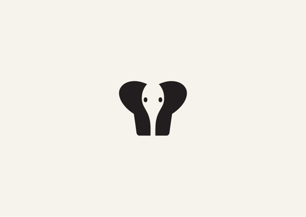
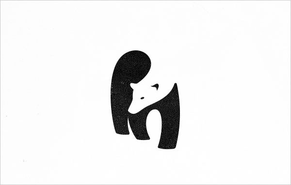
Method 2
step 1-draw the front view of the animal (side view also possible but is a bit difficult)
step 2-let the animal hold any object
step 3-make the object & the eyes negative space and let the body be the positive space
examples
Method 3
Step 1: draw a side or front view of an animal
step 2: between the animal legs introduce another animal or shape as negative space
example
Conclusion
I’m pretty sure that this information we discussed today will help you in your future designs. And I’m a huge fan of negative space logos, So if you guys design something great please do share it with me. Also as I mentioned before, this is only the start not the end of making negative space. the rest is yours. You should practice and make your own tricks to get a clever negative space. Take your time while designing your logo and keep an eye on the space around all the logo objects. Try to avoid the easy and common tricks to keep your logo stunning and eyes catchy. Finally please share with me your thoughts in the comments below or any design you created using negative space.
Resources: http://prototypr.io