I guess all of us had feel the huge responsibility of choosing the right font to your logo. Choosing the right font to your logo is like picking the right color to paint your house. Because once it’s done, you will be stuck with for a very long time and it will decide a lot of the energy and the impression of your visitors.
And like the colors of the house will have some pros, cons and psychological effect, each type of font come with its pros, cons and psychological effect as well.
For sure we won’t discuss all the fonts available today, as they are thousands of fonts. But all of them can be broken down into five main categories. We can explain this categories as each category has its own style and unique characteristics.
Let’s go and discover each type of this fonts, but first let’s understand some important definitions you might have been used a lot during playing with some text.
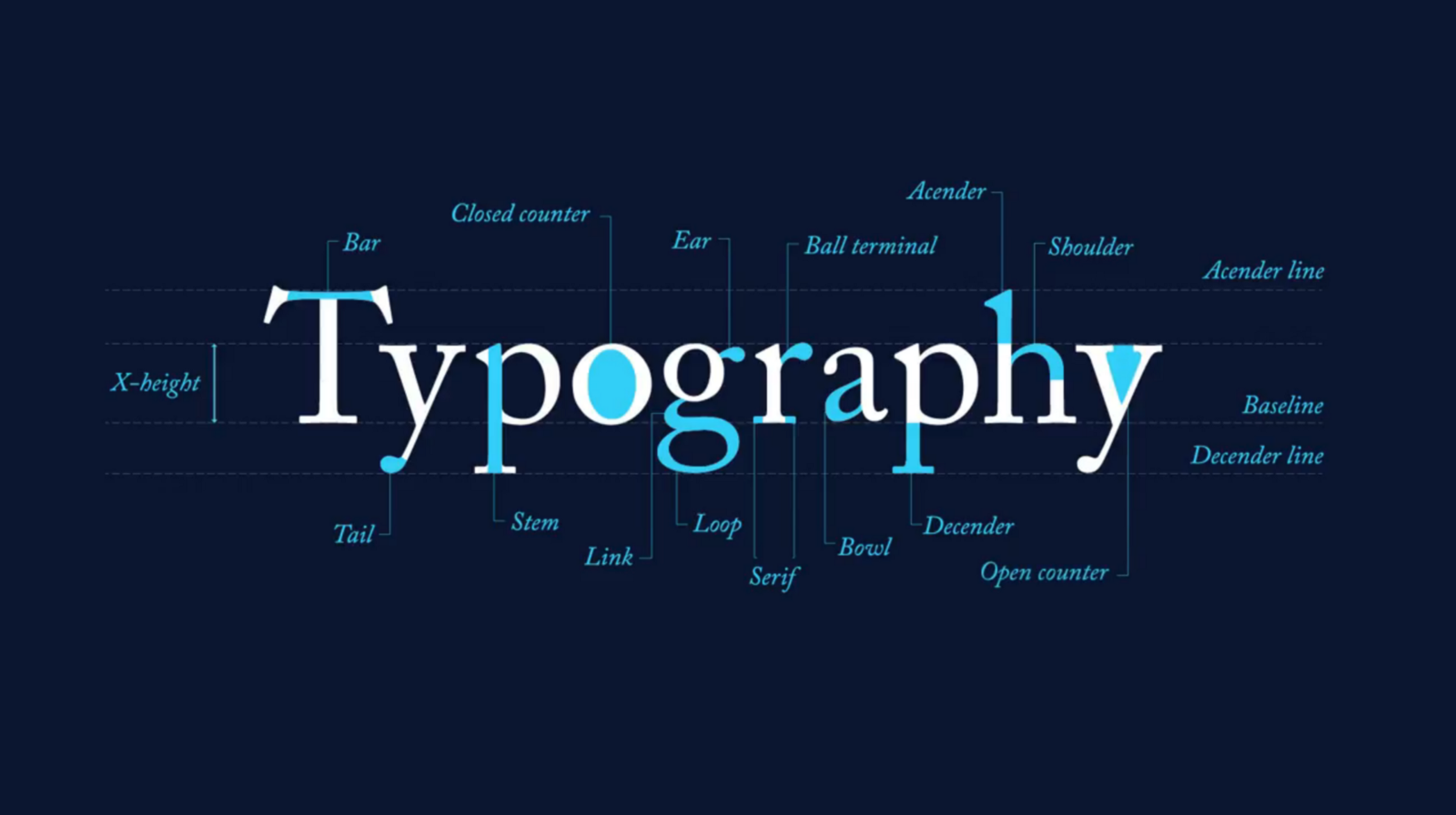
Also don’t forget to check the anatomy of letters post to understand more about the small details of each letter. Typography: The Anatomy of a Letter
How Type is Manipulated to Fit in a Space
Do you want to fit a word or a paragraph in a certain space, there are three ways to move around in space. Kerning, tracking and leading. let’s discover them before plus the alignment of any paragraph or text box.
Kerning
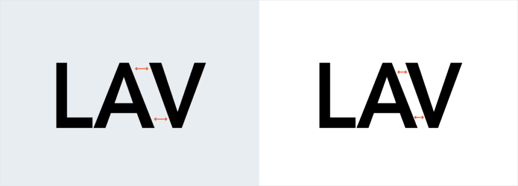
It’s that space between two individual letters and it might be too far or too close between some special letters. You can move or control one letter to achieve the balance between the rest of letters. Some typefaces have special spacing between the capital letter and the rest of letters. Kerning is actually give a balance between letters.
Make sure to control the kerning from letter to letter when you’re working on a logo. That will make the letters balanced and polished.
Tracking
It’s the proportional space between all the letters in a word or a paragraph. You can control the tracking to fit more or less letters in a specific space. Also you can spread it if the letters are too tight or overlapped.
Manipulate with tracking helps you achieve a specific look of your text and you can control a long page or small word at the same time. Make the letters too close or too far, will help you achieve the look you want for your design.
Leading
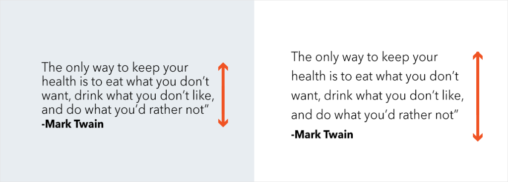
It’s the vertical space between each text baseline. When we manipulate with the leading, we are changing the height of the paragraph.
Leading and x-height are the two direct parameters that impact the height of the paragraph. We can measure all of this from the baseline, which is the horizontal line that letters sit on. The baseline is the bottom line of the x-height. We discussed all this definitions in our post Typography: The Anatomy of a Letter.
The lower the x-height compared to the cap height, the more empty space will be between lines. When letters have a higher x-height compared to the cap height, the leading looks more balanced and ordered.
Alignment
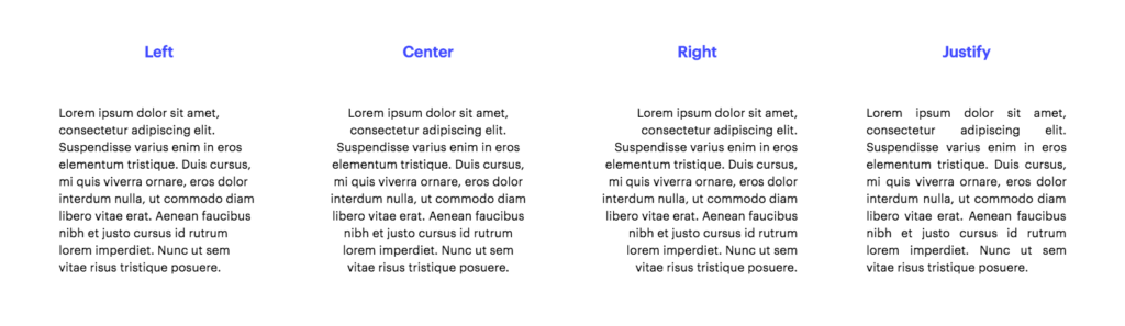
You can control the alignment of a whole page or a several pages by a simple click from your mouse. We have four ways to align a paragraph left, right, centered and justified. Mainly left and right are used for languages that read from left to right or right to left such as English and Arabic. But deciding the best alignment way and the benefits of each aren’t that simple especially when you’re not writing a book. there are so many factors you need to consider before clicking this button. You need to check the environment around your text and the relation between other text at the same space and much more to decide.
Fonts Types
Serif Fonts
These are the oldest types of fonts, the first appearing was as early as the late 15th century. The word ‘serif’ refers to the small feet present at the tops and bottoms of each letter. These tiny flourishes stemmed from artists’ brushes and would be added to the letters as decorative elements.
Serif fonts have several subcategories (Old Style, Classical, Neo-Classical, Transitional, Clarendon, etc.). Serif fonts are one the most popular typefaces in use, with styles like ‘Times New Roman’ being ever-present in books, official documents, and even some logos.
This style of font is characterized by a more conservative design and (some of the many subclasses notwithstanding) the presence of serifs at the tops and bottoms of most letters.
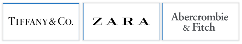
Brands that use serifs: Zara, Tiffany & Co, Abercrombie & Fitch.
Psychology of serif fonts: It’s popular with companies that are tend to look elegant, sophisticated brand. Logos with these typeface show some sort of tradition, respectability, and reliability.
The conservative and respectable appearance of the serifs gives the companies the look of more established. Beside it can give the brand the identity of authority.
Sans Serif Fonts
Sans serif fonts replaces with the flourishes of their predecessor with a cleaner and more modern approach. And this contrast makes them pair well with serif fonts. The first appear was at the 19th century and became very popular in the 1920’s and 30’s. During the mid-20th century, German designers further expanded the typeface with the creation of the popular Helvetica design. <3
Sans Serif is cleaner and have straight lines. Plus it has no flourishes at top or bottom so it’s easier to ready and very simple to recognize with any scale. Sans serif also has several subcategories such as Grotesque, Square, Geometric, and Humanistic styles.
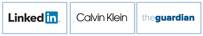
Brands that use sans serifs: LinkedIn, Calvin Klein and The Guardian.
Psychology of Sans Serif: Sans Serif provides a clean and professional corporate look. They emphasize forward thinking and modern approach. You can use both bold or thin and still be very clean and grab attention with its polished and efficient design.
Slab Serif Fonts
In the 19th century they emerged a variant type of the traditional serif typeface. They are bolder and with longer flourish than the serif.
The slab serif is known for being solid and bold. It looks modern more than classical once. It also have been used to bring modern bold look to the brand. It can be either rounded or angular but still look like a typewriter style.
Brands that use slab serif: Sony, Honda, and Volvo.
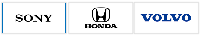
Psychology of slab serif fonts: This typeface give you confidence, dependability and creativity by looking at its heavy lines and less serifs. Brands who tend to use the slab serif want to look important and innovate.
Script Fonts
The casual script typeface gain its popularity in the 20th century. Looking at its stylish and modern flourishes make it stunning.
This types are very popular for its natural looking cursive style. Scripts can be broken down to two main subcategories formal and casual. It’s more to bring you the pretty of the handwritten calligraphy style.
Formal scripts might be less readable than casual script due to its heavy flourishes and curls which might confuse the reader. However casual script always emphasize legibility.
Brands that use script fonts: Coca-Cola, Instagram, and Cadillac.
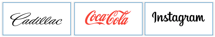
Psychology of script fonts: Script fonts give you a sense of elegance, creativity, freedom and femininity. The unique style of its flourishes provides a personal approach to business. Companies which want to add particular personal emotion can use script font to add a great effect.
Decorative Fonts
Decorative or display fonts provides a unique and appealing effect to your test. It’s useful for a variety of business and needs but only to specific companies.
Decorative fonts aren’t favored to be used for a long text. instead it can be used for a one word logo.
Brands that use decorative fonts: Toys R’ Us, Lego, and Fanta.
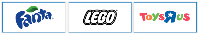
Psychology of decorative fonts: In general these typefaces are very unique and emphasize originality. Also it’s very flexible to work with so many industries and spread the emotions that the company focus on. But mainly it’s all casual, fun and creative emotions. Also this kind of fonts can stand through longer period of time.
Your Turn:
Choosing the appropriate font for your logo is a critical aspect of any brand identity. And it’s one of the main parameters that define your brand such as the color and the shape or the logo. Different font can gives different emotions, values and targets to your logo.
Share with me your logo design font in the description to discuss it further. Also let me know in case you need any recommendations.
Resources: