When it comes to branding, not all colors are equal. I’m sorry to say that; but that’s why some brand colors are better than others.
Creating a stunning color palette for your brand doesn’t depend on your personal taste or favorite colors. Your brand identity should be made based on some logic and science not just by try and error or any kind of fancy look, and your color palette isn’t an exception.
So we are going to spin the color wheel, and match colors together in a relationship. Through this color blog series of 3 parts we going to understand how to match colors that in love with each other.
So let’s get started and spin that color wheel to understand more about colors and how to use them effectively to create your brand color palette.
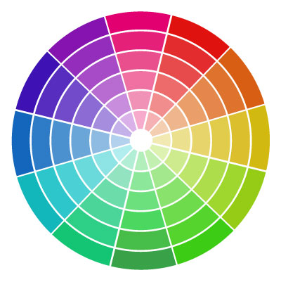
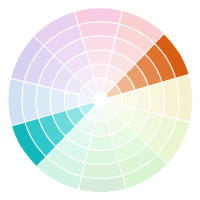
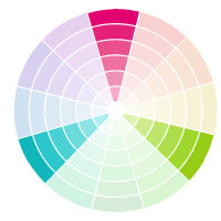
Here is the typical 12 spoke color wheel.
This is the same color wheel that graphic designers, interior designers and fashion designers are using. No matter where you use color in, it’s always in this wheel.
Here are the 5 types of branding color palettes that create the perfect, eye appealing color match, along with some examples of each.
1. MONOCHROMATIC COLOR PALETTES
Here is the simplest color palette, you pick a color and use it’s shades (darker) or tints (lighter). Well it’s not that easy or else everyone using monochromatic palettes will look like each other.
Well, Monochromatic palettes are the most widely used palettes for branding. But let’s take a look to 3 real world brand examples that use this one color palette.
Miranda Nahmias
Miranda likes to keep it simple. She used a different shades and tints of the pink color to create her color palette. As you can see it makes a beautiful contract in her visuals.
Using a monochromatic palette makes your visual easy to the eyes; and gives you options to stack your elements easier than other palettes. Due to the relation between colors to each other.
Here Miranda uses her tints for backgrounds and overlays, while uses her shades for the typography. I think that what made her text really pop and still maintaining the soft touch.

Jess Creatives
Jess uses a monochromatic color palette as well, but her style is a slightly different.
She uses her main color combined with white to create a clean and minimal style, and she add a little bit of tints and shades for a gradient overlays to her backgrounds.

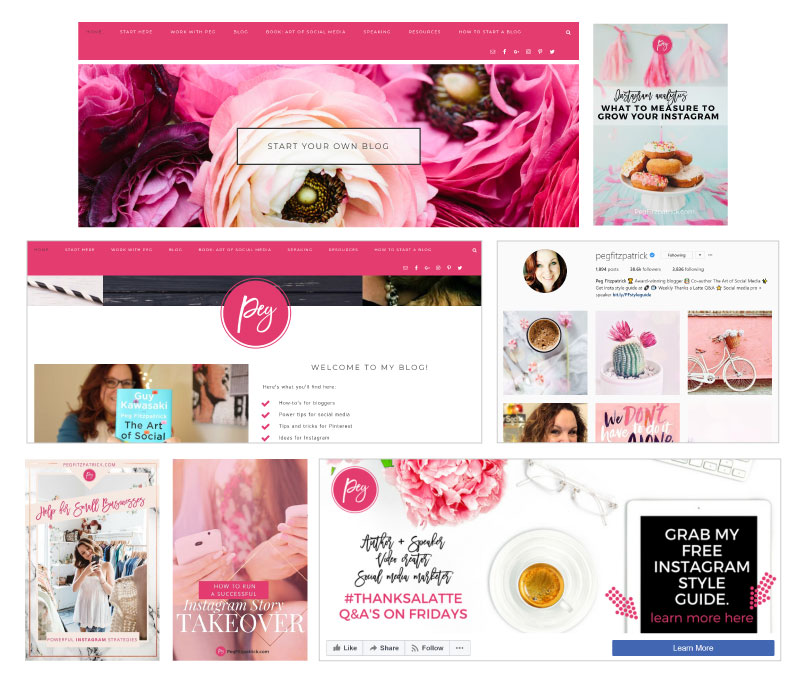
Peg Fitzpatrick
Peg uses her monochromatic palette very amazingly. She uses the pink color which is her main color as a background, icons and logo as well. Even in her images she used different shades and tints of the pink color which give her brand a strong feminine energy.
As we can see that using a monochromatic palette doesn’t mean losing the contract in your brand. But it’s the way you use the tints and shades in a particular order which gives your brand its strength.
2. COMPLEMENTARY COLOR PALETTES
A complementary color palette is using the direct across colors from each other on the color wheel. This type of palettes is the most recognizable, due to the nature of opposite colors used from each other.
In this type of palettes you can either only use the main colors like purple and green, or you can use their tints and shades as well.
Here in the complementary palette, we use the opposites in colors in the color wheel, which naturally brings contrast and the best for each other. Such as using the cold and warm colors at the same brand.
Now it’s time for real world examples of this type of palettes.
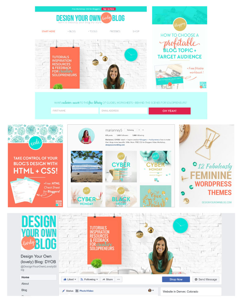
Design Your Own Blog
Marianne uses a complementary color palette of aqua and apricot pairing in her Design Your Own Blog website. She uses some tints and shades of each color as well.
So here Marianne decided to use all the tints and shades of her complementary color palette and not only use the base of the colors.
Bailey Richert
Bailey uses the complementary color palette as well. She chose to use the purple with green. And she also uses the main colors along with some tints and shades of those colors.
Note that she has defined the use of each color. So she made a color for backgrounds and overlays. Other color for text and call to action. And maintained a good style for all her visuals.

3. ANALOGOUS COLOR PALETTES
Analogous color palette consists of 3 colors next to each other on the color wheel.
An Analogous palettes are the most versatile color palettes due to the relation between the selected colors. So it’s able to provide a harmony to your visuals and incredibly recognizable look. Also it gives your brand a whole warm or cold style. Based on your selection whether you go with the warmer colors such as orange, yellow and red; or cooler colors such as blue, green and purple.
Let’s go now to the real life examples.
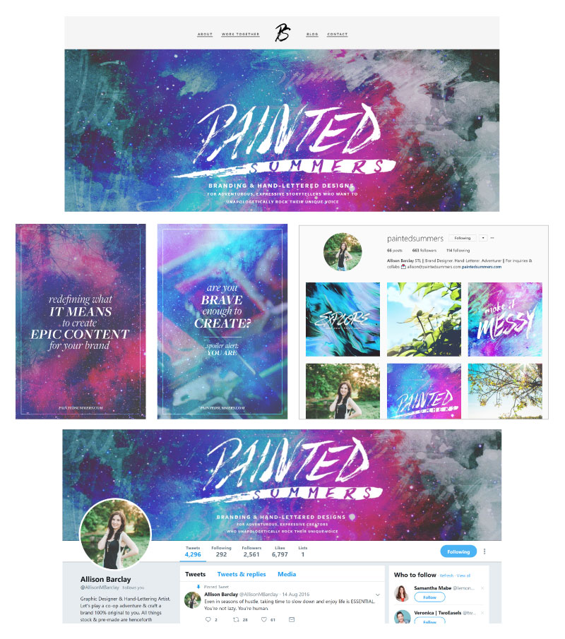
Painted Summers
Allison uses an analogous palette over her brand Painted Summers. She uses the cooler side of the color wheel. She got blue, green, purple with a hint of some magenta.
As you can see that choosing colors close to each other increases your design natural harmony.
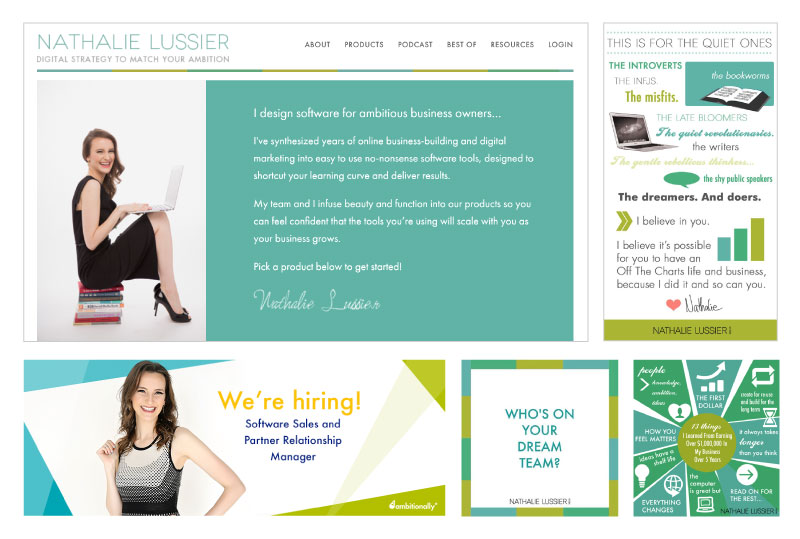
Nathalie Lussier
Nathalie also uses an analogous palette from the cooler side. However she has a different colors than Allison’s.
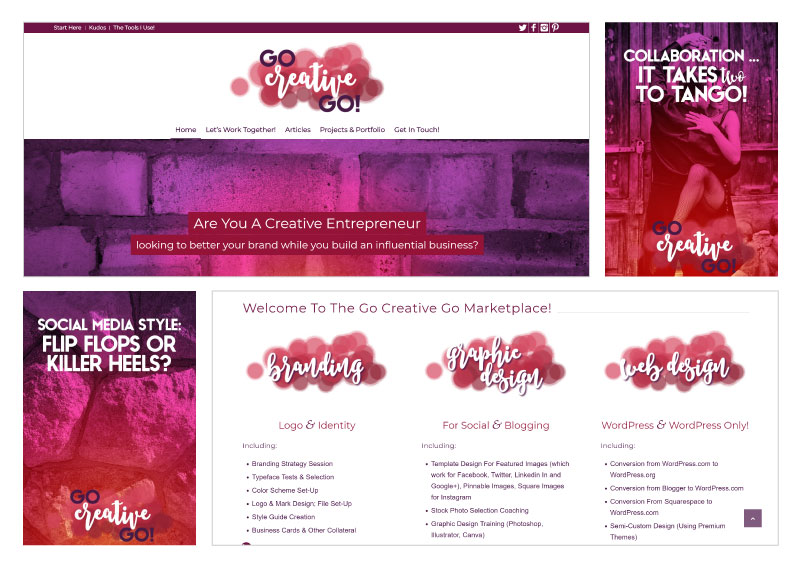
Go Creative Go
Mallie decided to go to an analogous color palette as well in her Go Creative Go brand. However she selected a bunch of colors located between the cool and warm colors.
So we understand from here that analogous palette doesn’t have to be cool or warm colors only. You can use any 3 colors stick to each other and they might be bring you some mix of cool and warm palette.
4. TRIAD COLOR PALETTES
Triad color palettes uses a three colors that are somehow perpendicular to each other on the color wheel. This tends to be the toughest color palette as it’s so busy with different colors. But the key of success here is to keep one color as a dominate color and the others as accents.
We can consider the triad color palette as an open relationship between colors. And as any open relationship it’s always complicated. It’s tough to give each of the three parties what they need. But usually a dominant and a couple substitutes will do the job.
Believe me that triad color palette isn’t for everyone, However if you could define each color use, then you will guarantee a pop branding using this color palette.
Now it’s time for real life examples of the use of this type of palettes.
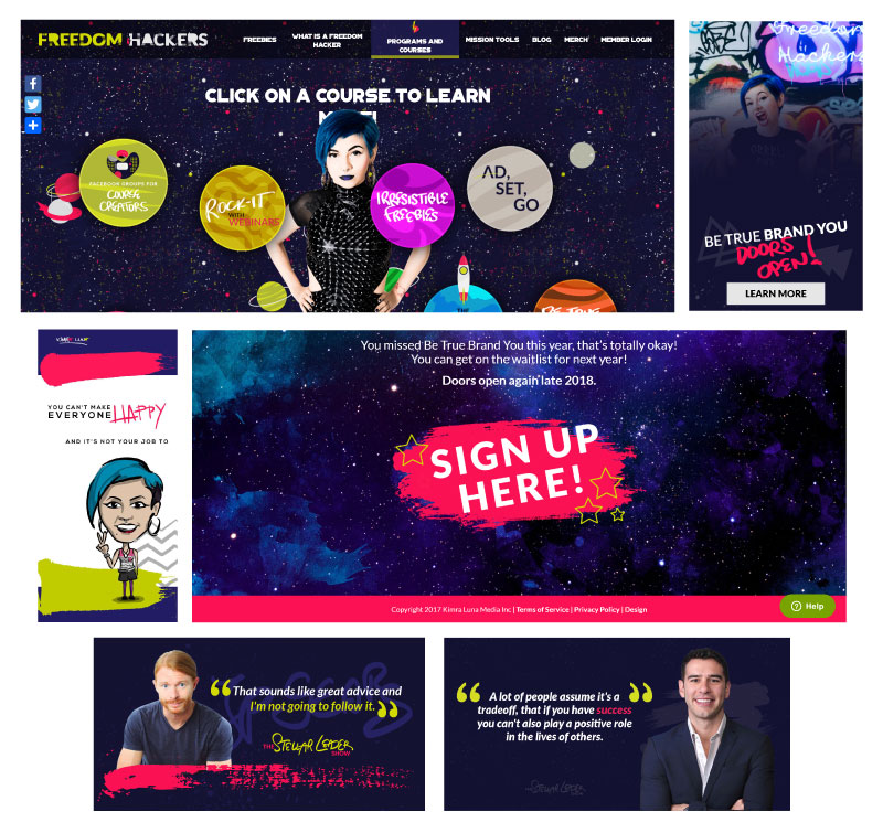
Freedom Hackers
Kimra has mastered a triad color palette branding over her Freedom Hackers brand. As you can see she uses a dominant color which is the dark navy. Beside two other colors as accents with is red and green which she uses for her typography and decorative elements.
Note how she controlled the audiences’ eyes to decide where to go through contents using her color palette.
So a triad palette can achieve this better than another type of color palettes if you do it right such as Kimra.
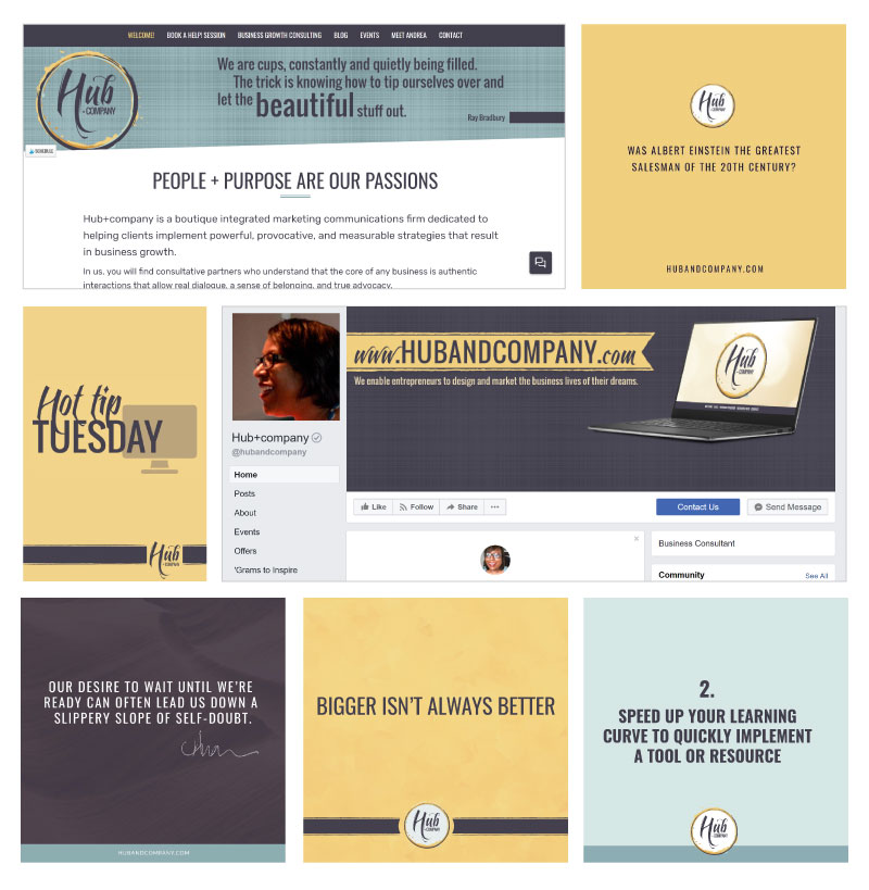
Hub and Company
Andrea over Hub and company also uses a triad color palette. Here as well she has a dominate color which is her shade of purple and the other two colors as accents. She mostly uses the accents as backgrounds.
5. NEUTRAL WITH A POP OF COLOR
Neutral with a pop color is the last type of color palettes we have here. It uses all neutral colors with one color that pops over the rest. This type of palettes became very popular recently for a great reason.
The neutral colors make a clean space for the pop color to shine. Which can helps with your brand recognition using that pop color.
so let’s check some real life examples of this type of palettes.
Cara Chace
Cara uses a combination of black, white and grey as the neutral colors, Then she pop with this really bright blue.
As you can see here she uses it to draw your eyes to the most important parts. And she has that cool brand recognition to her visuals.

Persuasion Revolution
Bushra uses that type of color palette as well which gives her brand a personality. She uses the black and white as the neutral colors. And then pop with this bright Orange.
As you see she uses this warm color to give more energy to her style. Beside she even wear the same color for her images.

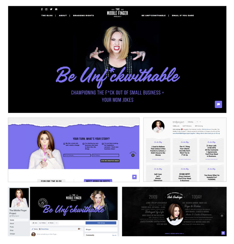
Middle Finger Project
Another brand who mastered this neutral with a pop color palette. She also uses the neutral colors from black, white and grey. Then she uses this bluish, purplish color as the pop color.
Whiskey and Red
Here Julie and Steven uses the same type of color palette but with a different approach. Their brand Whiskey and Red uses the creams and grays as the neutral colors with that purple color as the pop color. And all colors are in pastels.
Again it’s a very clever idea and it really make a brand recognition. Beside it really helps with their nature of industry.

Resources: www.thebrandedsolopreneur.com