
Atomic Design is a way for design teams to create new products with a calculated and controlled approach. But why is it such a trend? Find out in this guide!
Atomic Design has been making waves in the UX design industry. Designers all over the world are learning to love a more calculated approach to designing new things, but what does Atomic Design mean in practice?
Using concepts from chemistry in web design, most design teams find that their lives are made easier. This framework is all about seeing the interface and the components that make it up with brand new eyes, gaining perspective. The process itself often results in a system that lists all the components and patterns, like a design system that holds all materials and deliverables. It’s an exciting way to approach design, nurturing creativity in a way that leaves nothing to chance.
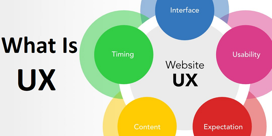
What is Atomic Design?
Atomic design is a design system created by Brad Frost in 2016. Frost wanted to create a design system that made it easy for him to focus on essential elements like color, typography, and texture. While exploring his ideas, Frost kept returning to the connections he found between design processes and chemistry. Naturally, he decided to call his approach “atomic design.”
All designers know that in the world of UX design, there are many different approaches. Atomic Design is all about choosing a scientific approach to the interface, applying a framework that comes from chemistry.
Think back to your days of high school chemistry classes. Your teacher probably invested a lot of time and effort into getting you to see the world through new eyes. Suddenly, everything on the planet could be considered large groups of molecules, working together to create our reality as we know it. Our own bodies are made up of atoms, each playing an important role in their own right.
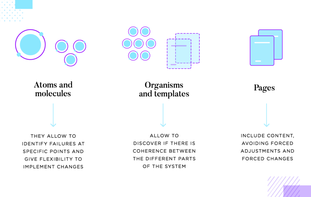
Atomic Design borrows from that way of looking at things, applying it to digital products. A silly example is individual UI components that together, form a signup form. In Atomic Design, the components are atoms, the form is the molecule. The entire page is a living organism.
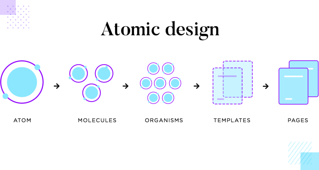
Frost’s original approach included five categories:
- Atoms
- Molecules
- Organisms
- Templates
- Pages
The farther you move up the chain, the more complex the design becomes. At the Atoms level, you work with the basic building blocks of a design, such as color palettes and fonts. At the Molecules level, multiple atoms work together. For example, you might pair a specific color with a particular font.
Why Atomic Design?
In a lot of ways, this is how we’ve been doing things all along, even if we haven’t been consciously thinking about it in this specific way.
This methodology is called Atomic Design because it’s very idea is founded in that of Chemistry, and the study of the composition of matter. The universe is made up of a fixed set of ‘atomic elements’ – known to many of us as the periodic table of elements. These elements are the building blocks of everything around us.
In Chemistry, these atomic elements have fixed properties that define them. Oxygen and Hydrogen on their own are atoms with independent properties. However when these elements are combined, they create molecules, which take on their own unique characteristics, made up of the atoms they contain. In the case of hydrogen and oxygen, pairing two hydrogen atoms with oxygen creates what we know as the water molecule.
This understanding of how smaller elements, or atoms, can be combined together to create larger objects, or molecules, parallels well with the design world, and the many elements we use to construct our designs. Following the atomic design principles provides us a structure for not only formulating our design, but creates the building blocks for constructing our design systems and pattern libraries.
1. Atoms
Atoms are often called the building blocks of the universe. Every single atom, small as it may be, ends up having a big impact on the molecules and organism as a whole. Atomic Design invites designers to see individual components like atoms – they each can be seen as a screenshot of the style and function of the page.
It’s true that in Atomic Design, one must see the real value and impact of each little component. With that said, designers shouldn’t fall into the trap of limiting their view to each component, but rather see the value they add to the whole.
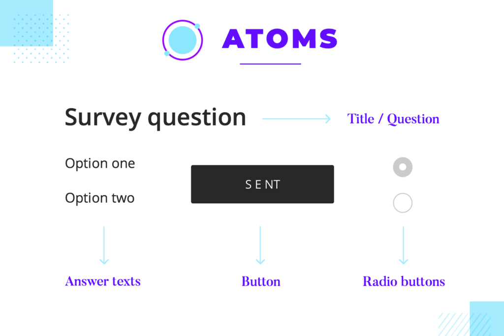
By looking so closely at each little element, the team gains the opportunity to create a list. This list will include all the components chosen to be the atoms of the product, working as an inventory. This is a resource for designers, who will constantly refer back to the list for any building block they may need.
2. Molecules
In chemistry, molecules are a group of two or more atoms that bind together and demonstrate new qualities. Consider the water molecule. It’s a combination of hydrogen and oxygen that together, create something new. With Atomic Design, designers can say the same about groups of components.
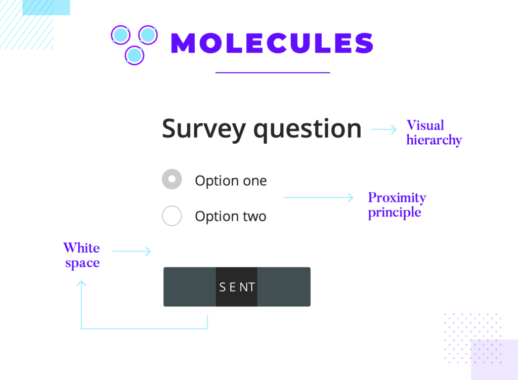
This can be approached in different ways. When dealing with a group of components, teams come to face concepts like empty or negative space, along with the need to group elements together in a way that makes sense to users. Generally, putting individual elements together leads users to believe they work together. This must be done in accordance with other design concepts, like creating a visual hierarchy that is consistent in the interface. Here are a few concepts that are all about creating molecules that work:
- Visual hierarchy: refers to allocating elements in a visual way that transmits their respective importance to the user. More important things look bigger and brighter, secondary things are placed in the background.
- White space: leaving a blank space between groups of components helps to avoid a feeling of clutter and can help to establish a good visual hierarchy.
- Hick’s law: concept that the more options users have, the more time it takes for them to process the information. Points to the fact that in design, more isn’t always good and encourages designers to prioritize.
- Gestalt’s proximity principle: by placing components together, we indicate that they have a close relationship. Things like labels and respective buttons are a good example of the role that proximity plays in the user experience.
- Information architecture: the general map of how each information relates to each other, showing the hierarchy of everything the product holds. This is about prioritizing what matters the most in a practical and visual way. The visual hierarchy and navigation design tend to reflect the information architecture of the design.
What do all of these design concepts have to do with Atomic Design molecules? In a way, they all seek to help designers create component molecules in a way that users can understand and enjoy. When using individual components (atoms) to create molecules (groups of components), we want to respect the previously mentioned rules of UI design. At the end of the day, UX design offers a lot of room to innovate and create new things – but ultimately, it’s all for nothing if users can’t benefit from the design.
One of the most powerful aspects of Atomic Design is that it allocates time to the creation of molecules in order to make sure that they have a clear meaning and function. This helps design teams be mindful of each component group, as well as the whole of the screen.
3. Organisms
Once we have a molecule, like our previous signup form, what happens? It might be tempting to look at each screen as a single organism, but that would be taking away some of the power in Atomic Design. Instead, this framework encourages us to look at each page as several organisms that together, create the interface.
Our signup form molecule might have other elements, like a text-based pitch, that work in combination with the form to create an organism. A large image carousel, buttons and navigation arrows can together create the header part of the screen – creating an organism. It’s important to think of these larger groups as organisms in their own right, mainly because this approach makes it easier to create modular interfaces.
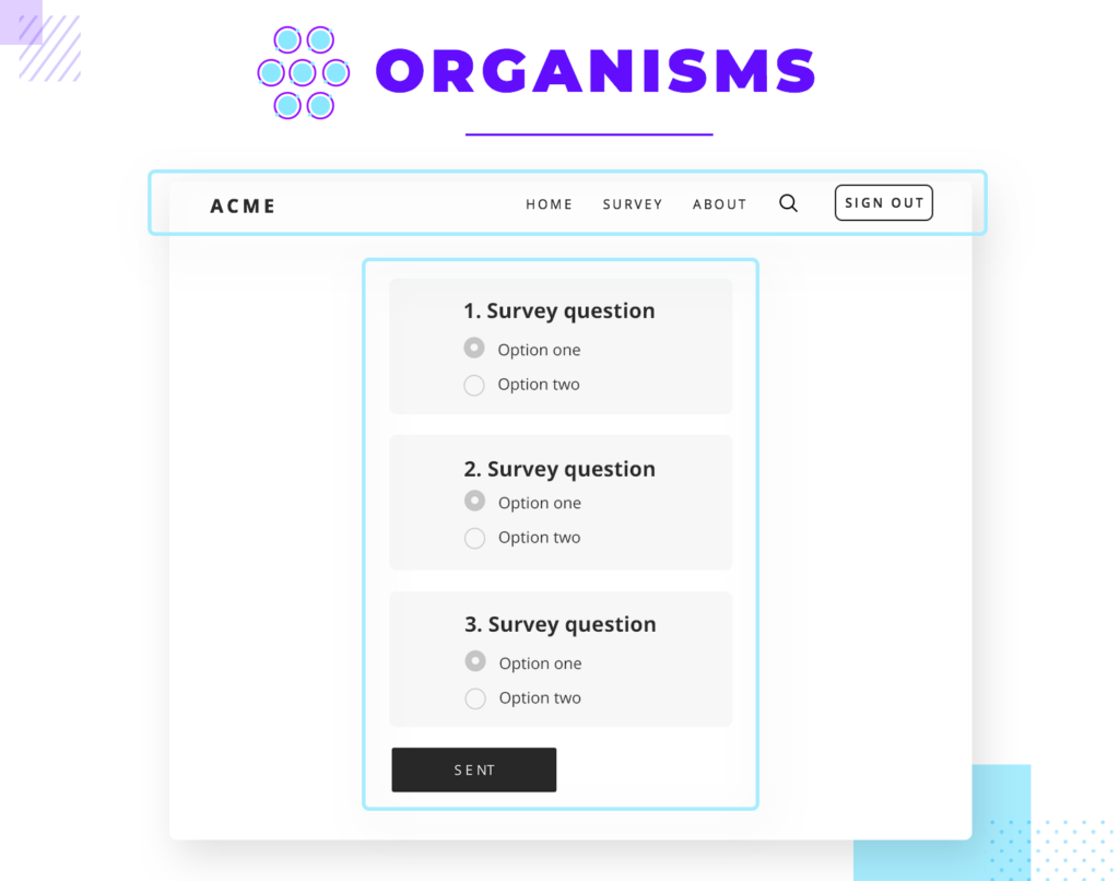
The organisms at play can show the same molecule over and over again, like most card-based lists, or show many different molecules and atoms, like the signup and header examples. The bottom line is that Atomic Design means to create a way to design that is almost like a flexible puzzle, where designers can exchange organisms within the same page according to what is needed.
Since designers look at every single atom as imperative, by the time the entire screens are assembled the design team will have something that resembles a design system. A whole base of atoms that all respect the relevant style, molecules that point to a specific function and organisms that can be added to the screens of the product.
4. Templates
This is when a lot of people get lost, mainly because we lose the chemistry analogy. Truthfully, it’s smart to drop the chemistry vocabulary after a certain point so the designers can communicate with stakeholders that aren’t in the design team. When putting things together and showing them to key users or clients, calling them by design-industry terms might make for a more straightforward conversation.
So far, the design team paid a lot of attention to the fine details of each organism and its molecules and atoms. Things like functionality and practicality have been major players in the game, offering a whole series of options for assembling the screens of the product. This is when we start creating what the Atomic Design approach calls templates.
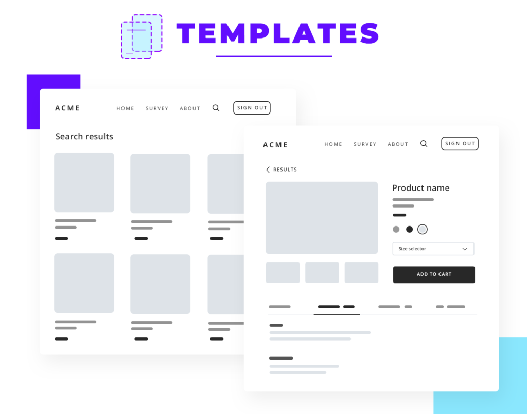
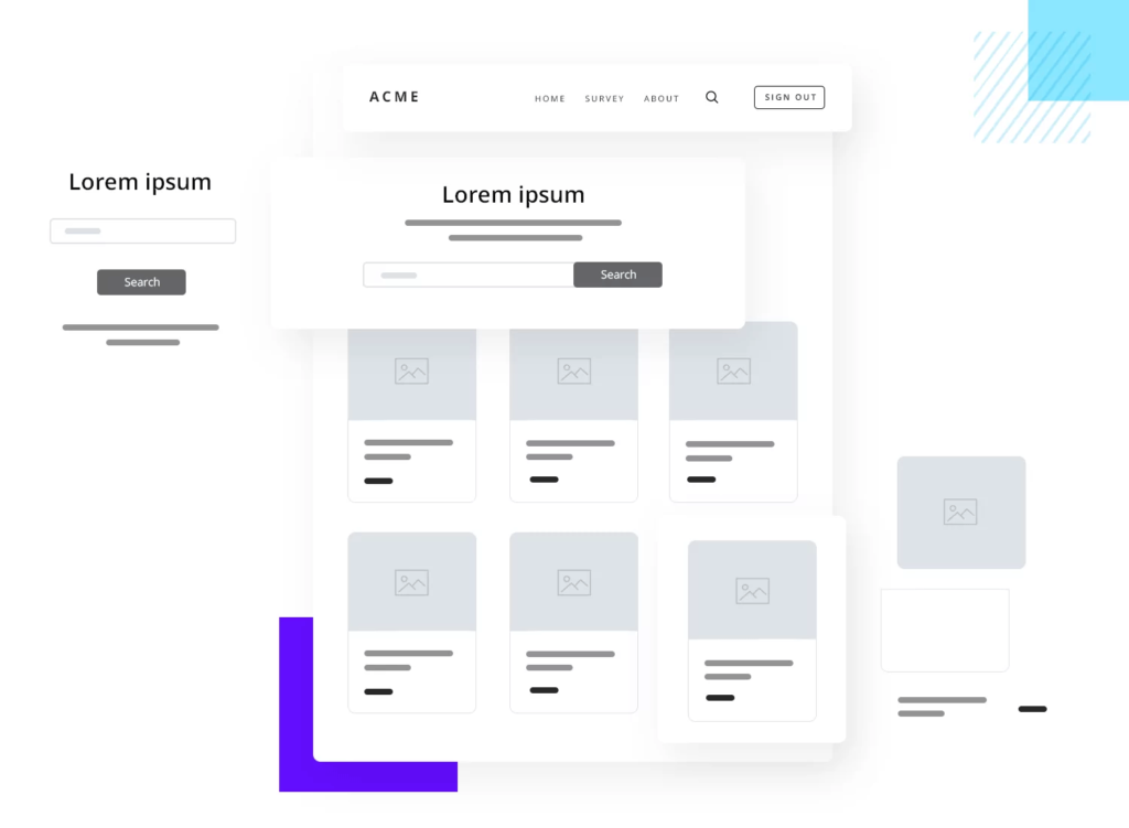
Now, the focus shifts from mere functionality to context. Equipped with the established patterns and organisms, designers have to put it all together to create the general content structure of the pages that will form the entire product.
Taking a look at the different types of content needed, the team can use the organisms to structure the entire product. This is done based on how the different organisms and the content relate to each other, resulting in the skeleton of the product – like a low-fidelity wireframe. At this point, the concepts of information architecture and visual hierarchy become very important.
At this stage, design teams will have templates that show the general patterns of the relevant pages. Product pages, search results pages, home pages and so on will all have their respective templates that show the content structure and general look for later use. This can be very practical for products that are constantly expanding, with the templates helping the team create new pages quickly and maintain consistency throughout.
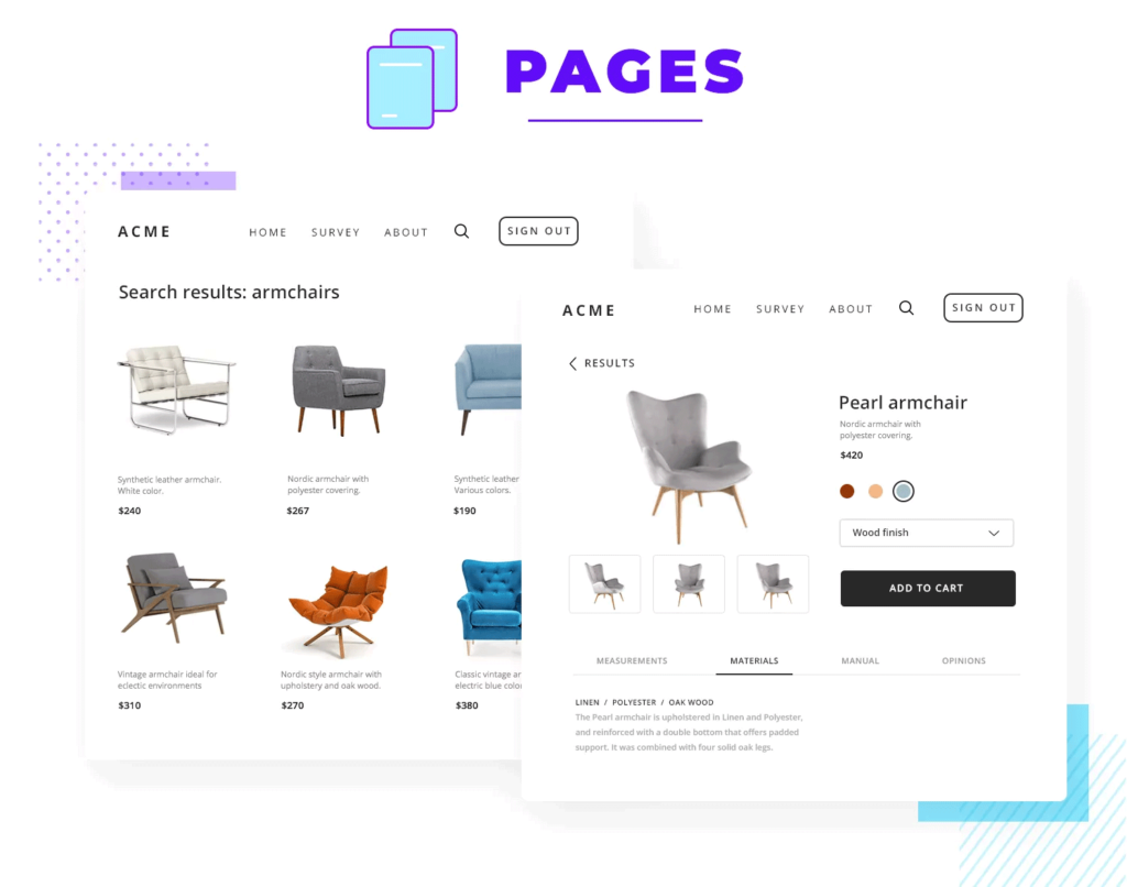
5. Pages
This is when we take the templates the design team established, and build on them. If before we had wireframes that showcased the skeletal structure, now is the time to add all the final details. Slowly, the templates are left behind to form the actual pages that final users will interact with. The fidelity grows until a realistic high fidelity prototype is left on the page, using a professional prototyping tool to get the design to a more sophisticated place.
At this point, there are several important factors that come into play. First, all the placeholder content must give way to real content – real images, real text. Once it’s all in place, the design team must carry out user testing to see if the organisms and their respective molecules worked as well as hoped. Do stakeholders approve? Do users? Does the team, seeing it evolve to its final form, approve of the user experience the page offers?
The answer isn’t always a resounding yes. And that is ok. Sometimes, stakeholders will have a change of heart once they see it in all its glory with all the details. Other times, the page design simply doesn’t offer good performance in user testing. While this can feel like a failure, it’s often an opportunity – to go back and improve.
Once again, the design team can benefit from the flexibility of Atomic Design. Looking at the finished page, what falls short of expectations? More often than not, the team will focus on a molecule or organism on the page that doesn’t have the desired effect. It represents a specific point in the past that can be revisited and then implemented on the page.
Making this improvement now means that each page created from that template in the future will offer a better user experience. Each iteration in the templates is a solid step forward.
The powerful benefits of Atomic Design
Flexibility and adaptability
Atomic Design is all about structuring the way things are done in the design process, but it doesn’t restrict the freedom to respond to changes in circumstances. By taking the time to create sound groups of components and patterns for each type of content in the product, we have a flexible system that can be used for just about anything.
The templates offer a great way to make sure that with each new screen, a certain coherence is kept. These templates can be implemented quickly as they are, or they can be adjusted if need be.
Either way, they can be a powerful point of reference for how the content is to be structured on any given screen. This is important because it points to the complex relationship between design and content. If done separately, many teams find that combining the pre-established design with the content can be difficult, with many last-minute adjustments being needed. Depending on how last-minute these changes are, they can be really costly and painful to implement.
Atomic Design takes content into the equation by carefully creating organisms that not only respect the content they will hold, but truly showcase it in the best way possible. This way, designers can let go of the assumption that design or content comes first – here, they walk hand in hand as the project moves forward.
A style-guide, systematic patterns
When having a design project that is done in the Atomic Design way, most teams find themselves with a design system that they created, sometimes, without even knowing it. Because of the importance that Atomic Design places in each small individual component, a style-guide is assembled as each atom is carefully chosen.
As we are designing for scale isn’t easy. It takes planning and a well-kept design system that allows a product to grow without losing its soul. Having a list of components that respect the general style of the product is only part of the battle. It takes entire patterns and templates, the ability to implement new things that follow the lines of previous work.
That’s why many teams swear by Atomic Design. It encourages designers to invest time and effort into creating this entire system so that in the final stages of the product design, things can be done with agility in a practical way. Trust us, the first painful stages are worth it in the end.
Fewer components, more efficient development
Most design teams find that at the end of the project they have fewer components than they would without the Atomic Design approach. This is because Atomic Design is very calculated and controlled when it comes to the building blocks of the design. Working in a similar way to a classic design system, Atomic Design keeps teams from having many versions of the same components or duplicates that offer slightly different styles.
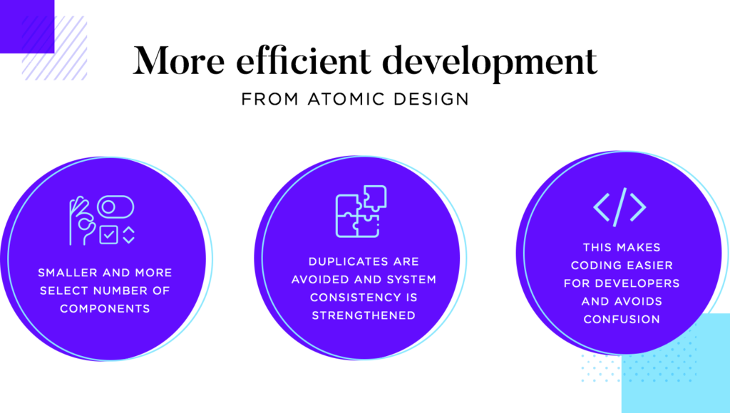
One of the consequences of this great control over the UI components is that coding is made much easier on the developer team. With the design system that grows from the atomic way of doing things, there’s no guessing, no confusion. Instead, there’s a single source of truth that holds all the components in use along with their respective codes. This can be a great tool for designers and developers alike.
Inventify UI Kit & Design System
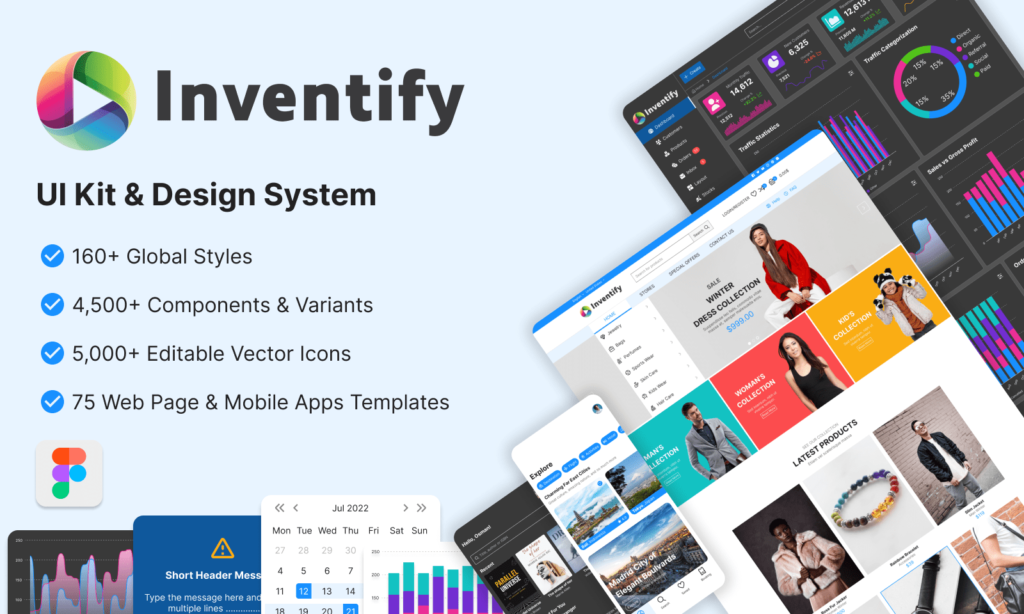
As an example of atomic design system, I created Inventify UI Kit & Design system which is the most comprehensive design system for Figma. With big library of styles, components, variants, icons and web pages and mobile apps template. You can create any kind of web or mobile UI design and save tons of hours designing the basic elements.
The wrap up
There’s no doubt that Atomic Design can be a brand new approach to UX design. By encouraging a whole new way to look at components and their groups, designers can create an entire system that works in the long haul.
Hopefully, with this post, you’ll be feeling inspired to give Atomic Design a try!
Resources: