While you try hard to reach the color palette for your brand and pur your style, personality and field into it, it will end up not unique to you or your brand.
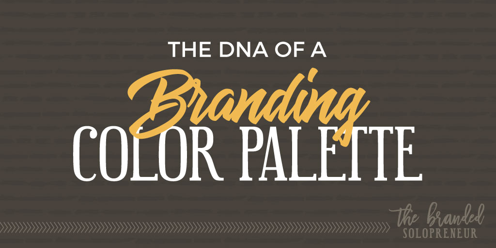
Don’t worry through, because in this post we are going to talk about the DNA of color palette. So you will understand how to reach a stunning brand color palette.
In the first part in this series, I showed you the 5 types of branding color palettes and how exactly each of them works.
In this second part of this color series, I’m going to talk about the DNA of an agency quality brand color palette, so you understand exactly what versatility you need in yours.
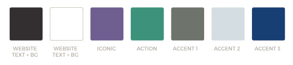
A branding color palette is divided into 4 main sections, each one of them fulfilling a unique purpose. So let’s start by the order that helps you define them.
We are going to give you some examples from real life brands through each section to have clear understanding of how real world brand palette generate.
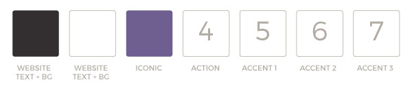
1. Website Backgrounds and Text Colors

Let’s get the smallest visionary section out of the way first, because I do know that you are waiting for some creative talk and this category is not where we going to talk a lot about that.
The first two colors you need to come with for your brand color palette are the background and text of your website. These colors should be very far away in the intensity of color. for example black and white.
Readability is a must for the importance of your website and documents. That’s why you should keep it basic for these two colors.
Your options for the dark color are:
- Black
- Dark Grey
- Navy Blue
- Dark Brown
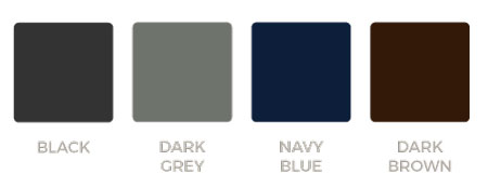
Choose whatever option that blends best with your color palette and the overall style of your brand identity.
Your options for the light color are:
- White
Yep, that’s it, JUST white.
Unless you still stick back to the early 2000’s when colored website backgrounds were the trend, I highly recommend you stick to white.
The white isn’t going to be less creative option, it’s just simply preparing your palette for maximum usability.
2. Iconic Brand Color
The next color you need in your palette is that iconic brand color. That color which will be associated with your brand. Consider it as the color when people see it, they will remember your brand. that’s what called brand recognition.
This will be the dominate color used all over across all your visuals including logo, images and website. So this color has to be very much related to the nature of your brand.
If you choose to go with a triad brand color palette which we talked about in the first part in this series. Then this color will still be the main color of your brand and the other 2 colors in the palette will be built around it.
Regardless of what color palette you chose, make sure to stick with a specific relation color scheme using the color wheel. This simple relationship will guarantee that you won’t mess with the perfection of your color palette.
3. Action Color
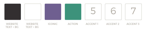
Next you will need to select your action color. Which you will use it for any action element such as link, button and call to actions.
Keep in mind that this color should be popping without enforce it to. Remember you need people to pay attention to take an action.
So your viewers and readers’ eyes will naturally be drawn to that color. Just like a mosquito to a light. Which will guarantee the first step to take that action.

Make sure that the action color will pair effectively with your iconic color. Because these two colors will be used mainly in all your brand visuals, website, banner, ads and letters.
4. Accent Colors
Now the last part you have to choose in your color palette is the accent colors. This could be anything between 1:3 colors. these colors is what will disturb the pairing of your dominate and action color. You will use it to highlight something special in your visual.
There are endless methods to use your accent colors, but here are just two of them…
ASSIGN THEM TO SPECIFIC TYPES OF CONTENT
Assign each of your accent color to a specific event. So you can use one color for articles, another for YouTube channel and another for products. So people can relate to what you offer through your branding color palette.

Remember to stay pop while your users scroll over tons of social media posts. So your product fans will just stop when they see any red color which is related to your products. Or stop when they see an orange color which related to YouTube new video. Then you will get more reach and higher clicks.
USE THEM IN YOUR FEATURED IMAGES
Accent colors are useful for creating a unique style for your featured images as well.
You can create a tricolor gradient overlay, a solid backgrounds in your images.

The latter option will save you a lot of time looking for stock photos or patterns to use as the background of your images.

However you should make sure that your accent colors still matching with the harmony of your color palette. Which we discussed earlier in the first part in this. For example if you chose a monochromatic color palette, then your accent colors will be shades of your chosen color.
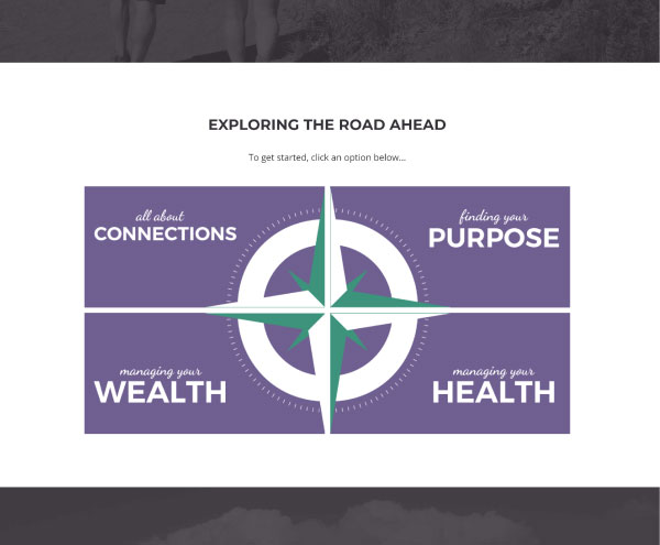
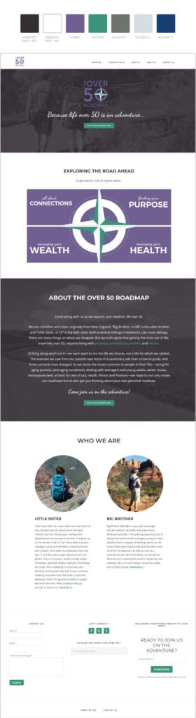
THE OVER 50 ROADMAP
FINAL BRAND COLOR PALETTE + WEBSITE HOMEPAGE
Wrap Up
Now you are ready to get any brand color palette which consist of 5:7 colors. And to ensure that your color palette is following the right methodology.
You will also be sure when, where and how exactly you will use each and every color of your color palette.
Now go and make your color palette and share it with us in the comments below to get a feedback from other designers. Also to give more inspiration to others.
In the 3rd and last part in this series I’m going to show you 3 ways to create your fail proof color palette. So you will be ready to face the world of color with the whole knowledge you need.
Resources: www.thebrandedsolopreneur.com