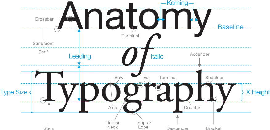
The world of typography has its very own language, full of serifs, strokes, and swashes.
Do you ever heard some terms related to typography and felt lost? I bet all of us felt the same at the beginning. So we built below visual glossary to guide you through this language. Understanding this definitions will help you whether you’re an artist or typography enthusiast to pick the right font for your design or your article.
Today we will go through some definitions and some basics of the typography including the anatomy of letters and the spacing of type and positioning.
Also make sure to check the different types of typography is this post. Typography: The Different Types of Fonts, When to Use Them, and How!
Typefaces vs. Fonts: Difference?
A lot of people use the terms “typeface” and “font” to refer to the same topic which is totally wrong. Both of this terms are completely different but they are some how linked to each other.
A typeface is the characters and symbols that appears as letters and numbers on our screen or paper which build the words and sentences we want to write. However a font is the complete character set with a particular size and style. Fonts can be called at the computer files that contains the letters, numbers and symbols in certain size and style.
The Foundation: Positioning & Spacing
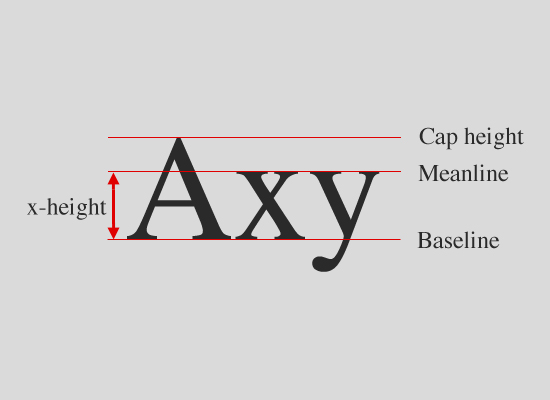
Baseline: The imaginary line on which most of the letters and characters sit on.
Cap Line: The imaginary line that defines the upper boundary of capital letters and a few lowercase letters’ ascenders. So it is the highest point that any letter, number of character can reach at the same size from the same font family.
X-height
The x-height is the measurement of all lowercase letters height of the same size of the same typeface. It’s called x-height because the letter x is what determine this height or measurement of each typeface.
Cap Height
The cap height is a measurement of all capital letters height of the same size in the same typeface. We can get the accurate measure of the cap height in flat bottomed characters such as the letter E.
The Anatomy of Letters
Leg
The part of a letter that extends downwards. It will be attached to the letter at one end and free at the other end.
Arm
The part of the letter than extends upwards and it might be curved or straight. It’s attached at one end and free at the other end as well.
Ear
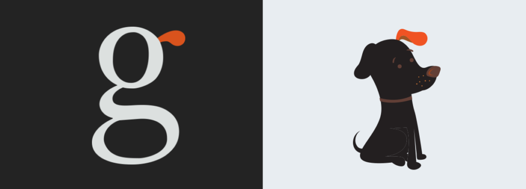
The tiny stroke that extends outwards from a lowercase letter “g” in some typefaces.
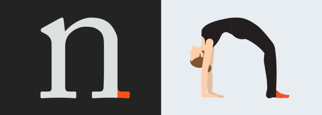
Shoulder
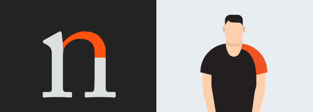
The curved stroke which directed downwards at the right of the lowercase letters m, n & h.
Spine
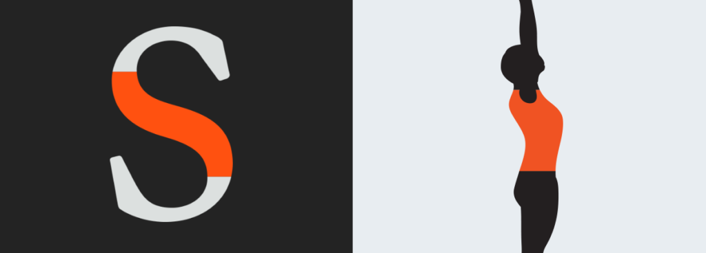
The main curved stroke in the middle of the letter S.
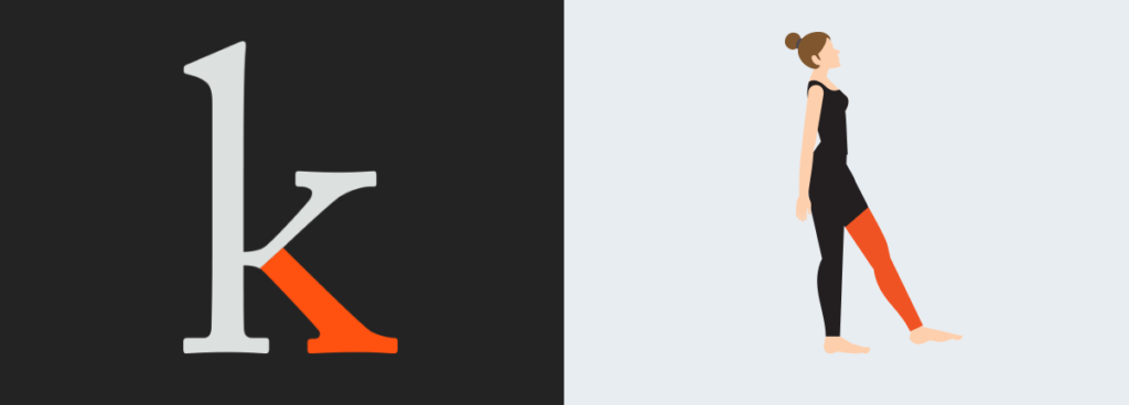
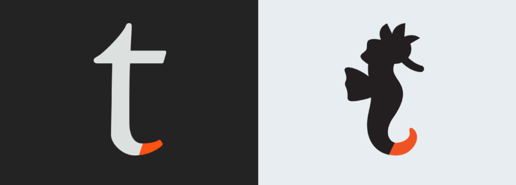
Tail
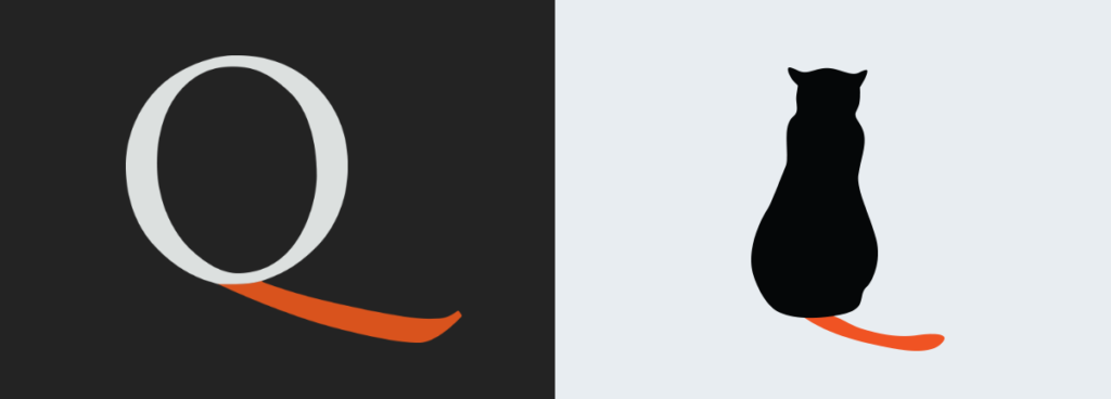
The decorative curved part of the upper case of letters Q, R & K. It also known as descenders. It can be also called on the tails in the lower case of letters g, j, p, q, & y.
Ascenders
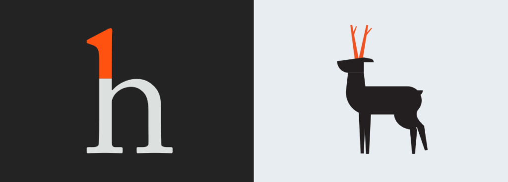
It’s called on the vertical stroke that extends upwards over the x-height.
Descenders
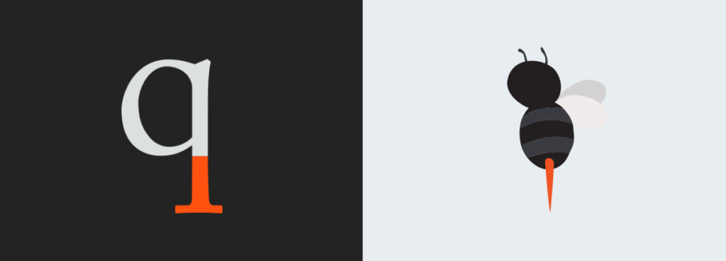
it’s called on the vertical stroke that extends downwards below the x-height.
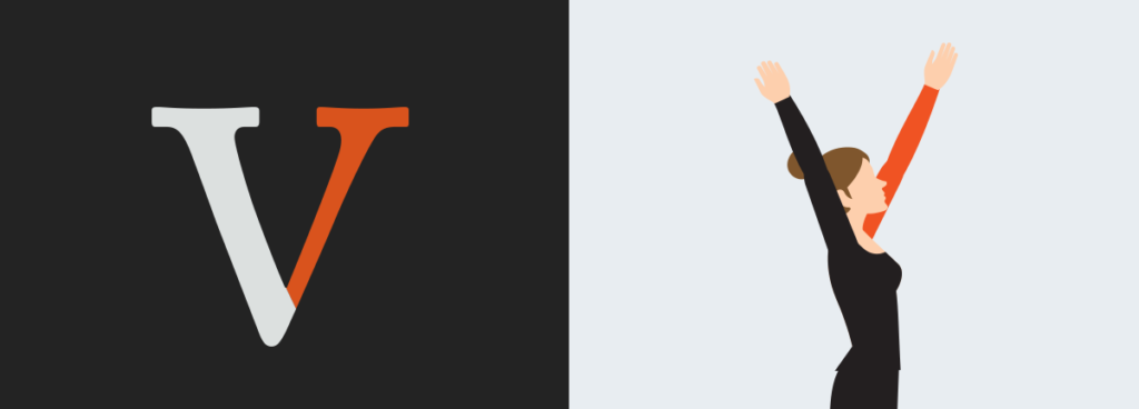
Stem

It’s the main vertical stroke on the upright of any character. Some letters has no vertical strokes such as the upper case of A and V, so the first diagonal stoke can be considered as the stem.
Stroke
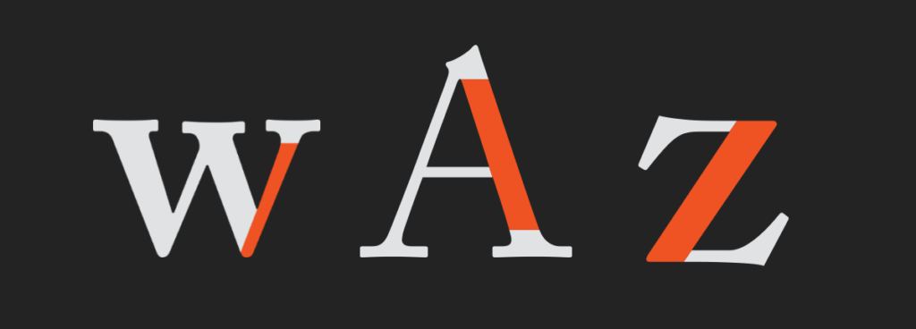
it is that main vertical diagonal line in a letter.
Bar
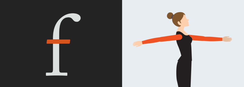
the horizontal stroke in some letters such as A, H, e and f.
Serif
It’s the small flourish at the end of strokes in each letter. It’s also the main difference between the serifs and sans serifs typefaces. It also come in different shapes such as hairline, square or slab. It can can be rounded or perpendicular.
Terminal
it’s the end of the stroke of the letter which doesn’t have a serif.
Bowl
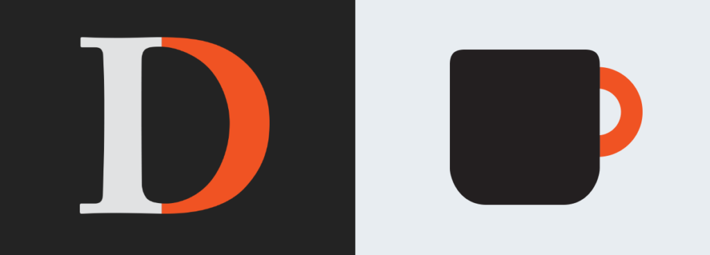
The main curve that create the enclosed space of letters D, B, O, d & b.
Counter
it is the enclosed space which created by the bowls in letters like o, b, d, and a.
Link
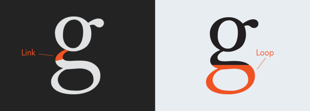
It is the stroke connecting the bowl and loop in lowercase letter g.
Swash
it’s a fancy decorative to the serif or the terminal in any upper case letter. It can be used at the beginning of a sentence and It can also be used at the end of the letters. You can fine a lot of swashes of all kinds at calligraphy and it can be at the beginning or at the end or even at the middle.
Spur
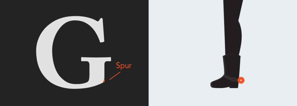
A spur is a tiny projection that hardly pop off the main stroke on many uppercase letter G’s
Resources:
http://www.canva.com
http:// visme.co