This might feel like a math lesson but hang in there. The golden ratio is a combination between math and nature with a lot of practical application for designers. In this post we will understand what the golden ration means and we will introduce some tips for using it in your designs.
The golden ratio has a lot of application through the history to create design elements that have an ideal visual appeal. Because the shape had been came from nature and mathematics, it’s the perfect combination of balance and harmony. And it’s an amazing tool to enhance your work you as a designer.
What Is the Golden Ratio?
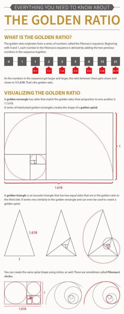
Simply, the golden ratio is a shape with a proportion of 1 to 1.618.
More more information, the math had be described as explained by the Interaction Design Foundation:
Each number in the Fibonacci sequence is simply the sum of the two numbers before it. It begins with 1, 1 (i.e., 1 + the unseen 0 = 1), and the first 10 members of the sequence are 1, 1, 2, 3, 5, 8, 13, 21, 34, 55. It continues infinitely.
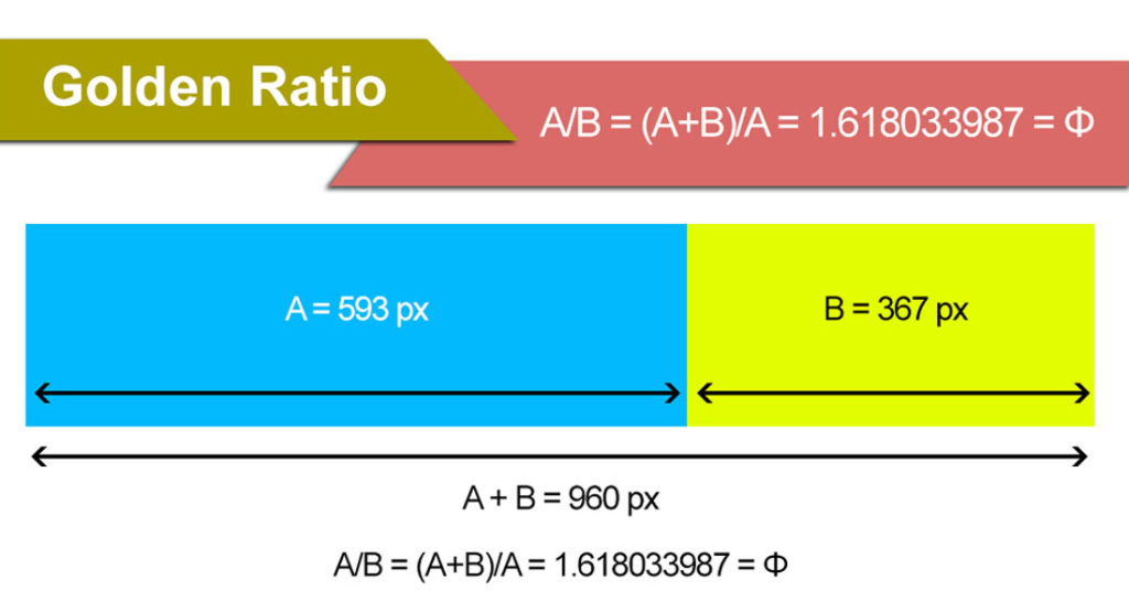
Mathematically calculate the ratio using the formula for Phi: A/B = (A+B)/A = 1.618033987 = Φ
The applications for print and web design projects are often less precise than that 1 to 1.618. Many designers will round numbers when creating a mathematic golden ratio for grids that are easier to work with.
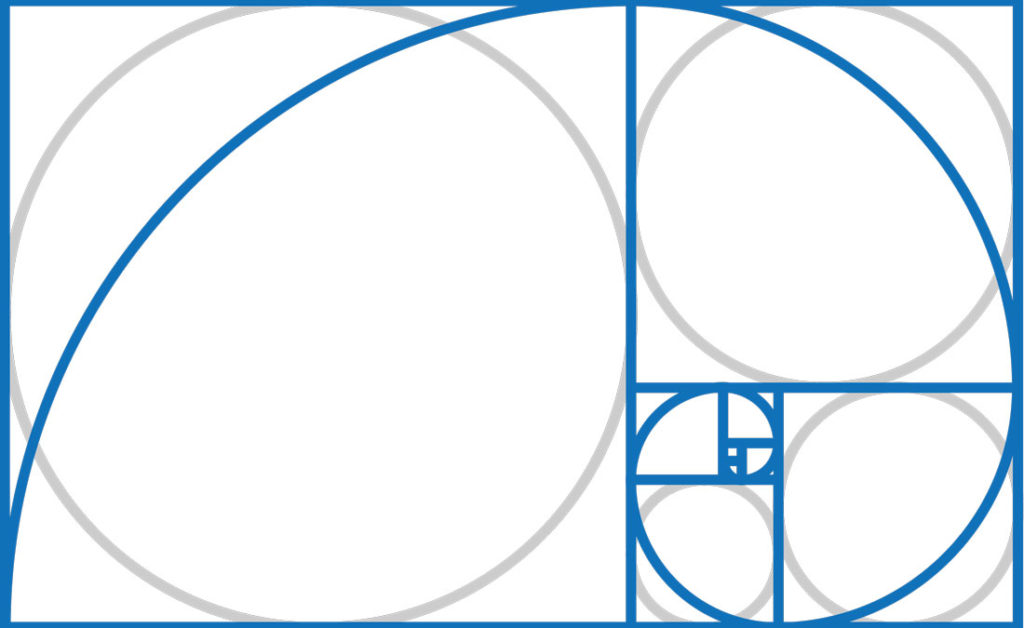
When it comes to applying the concept, it’s often represented using a spiral, circles or triangles.
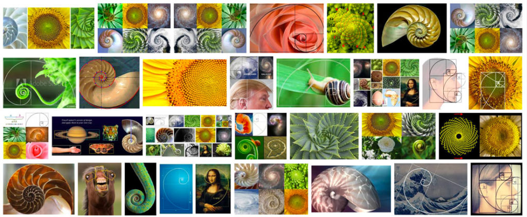
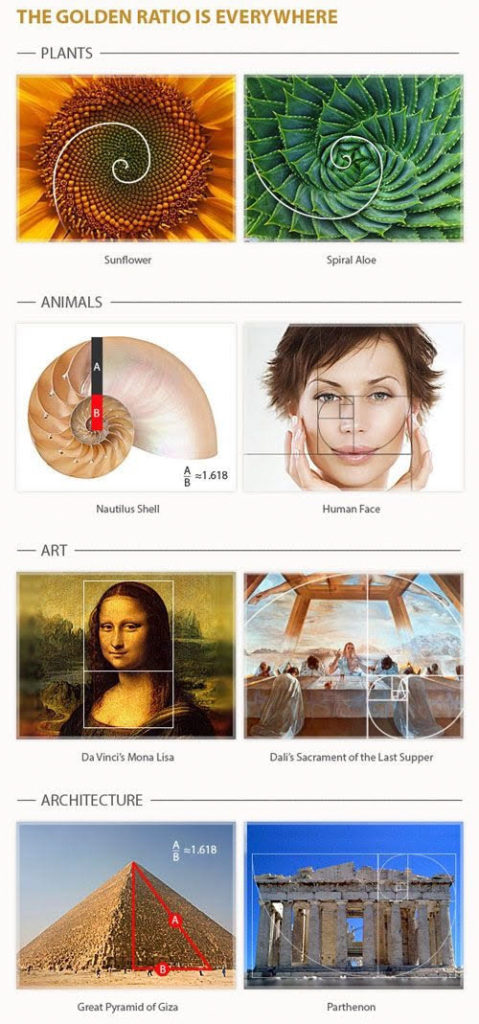
And it’s not “just a design thing.” The golden ratio is found in nature (nautilus shell), art (the Mona Lisa), architecture (the Eiffel Tower) as well as design.
How Do You Use It?
When it comes to applying the golden ratio there are different schools of thought:
- Set up the design using a grid based on the ratio to create harmony
- Do nothing because it applies whether you do it intentionally or not
The best solution might be somewhere in the middle. In all likelihood, your eye is probably trained to create and lean toward designs that include this theory, but it can never hurt to see if you are actually applying it well.
And the canvas can cause all kinds of issues when it comes to the golden ratio. You don’t know what browser size someone might use or the ratio might not fall in line with a specific print size.
The goal is to make parts within your design that fit this perfect shape. Consider it for a logo or photo. Use it to make a header or a particular piece of a design. Use the concepts to make a base grid or hierarchical scale for typography.
Grids and Templates
If you are anything like me, the idea of complex math to solve a design problem is a little intimidating. There’s where having some great tools can help.
Here are some templates and calculators to make using the golden ratio a little easier.
- Phiculator: Enter any number and get the corresponding golden ratio value
- Golden Ratio Typography Calculator: Create a scale based on a base font and size
- Golden Ratio Template: Free downloadable vector template
- Golden Ration Wireframing Template: With layers for a curve, circles or square
- Golden Ratio Calculator: Calculate the ratio with any set of numbers
- Golden Rectangle Calculator: Get dimensions for outer and interior golden rectangles for any number (this is the basis for many web grids using the ratio)
3 Tips for Using the Golden Ratio
So how do you put all of this information into practical use? (We don’t want you to overthink design projects and get overwhelmed by math.)
Here are three tips for using the golden ratio in design projects.
- Use the ratio to create a base website grid for the main content area and sidebar. According to W3Schools, the most common browser resolution at the start of 2018 is 1366 by 768 pixels. Apply the golden ratio for a content area of 846 pixels wide with a sidebar that 520 pixels wide. When considering the ratio for this purpose the height isn’t important.
- Use the ratio to create a guide for spacing in the design. Prototypr.io has this advice: “Use larger squares like unit 8 and 13 to define layouts. Use smaller squares of unit 1, 2 or 3 to define gutters and content spacing” based on golden rectangles.
- Use the ratio to create lasting elements such as icons or logos: Having a lasting element with a strong harmony can create the structure for ongoing projects. The example above includes a template that you can download and try.
Why Does the Golden Ratio Matter in Design?
So why does the golden ratio really matter to designers?
It’s one more tool to help you create something that establishes the right emotional and visual tone with users. This theory exists whether you apply it intentionally or not. So what matters is that you understand and acknowledge it in an effort to create the best and most usable design possible.
What the golden ratio does is cue you into to focal areas where the user is likely to focus and look based on nature. It helps create balance and scale, even when not wholly intentional.
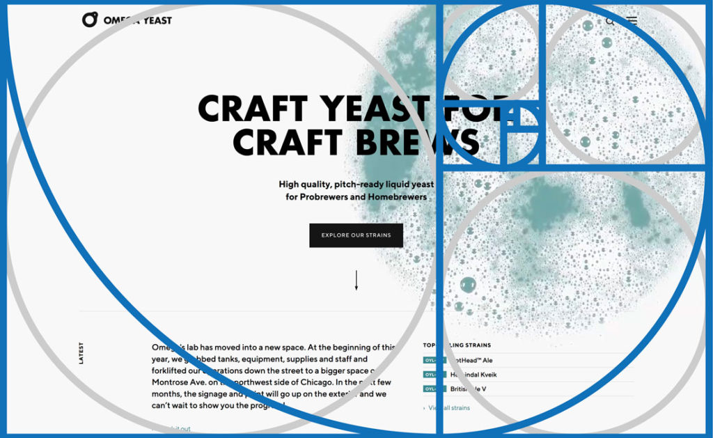
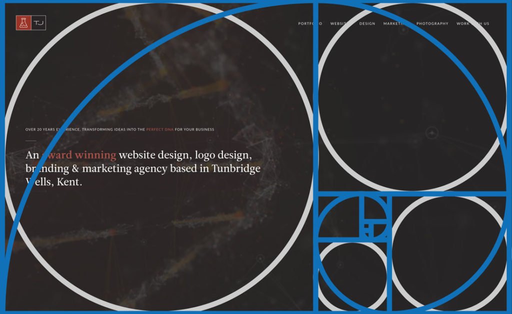
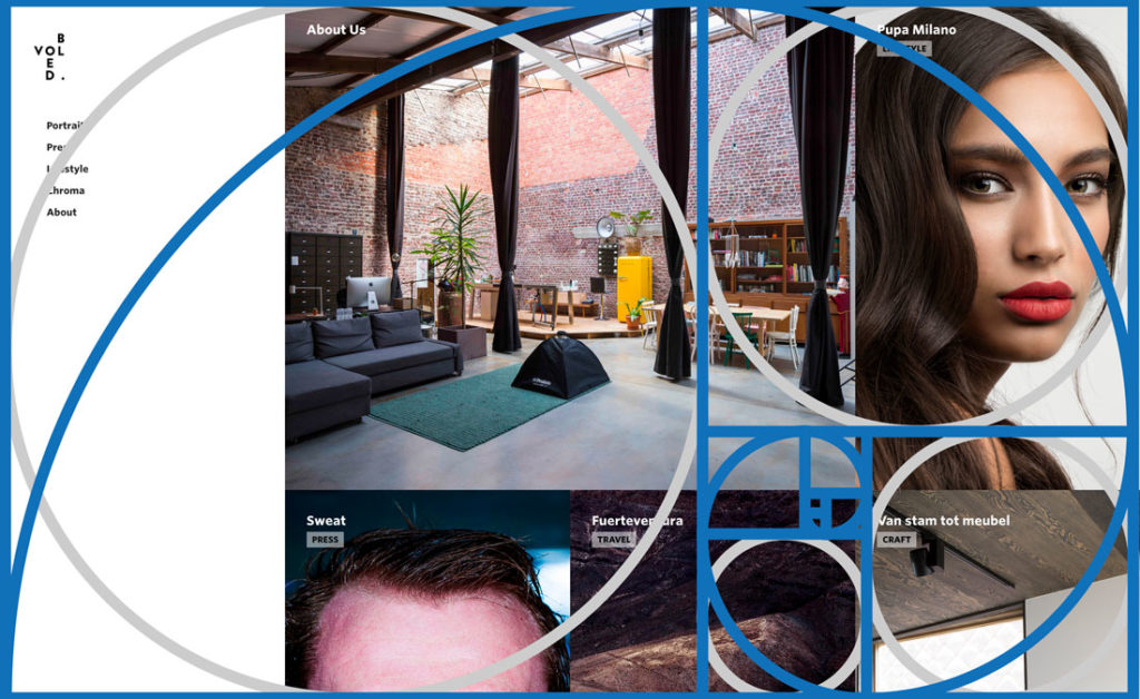
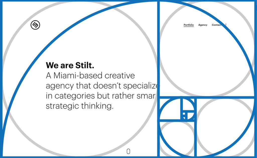
Here are a few well-designed websites with the golden ratio template overlaid on them to see exactly how it relates to the individual designs.

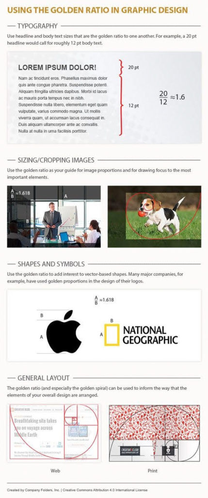
Infographic
Conclusion
So here’s your key to understanding and using the golden ratio: It’s there whether you think about it or not. So why not consider how this time-tested design theory can work for you and make projects better?
Download the template we used here and pop it on some of your designs to see how close you’ve come without even thinking about it. Golden ratio overlay designed by Eightonesix
Resources:
designshack.net