Today I brought you a very quick and useful UI/UX design tips from Steve Sc a very popular designer based in Kitchener, Ontario. Steve always post very useful tips on his twitter account which is worth to follow him. Also make sure to check his Twitter story Little UI Details of a twitter collection of short tips for UI/UX designers based on the before and after method. Let’s check below tips.
Also in case you’re newbie in UI/UX Design. Please check the below post to understand the definitions and the main elements of each field.
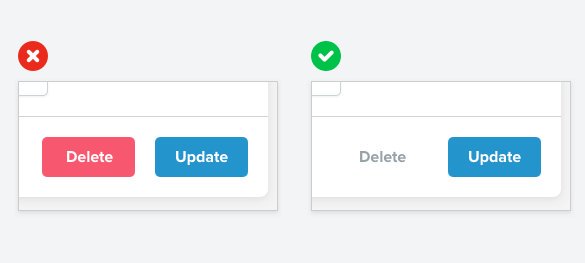
A subtle link for negative secondary actions often works better than a big bold button. (Just make sure you have a confirmation step!)
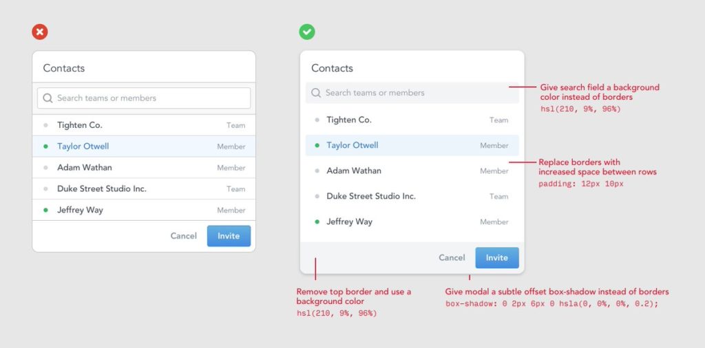
2. Less borders
Too many borders can make a design look really busy. Here’s a few ideas that are a bit more subtle.
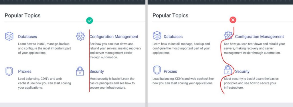
3. Aligning text
Aligning text is an easy way to clean up your design and make your content much more scannable.
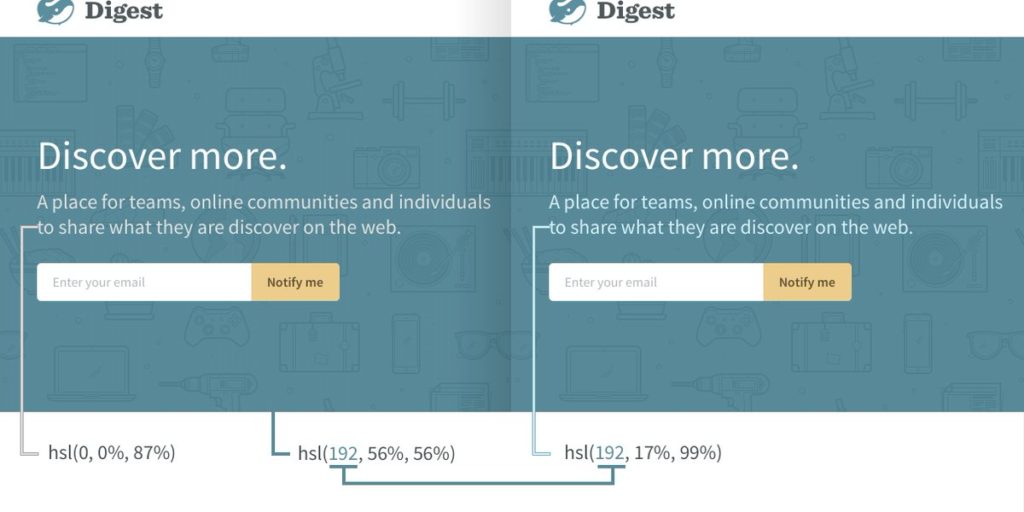
4. Saturated text
Pure grey text always looks “off” on a colored background. A quick fix is to saturate your text with a bit of the background hue.
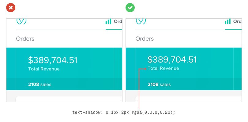
5. Subtle shadows
Adding a subtle shadow to white text when on a bright background not only makes it more legible but helps it ‘pop’ more.
6. Styling icons
Instead of blowing up small, in-app icons for your landing page, try putting a shape behind them and giving them a background color.
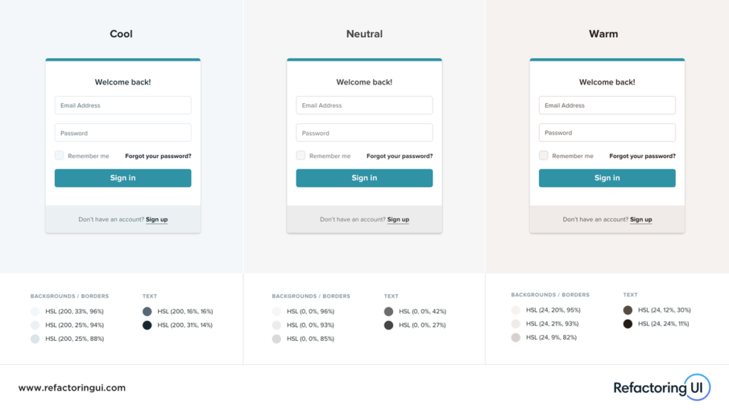
7. Saturate your greys
“Grey” doesn’t have to mean Grey™. Try saturating your greys with a bit of blue or brown for a cooler or warmer feel.
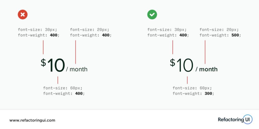
8. Uniformity in text of different sizes
If you want text of different sizes to *feel* like the same weight, make larger text thinner and smaller text bolder.
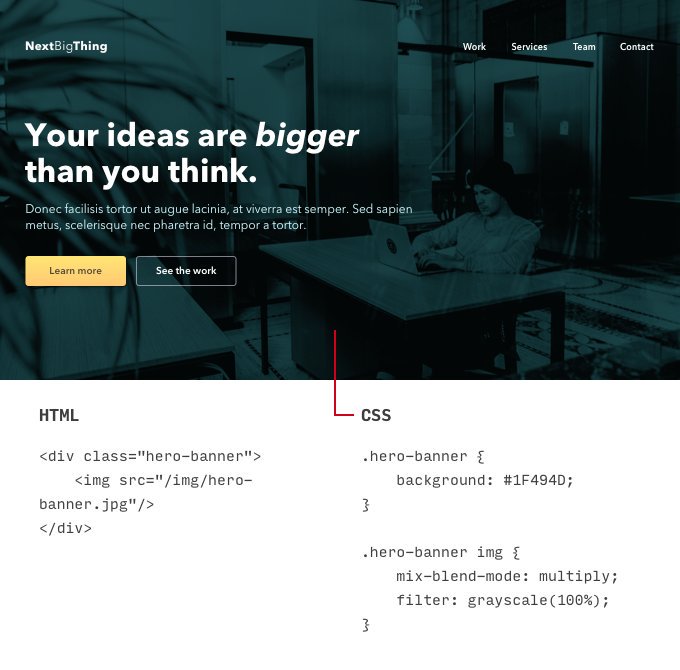
9. Hero banners
Desaturated photo + bold color + blend-mode: multiply. Great for hero banners and creating high contrast for text.
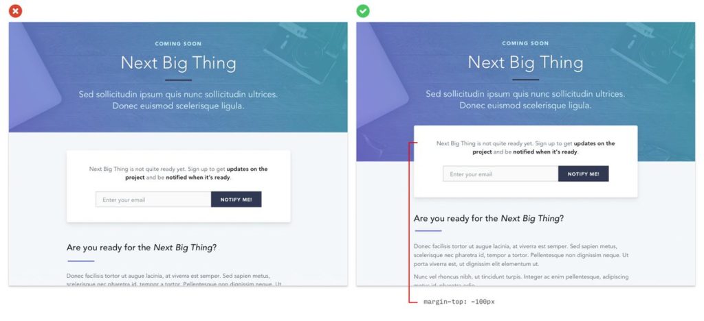
10. Overlapping elements
Overlapping elements on a page is a great way to create depth and encourage users to scroll
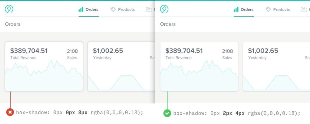
11. Box shadows
Giving your box shadows a slight, vertical offset helps to make them look more natural.
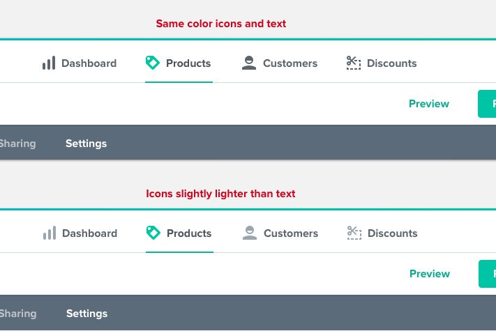
12. Light icons
If I am using icons that have more weight than the text, I typically make the icons slightly lighter than the text for inactive states.
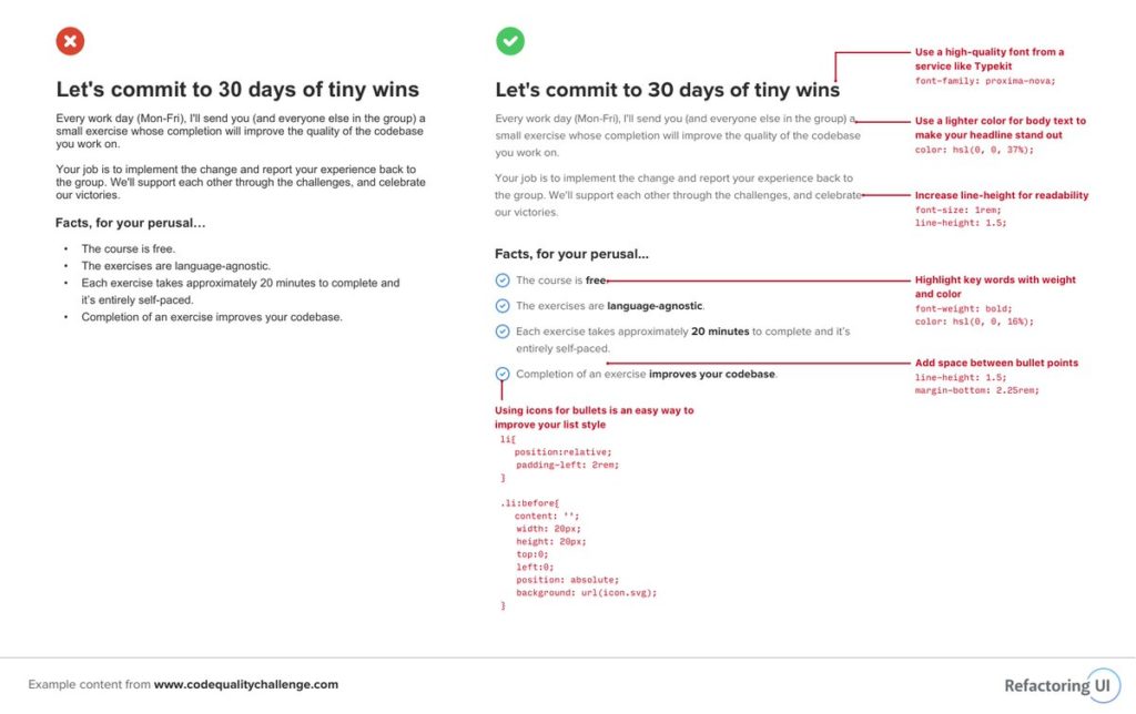
13. Checkmarks vs. Bullets
Using a generic icon like an arrow or a checkmark instead of the standard bullet is a great way to add visual interest to unordered lists.
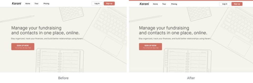
14. Color on top
Adding a hint of color (4 to 6px) to the top of your hero is a simple trick to bring more liveliness to your design.
15. Contrast vs. keyline
A technique I’ve been using lately on panels to distinguish the titles instead of a keyline is using subtle contrast.
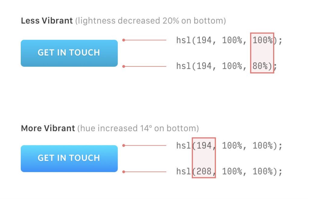
16. Vibrant gradients
Make your gradients appear more vibrant by adjusting the hue by a few degrees (10º or 20º max) in either direction.
17. 16px font, 1.5 line height
If in doubt, 16px font with 1.5 line height is pretty good safe for body copy.
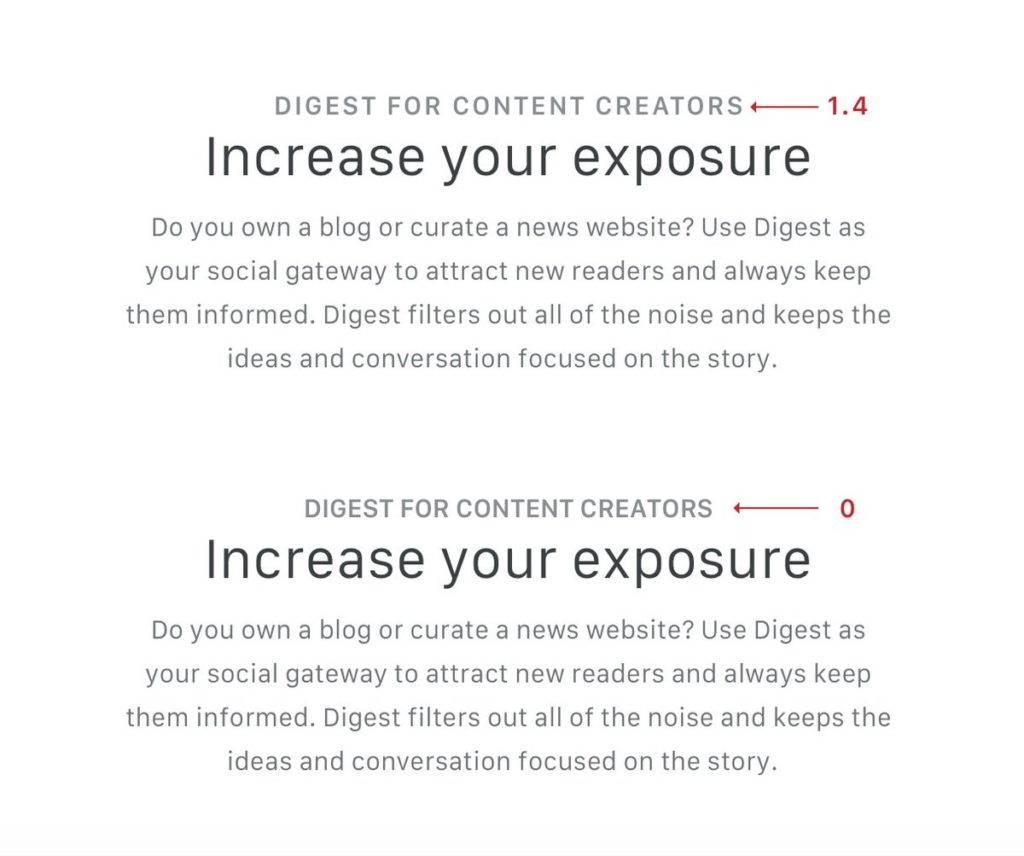
18. Letter-spacing in all-caps
All-caps can sometimes be difficult to read. Consider using letter-spacing to give your text a little more room to breathe
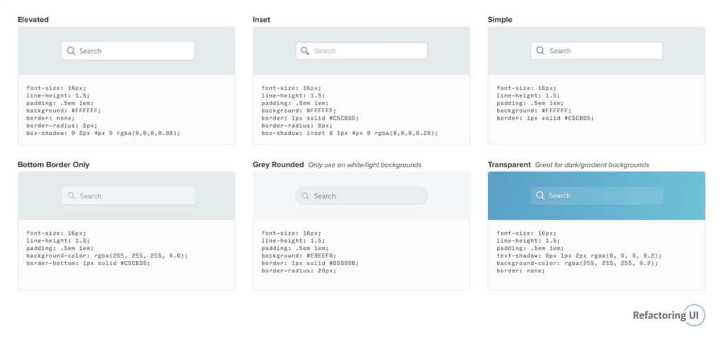
19. Input form styling
Little details go a long way when styling UI components. Here are a few different ways to style inputs
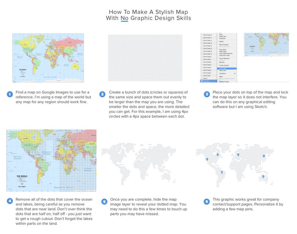
20. Make your own map
How to make a stylish map with no graphic design skills.
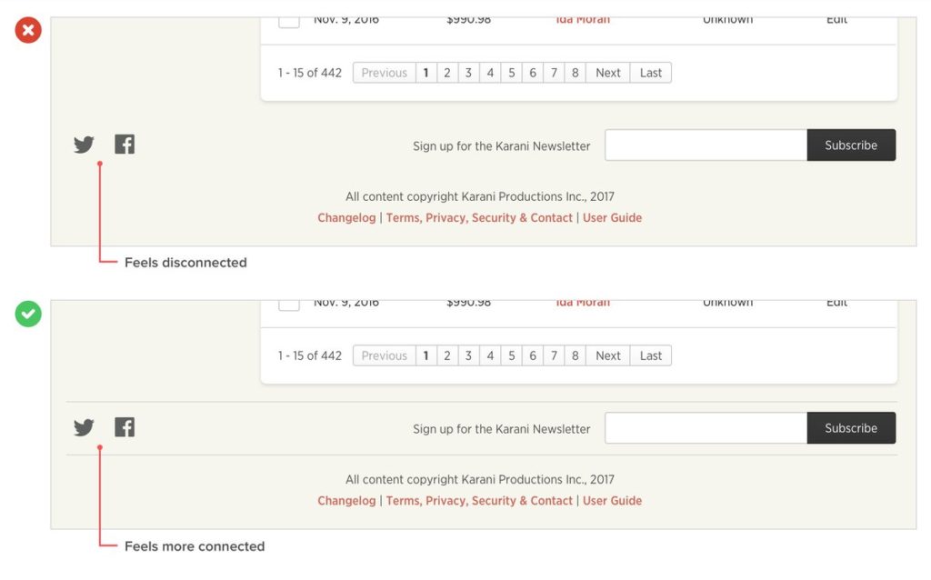
21. Keylines to connect content
Keylines are not only great for dividing content but also making disconnected content feel more connected.
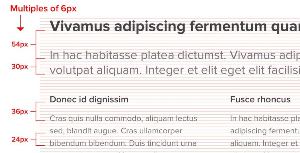
22. Multiples to define spacing
Using multiples to define your spacing is a great way to achieve vertical rhythm and provides a formula to justify your choices.
23. Two-colum form layout
This two-column form layout is great for organizing long forms and filling wider screens without using awkward long form fields.
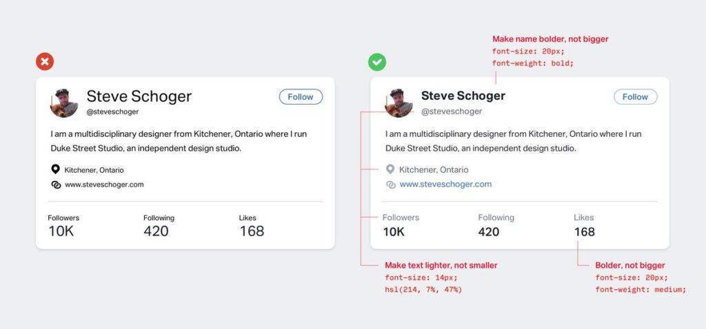
24. Use font color/weight for emphasis
Font size isn’t always the best way to emphasize or de-emphasize text, try using color and font weight instead.
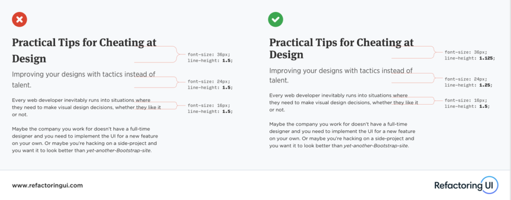
25. Adjusting line-height
Using the same line-height for all text is a very subtle but common mistake. 1.5 may work great for body copy, but as text gets larger, your line-height should get tighter.
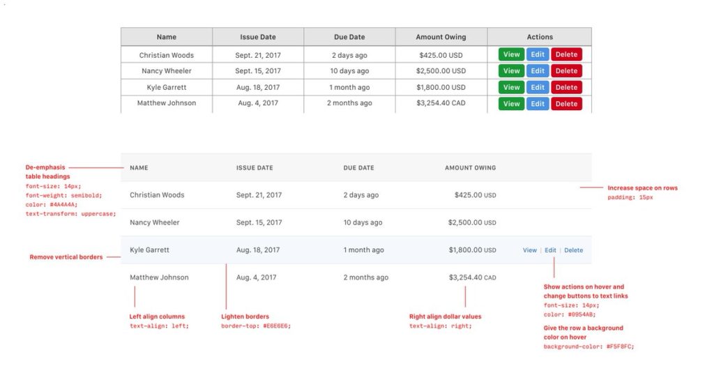
26. Designing tables
Designing nice tables can be tough, but here’s a few ideas that can make a big difference.
27. Styling content
Styling content can be difficult. Here are a few ideas that can make a big difference
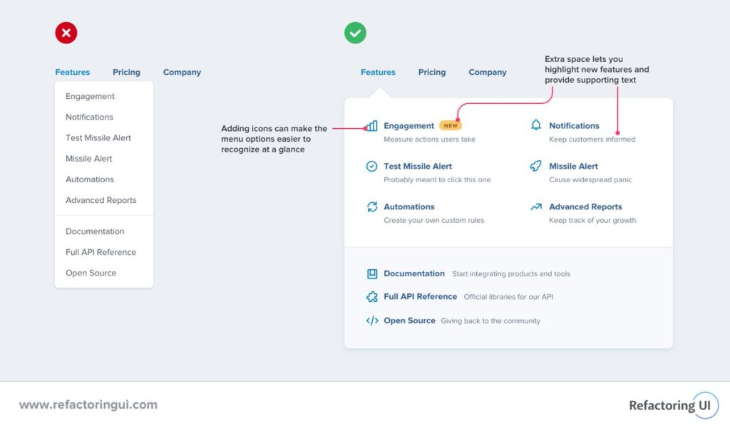
28. Dropdowns
Dropdowns can be more than just a boring list of links. They’re just boxes, you can do anything you want with them! For example, this two-column layout is great when you want to add supporting text.
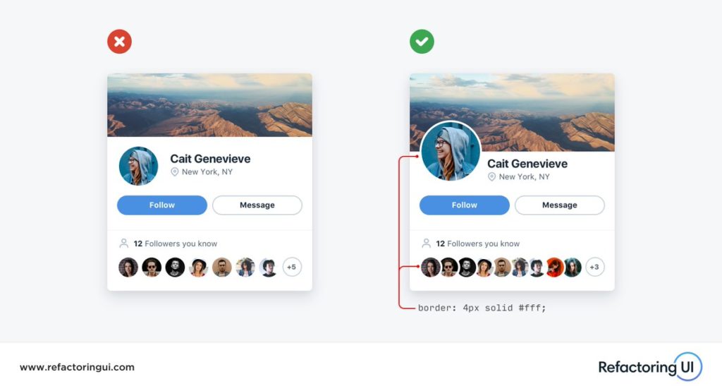
29. Overlapping images
Overlapping images is a great way to add depth to an interface and make it look more “designed”. Use a border that matches the background color to create distinction and keep things looking clean.
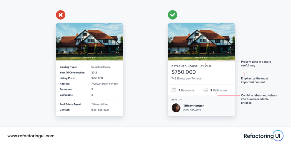
30. Think outside the database
Don’t be afraid to “think outside the database” — your UI doesn’t need to map one-to-one with your data’s fields and values. Here are a few ideas you can use to present “field: value” data in a more interesting way .