Smartphones and tablets have changed the approach toward design and user experience. Before the proliferation of mobile devices with advanced web-browsing capability , web designers had only one primary challenge to deal with – keeping the same look and feel of their websites in various desktop computer browsers.
However, interacting with websites on smartphones and tablets is not the same as doing that on a desktop computer monitors. Factors such as Click versus Touch, Screen-size, Pixel-resolution, support for Adobe’s Flash technology, optimized markup and many more have become crucial while creating websites with Responsive Design
But, why is responsive design so important for your website? Before we understand that, we must understand what is “Responsive Web Design”.
What is Responsive Web Design?
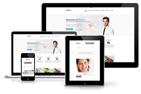
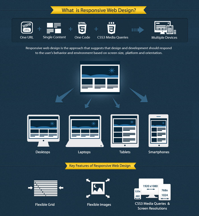
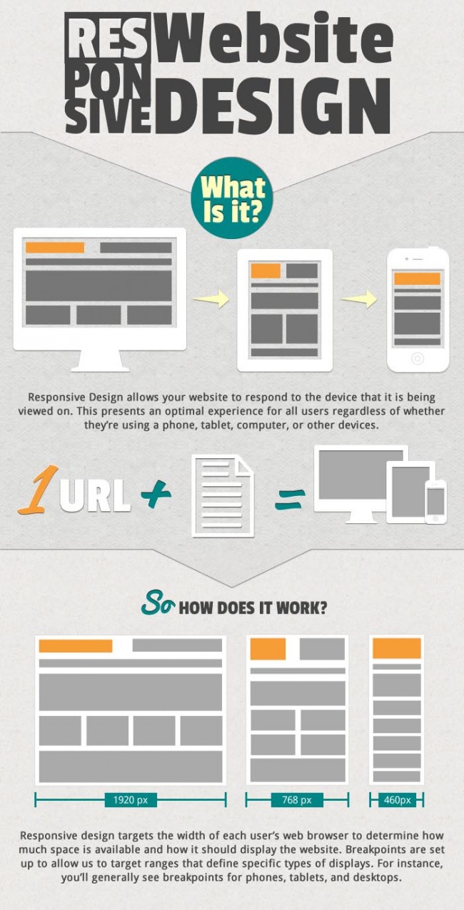
Responsive Web Design (RWD) is an approach of laying-out and coding a website such that the website provides an optimal viewing experience — ease of reading and navigation with a minimum of resizing, panning, and scrolling — across a wide range of devices (from desktop computer monitors to mobile phones).
The designer creating a Responsive Design should ensure that the website’s navigation elements, screen-layouts, text, images, audio/video players and other UI elements re-adjust themselves on a variety of devices. Thus, one need not spend extra time and money in creating and maintaining one “mobile-site version” and another “desktop-site version” of her website.
Now, having understood what is Responsive Web Design, let us understand why Responsive Design is important while creating websites.
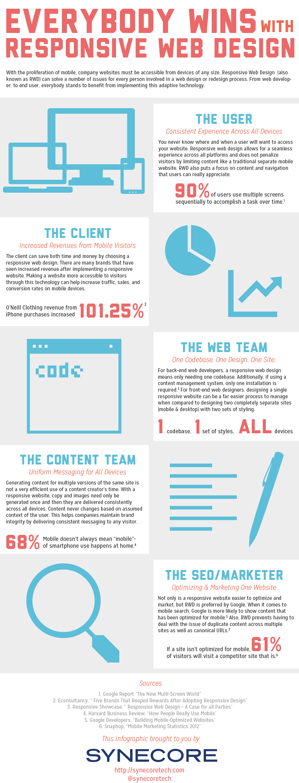
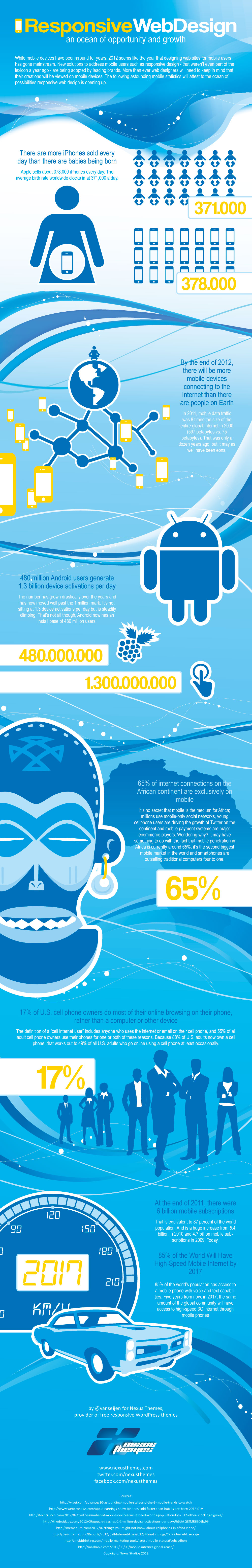
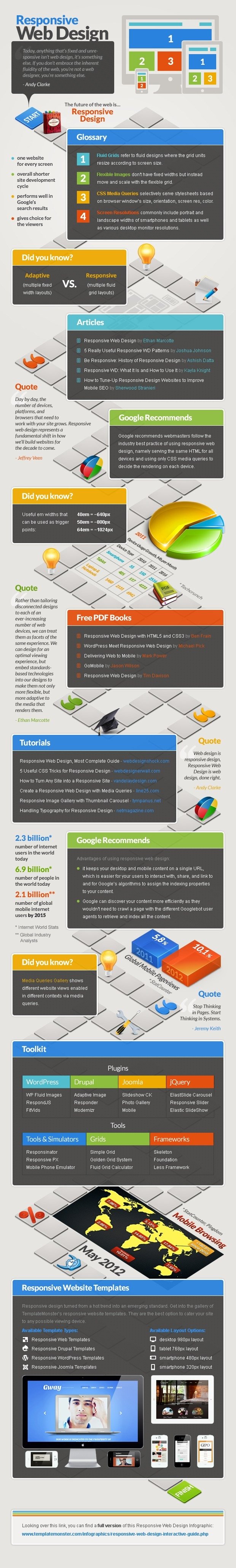
Infographics to show you the meaning of responsive web design.
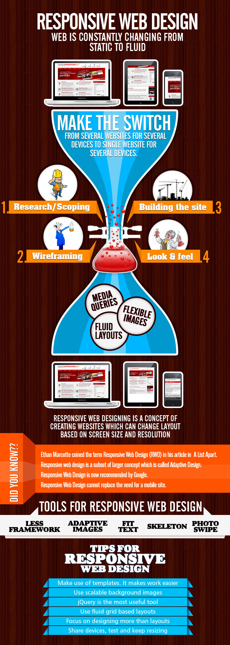
The Benefits of Responsive Web Design
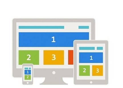
1. Responsive web design sites are fluid, meaning the content moves freely across all screen resolutions and all devices. Both the grids and the images are fluid. Just as a liquid spreads out or draws in to allow its content to fill an allotted space and retain its appearance, responsive web design’s fluidity achieves the same result with website content on a device screen.
2. People are on the go 24 hours a day, every day. Responsive web design accommodates the busy professional during the day and the wide-awake college student needing access to your site at 2:00 am. No scrolling or resizing is needed for any consumer to access your website from their favorite device.
3. The advantages of having a single site that conforms to the need of all devices are significant when compared to having two separate websites. One website costs less than two, and the savings can be substantial. Sites designed solely for mobile device traffic don’t offer the advanced navigational techniques found in traditional websites, and they also require the user to maintain two separate web addresses for your site. This is inconvenient for most people and can cause them to check out the competition’s website. Responsive web design enhances SEO efforts by having all your visitors directed to a single site no matter what they prefer to use as a device.
As the number of people using mobile devices to access the Internet grows, your consumer base can grow with it through RWD. Businesses failing to grasp the significance of mobile device use on the Internet risk a reduction of visitors to their website. If you haven’t made the switch to RWD, don’t let your competition get ahead of you. Talk to your web designer, and make the transition to responsive web design.
Infographics to show you the importance of responsive web design