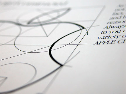
Apple. McDonalds. Twitter. Coca Cola. Nike.
What makes those symbols so special and iconic?
Is it their beauty or the colors? Maybe it’s because they explain what the company does…or maybe not?
While these things are considered during a logo design project, none of them are particularly important. Some great logos are beautiful and some (according to many) are downright ugly. Few of them suggest what the company does but others don’t really bother. If you look at the colors, there really are no rules.
So, if none of these things are responsible for making a logo great, what is?
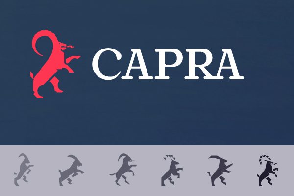
It’s distinctiveness.
That is the single, most important trait of any professional logo. If it truly stands out from the rest and makes the brand unique and memorable, while respecting some basic design principles, it qualifies as great.
Clients all over the world look for and pay for that kind of work, and logo design professionals know how to do exactly that.
How do they do it, you wonder?
Phase 1: Client discovery
A great logo is an expression of the company values, culture and people. Think of it as an employee whose main job is to be distinctive and represent the company in the best possible way. What would he look like? How would he feel like? Is he a boss or the guy next door? Is he loud and cheerful or wise and calm?
You cannot answer questions like these without making wrong assumptions.
That’s why professionals kick-off logo design projects with some good, quality conversations with the client. They aim to learn as much as possible about the company culture, values and the way they do business, and then inject that message into the logo design.
By completing this step, you’re not creating a logo that looks like a total stranger to your client and other stakeholders in the company.
So don’t stop at reading the brief – kick-off your logo design projects by asking a client some specific questions you want to know about his business. Ask about their values, their personality and their customers.
Get to know how they think, so you know what is appropriate for them.
Phase 2: Industry discovery
Once you get to know the client, you’ll need to find out more about:
- who is the logo for (the audience)
- who you’re up against (the competition)
Knowing the audience will give you some clues as to where you need to take the logo, style wise. For example, if you’re working for a teenage market, you’ll probably need something mainstream, loud and catchy. But if your teenagers are wunderkinds who dig computer programming, you may need to think harder.
That’s why you need to ask the client to tell you as much as possible about the customers they are catering to — who are they, where they live, what they buy, how they dress. The more you know about these target audience, the easier it will be for you to create a logo they can fall in love with.
The second, and perhaps more important part of this process is researching your client’s competition. You need to see who else is out there and how their logos look, so you avoid doing something similar, or worse — doing something identical. Remember, your work has to set the client apart from everybody else, so ask the client to give you a list of key competitors you need to consider.
Phase 3: Application discovery
This phase is about answering one simple question: how and where will the logo be used most of the time? Different usage of the logo is typically referred to as “logo application.”
This is really essential for the logo design process because it tells the designer what can and cannot be done from a design point of view.
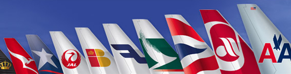
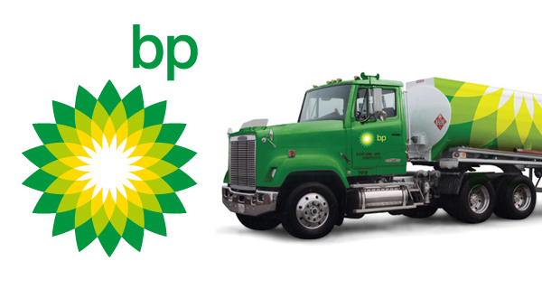
For example, airline companies demand a very specific type of logo application, where a logo has to be placed on the tail fin of the airplane. That is a very tall and narrow space to work with, so designers will have to avoid ideas that do not fit there, or develop separate graphics that will be used for that purpose.
Another example are web-based companies, who do most of their business online. In this case, designers might decide to use full RGB spectrum for the logo, because digital devices have no problems with that and it might help the logo stand out. On the other hand, this would be a very bad choice for a company who does business offline and has to print a lot of stuff.
For this reason, always think carefully about where their logo will be used most of the time, so you don’t waste time on ideas that cannot be executed in practice.
Phase 4: Sketching (a lot)
Did you know that some design schools ask the students to come up with exactly 100 ideas before they decide on the right one? The reason is simple — the only way to separate the good from the bad is to have a lot of things to pick from.
Because of this simple truth, professional identity designers usually sketch dozens of logo ideas during the brainstorming phase, then pick only a handful to present to the client.
As hard as it may sound, this really isn’t that lengthy of a process. Sketching a logo with a pen and paper takes less than a minute; with all the thinking in between, you can easily sketch 10 in under an hour.
Never get fooled by thinking your first ideas are your best.
Sketch, then sketch some more, so you can really separate the wheat from the chaff.
That’s how professionals do it.
Phase 5: Draft designs
After you’re done with the sketching process, pick 5-7 of your best ideas and create some initial designs in Illustrator or other vector based apps. As a reminder, the best ideas are not the nicest looking ones or the safe ones which look like everything else out there — they are ideas which have the chance to make your client truly stand out in the market.
Create some quick designs in black and white, then present them to the client for initial review. Don’t bother with adding color and detail — keeping things simple will put the focus on the ideas themselves instead of tiny details, which is much more desirable at this stage.
Your main objective is to get client feedback on your rough ideas and identify the ones they’d like to refine.
Phase 6: Refinement
The refinement stage is the longest one because it involves a lot of back and forth regarding the improvements and changes for the presented logo drafts.
Sometimes the client will pick just one idea for refinement — sometimes he’ll run two or three in parallel just to see where they go.
But here’s where the fun happens.
Colors, details and various bells and whistles are added, changed and thrown away during logo refinement stage. Various application mockups are developed to see how the logo will perform in different situations — sometimes a logo detail on paper doesn’t really work well on a building.
Ultimately, the final logo is chosen, approved and prepared for identity development.
Phase 7: Identity development
As you can imagine, a great logo is not the end but the beginning of a great brand identity.
Business stationery, signage, vehicle branding and many other communication tools have to be designed so they all send a unified brand message. Identity development makes that happen.
During this stage, all important logo applications are designed and standardized in a brand guidelines book, known simply as “brand book.”
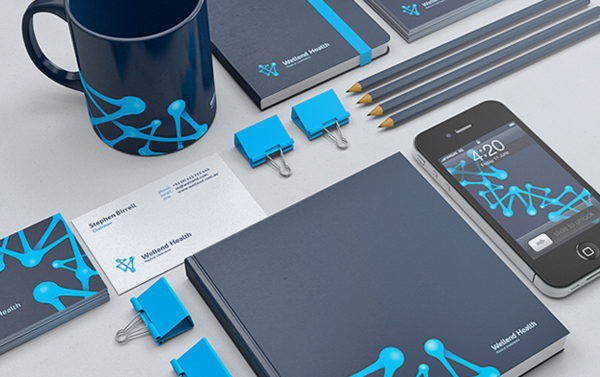
This book shows how to work with the logo and prescribes standard layout, color, imagery and typography guidelines for common marketing materials. This way companies make sure their identity is protected and guided by the same principles even when they switch designers or agencies.
Note while the identity development stage is optional, it is usually offered as a part of the total identity design package — most clients want to standardize at least business stationery and signage.
How you can benefit from this process
As you can see, the professional logo design process is a rather serious business involving seven distinct stages, all with an aim to create a unique, memorable symbol that adds value to the company and makes it stand out in the market.
However, it’s important to understand that this isn’t something reserved for the big agencies or designers — everybody can benefit from following these steps, and clients will appreciate you more because of it.
So for your next logo design contest, start by taking things seriously. Don’t stop at the brief — ask the client as much as you can about his business, his audience, competitors and logo application needs. Do some sketching and share your early designs with the client. Refine based on what you hear. Offer to design a brand book once you win a competition, and make use of 1-to-1 invoicing.
If you work like professional, you’ll set yourself up for success.
Resources: 99Designs