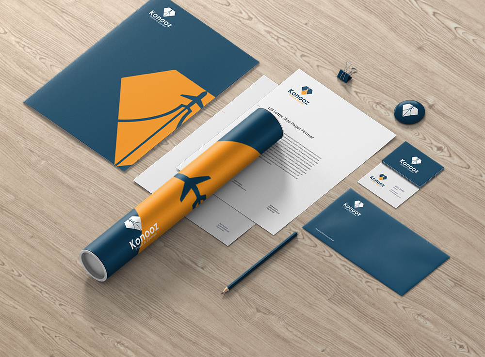
Following the successful branding of Konooz Travel & Tourism, this project focused on designing a full stationery system to extend the brand’s visual identity across print communications. The goal was to create a cohesive, professional, and culturally relevant package that reflects the agency’s premium travel services.
/ Key Features
Deliverables:
Business Card
Letterhead
A4 File Folder
Envelope
Custom Tube Wrap
Design Language:
Dominant use of deep navy and warm amber brand colors
Visual emphasis on the logo icon (sail + minaret) as a recurring motif
Balanced whitespace and clean typography for legibility and professionalism
Brand Consistency:
Every element reflects the brand’s dual identity: spiritual serenity and exploration energy
Symbol placement and minimal graphics ensure adaptability for future marketing use
/ Design Approach
Created in Adobe Illustrator for high-precision vector outputs, the layout was built with print production standards in mind. Mockups help visualize real-world application, ensuring a client-ready, premium presentation across mediums.