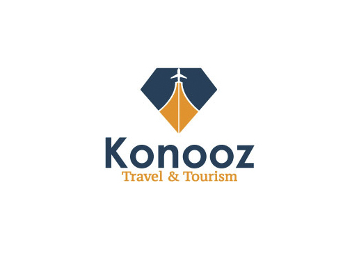
Konooz is a Dubai-based travel agency specializing in religious tourism and island adventures. The branding needed to reflect both spiritual significance and luxurious exploration—blending cultural depth with modern travel appeal.
/ Key Features
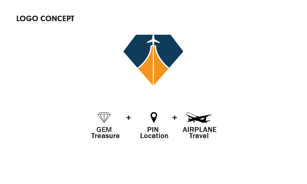
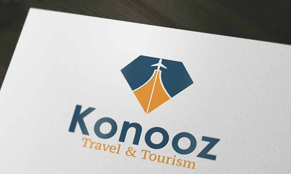
Logo Symbolism:
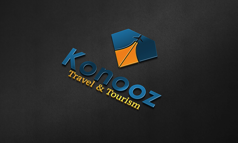
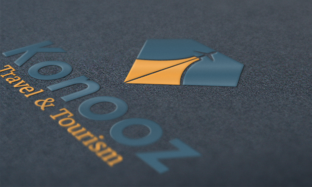
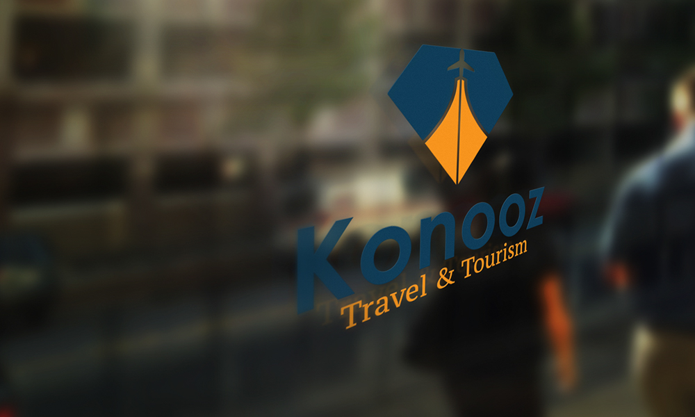
The logo combines a sailboat and a minaret-like shape, symbolizing both travel and faith.
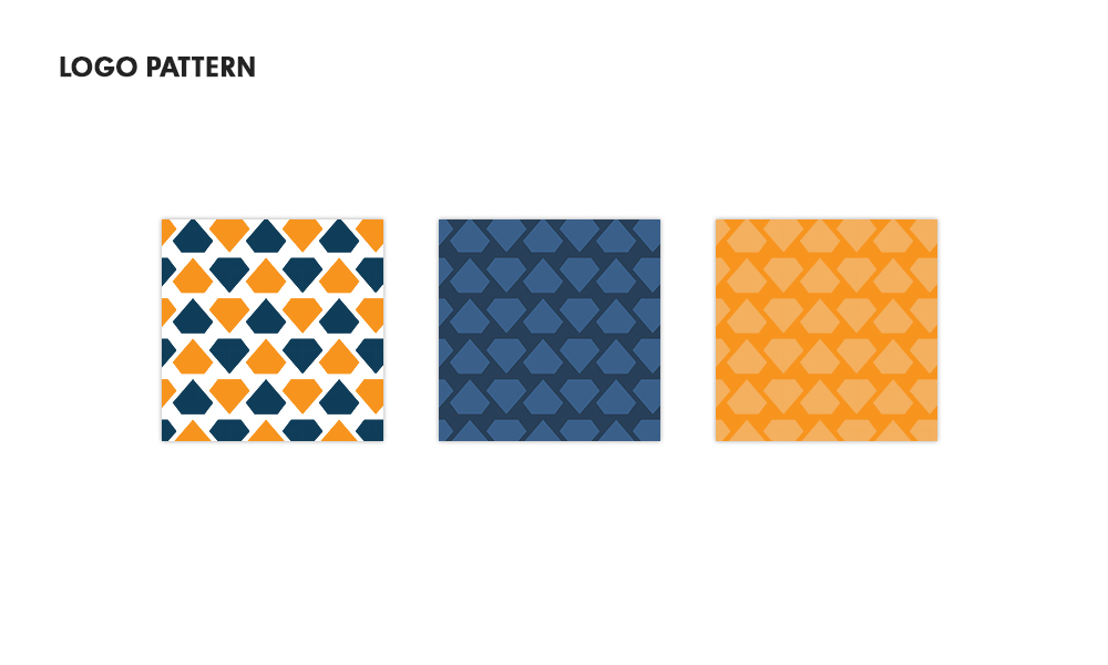
Diamond frame suggests value and exclusivity—“Konooz” translates to “treasures.”
Typography & Palette:
A refined sans-serif font conveys clarity and professionalism.
Color scheme:
Deep Navy Blue for trust, stability, and elegance.
Golden Amber to evoke sunshine, warmth, and desert beauty.
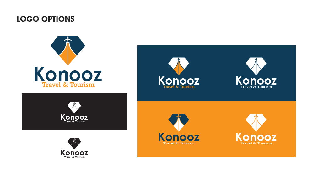
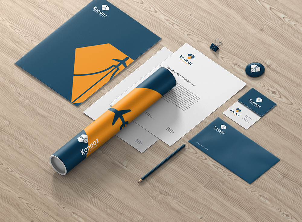
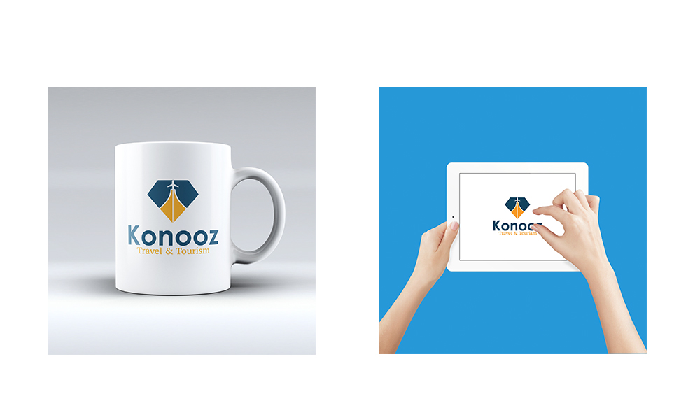
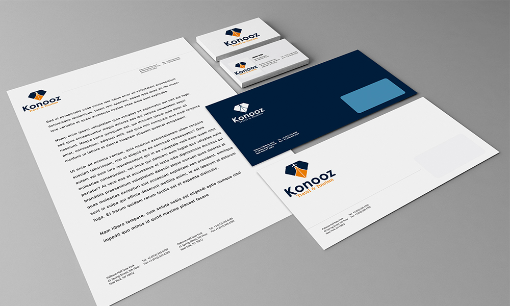
Brand Applications:
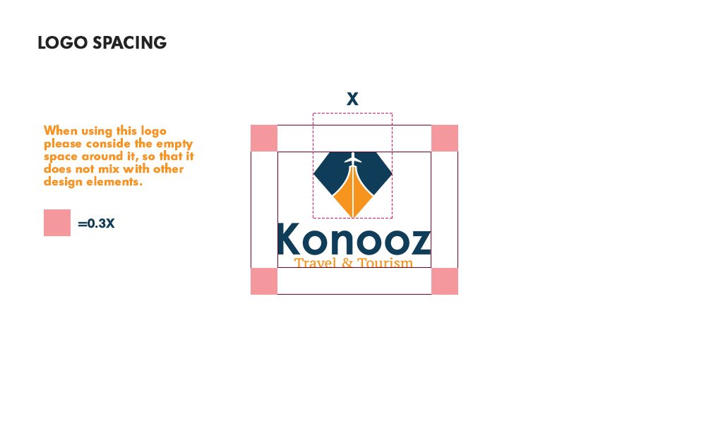
Developed a full brand guideline including logo variations, spacing rules, typography system, and branded materials.
Identity applied across signage, business cards, print materials, and digital previews.
/ Design Approach
Created in Adobe Illustrator to ensure scalability and precision across formats.
Focused on balance between cultural nuance and international appeal.
Delivered in a clean, modular layout ready for use across platforms.