Sorry, but you just don’t understand me.
If logos could speak, this is what they’d probably say to most of their owners — and designers alike.
There is no other design format more misunderstood and mystified than logo design. It seems everyone has a theory about what makes or breaks a good logo, but none of them seem to be working.
Here are top logo design myths to be aware of, and to avoid at all cost.
Myth 1: A logo has to reflect what the company does
If a flag cannot tell you a lot about the country it represents, why should a logo tell you anything about a company? It shouldn’t.
A logo is not a storytelling device — it’s a form of identification. Countries have flags, royal families have their crests and companies have their logos. They all serve a single purpose — to identify and differentiate their owners from everyone else in the crowd. Nothing more, nothing less.
When you try to tell a story about a company purely through logo, you will inevitably fail — there’s simply not enough room or a proper way to tell everything there is to be told. It’s like asking a CD cover to sing you a song… it simply doesn’t work.
A logo is an expression of a company’s identity — the things that matter and have meaning to the company. As such, it’s perhaps the only commercial device which isn’t intended to boost sales, but provide a form of identification and a source of pride to company owners and employees.
Myth 2: A logo must include a symbol
Not really. Some of the most famous logos have no symbols at all, just well-crafted type.
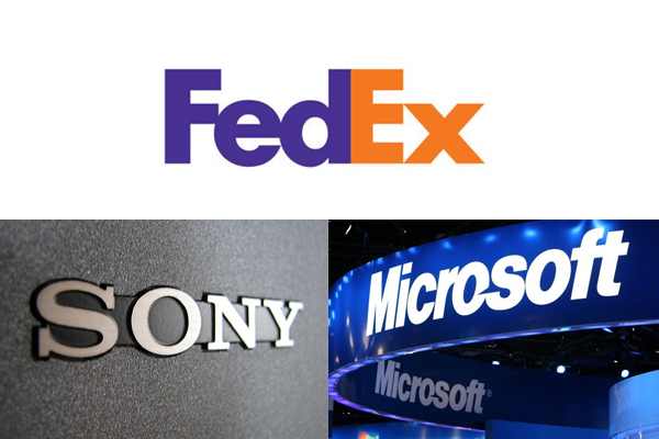
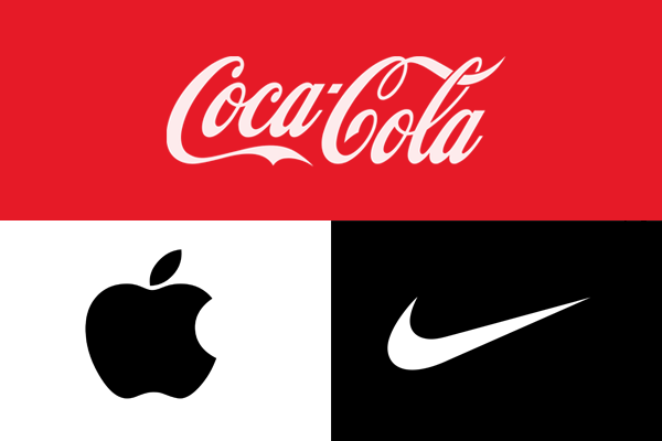
However, this is not to say that logos should not carry symbols. Sometimes a symbol can become more memorable and ubiquitous than the company name itself, such is the case of Apple, Nike or Pepsi. Other times, a symbol is just a hindrance, a superfluous decoration which doesn’t really add value or meaning – such as the semitransparent blue square in the late GAP logo.
The lesson: use a symbol if you need to represent something important to the company. If not, it’s best to consider more typographical solutions.
Myth 3: If your logo is great, it’s okay to only show the symbol
Recognition comes from repetition.
Recognition comes from repetition.
Recognition comes from repetition.
Repetition is a learning tool — so powerful that you will be able to recognize a grain of sand in the Sahara desert, provided you look at it every day, for years on end. But to make that work for logos, that means millions and millions of dollars invested in advertising and promotion.

This is why it’s important to understand that Nike and Apple logos do not have magical powers — they are just symbols repeated enough times on mainstream media that it simply becomes impossible not to associate them with these companies.
Unfortunately, not many companies enjoy the benefits of unlimited advertising budget. This is precisely why they should never use their symbols without the company name present: no matter how good the symbol is, nobody will know what it stands for, and nobody will care.
Myth 4: A logo has to follow its established industry style
There is a certain feeling of dread and boredom associated with most real estate logos. There is a house, and a tree, and sometimes even a sunset or a hill. More imaginative designers will throw in a key to make the story more complete.
Similarly, 9 out of 10 fashion logos are pretentious and stylish — black and white, elegant type, very few symbols or graphics. They all seem to be saving color for the clothes.

Every industry has unwritten rules and expectations about how a logo should look, and we’re all guilty of following these rules from time to time. But for companies just starting out, there’s nothing worse than having a logo which looks everything but inventive and original.
Kill the voice that tells you how a logo “should” look. Be bold, be unexpected and break the rules. That’s how new rules get created.
Myth 5: A logo has to be “timeless”
I’ve heard this one so many times that I’ve started to wonder whether someone invented a time machine.
You cannot create a timeless logo intentionally — you can only make sure it’s not entirely based on fads, such as swooshes or glossy treatments, so it lasts longer than usual.

Like everything else, logos age. From time to time, they need to undergo plastic surgery to make them look less antiquated and more in line with current trends. Companies like Shell, IBM, Xerox, Volkswagen and Coca Cola changed their logos nearly a dozen times so far, improving their look with each iteration.
So don’t worry about creating a timeless logo. Create something that works now and there will be plenty of time to improve it later.
Myth 6: A logo has to be likable
“I like it, but my wife just hates this shade of brown.”
Sounds familiar?
The purpose of a logo is not to provide eye candy, but to provide a unique signature that will become associated with the qualities of the company. Whether people like or dislike the logo design has nothing to do with what they think about companies and organizations those logos stand for.
Consider this:
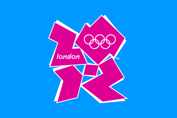
- London Olympics is arguably one of the ugliest logos in history, but everyone associates it with its top sports event.
- Bacardi rum has a big black bat on every bottle, but everyone knows it’s one of the best rums in the world.
- Google logo is essentially a tribute to Photoshop effects, yet everyone thinks of it as the best search engine in the world.
The list goes on.
Customers do not care about logos — they care about what companies can or cannot do for them. So while your logo does need to employ some basic principles of good design, you don’t need the approval of friends, your aunt or next door neighbor before you put it out there.
Just do it!
So what should a logo look like?
You may not be happy with the answer but here it is: it depends.
It depends on who the client is, what their history is and where they’re trying to go. Are they a market newcomer trying to grab attention? Are they an established business seeking to show some tradition? Or maybe they’ve been out there for decades and need just a quick face lift.
Just like a signature, a logo is entirely about the person behind the signature, and very little about the person receiving it.
Keep that in mind, and you’ll do well.
Resources
- Logos, flags, and escutcheons by Paul Rand
- Logo evolution of 25 famous brands by Michael Poh
- How does design age – excellent thread on StackXChange
- 10 of the ugliest logos in the world by Joe Foley
- 99Design


