Banner ads are one of the most prolific forms of marketing used in today’s online world. All companies use them in one form or another because they’re an affordable, measurable and effective medium to increase brand awareness – and there’s a lot of design work out there for them.
So let’s say that you have a client that needs you to design a banner ad, and lets assume that they’ve provided you with some killer copy. Now it’s your job as the designer to create a banner ad that will bring in those clicks! Below is a list of tips and general guidelines for designing banner ads.
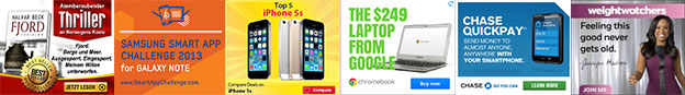
1. Use the standard and most effective banner ad sizes
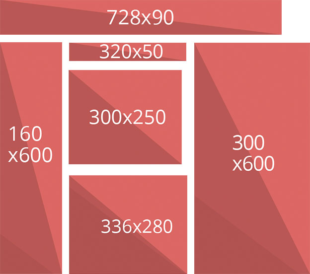
According to Google Adsense the most successful sizes are the:
- 336×280 Large Rectangle
- 300×250 Medium Rectangle
- 728×90 Leaderboard
- 160×600 Wide Skyscraper
Ideally, your client will have bought space on a website where your design will be featured above the fold and close to the main content of a webpage.
2. Maintain hierarchy
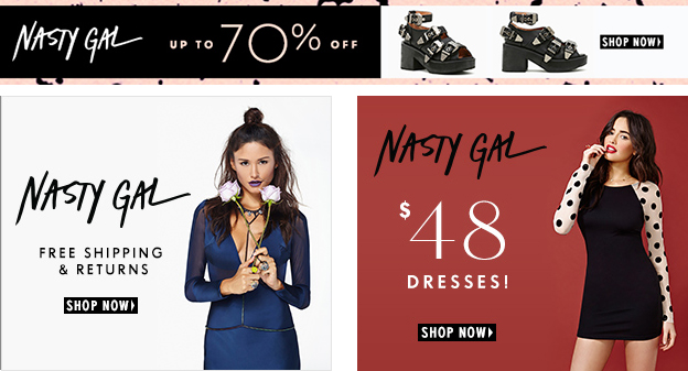
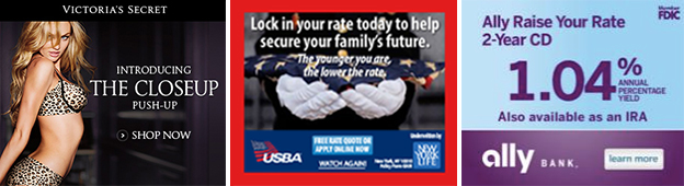
First and foremost: banner ads are designed to increase brand awareness and drive traffic to your website. They have 3 basic components:
- Your company logo: Your company logo must be included to build brand awareness. Make sure that it’s visually dominant but not as dominant as the value proposition and the call to action.
- The value proposition: The value proposition showcases the service/product your brand provides and calls attention to itself with attractive products, special offers and prices, i.e. ‘High Quality,’ ’50% off,’ ‘Limited time offer,’ or ‘Free!’ It should take up the most space in your ad and be the first thing that you viewers’ eyes are attracted to.
- The call to action: The call to action is usually made of text or a button with phrases like ‘Click Here,’ ‘Learn More,’ ‘Watch Now,’ or ‘Register Here.’ It should be a standout focal point of the ad, prompting viewers to click on it.
3. Keep the design simple
Keep it simple visually and content-wise. Viewers are probably only going to glance at your banner for a second.
4. Use buttons, appropriately
Depending on the type of banner ad, buttons are known to increase Click-through rate, or CTR. If you’re going to use them in your ad, place them after your copy, on the lower right side, in (tastefully) contrasting colors, and keep them looking consistent throughout the set of ads.
5. Make sure your banner has a clearly defined frame
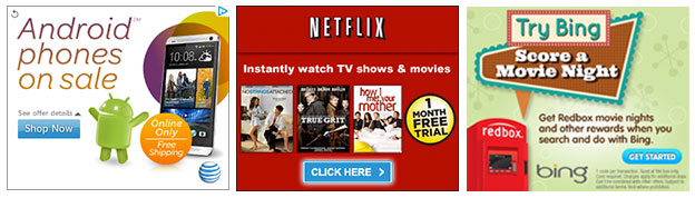
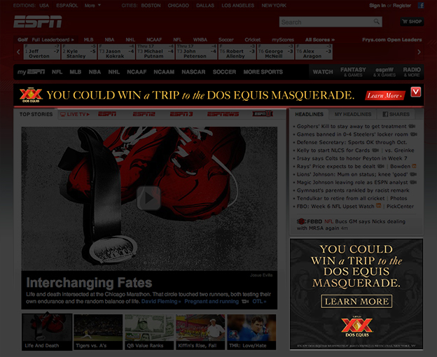
People’s eyes are naturally drawn to a subject inside a frame. So make sure that your banner ad’s has a clearly defined frame by extending the graphics right to all the edges of the box. If your ad is white, it’s a common practice to put a 1 pixel gray border around the ad. If it’s not white, you can still use subtle borders like the faint black border around the edges of the Netflix ad above, which make it pop just a little more.
6. Make your text instantly readable
Do: make the headline and body copy different sizes, make the headline and body copy 4 lines or less each.
Don’t: use cursive fonts, script fonts, extremely thin fonts, all uppercase copy, or smaller than a 10 pt font (unless you’re including a disclaimer or copyright notice.)
7. Make sure the design is consistent with that company’s branding
Your banner ad is going to link to a landing page about the offer in your ad. Make sure it looks consistent with the company’s branding and the landing page it links to so that potential customers don’t get confused.
8. Use the correct file formats
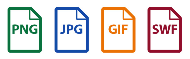
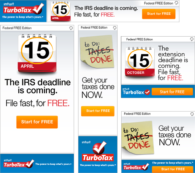
.JPG, .PNG, .GIF, or Adobe Flash files are going to be your working deliverables, and you’re going to be working Adobe Illustrator, Photoshop or Flash to produce them. Keep in mind that flash banner ads are not supported on all devices so always provide your banner in .GIF form so you won’t miss any potential clickers (read our article to learn how.)
9. Keep your file sizes small
The smaller the better, under 150 kb according to Google Adwords. Your ad needs to load fast on that webpage before viewers scroll down and miss it.
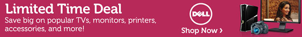
10. Use imagery well, and only when you need it
Choose relevant images, graphics or photos that enhance your message and that are directly related to your client’s product. No abstract concepts here. Can’t afford professional photography or supermodels? Buy an affordable license for a stock photo. There are millions of high quality ones out there.
But it’s not always necessary to use photos or images in your ads. Text ads will some killer copy and nice typography can be just as effective.
11. Instill a sense of urgency
Bring a sense of visual urgency to the text by using contrasting, bold colors. Web ads are not always meant to be subtle.
12. Choose appropriate colors
Speaking of colors – all colors have different associations, and it’s important to consider what types of emotions you want to evoke in your viewers. Your colors choices have to be on point, because the colors are the first thing that viewers notice in an ad.
Colors can also be subjective, and have different associations in different cultures, so make sure to study you target audience when selecting your colors. Below is a list or colors and the kinds of emotions they typically evoke in viewers for a western audience. Your ads are going to be different combinations of these colors that create the overall mood:
- Red: associated with danger, passion, anger, excitement, speed, and love.The most powerful color and attractive to all audiences, also known to stimulate appetite. Use in moderation.
- Orange: associated withvitality, happiness. Not as overpowering as red and it energetic, inviting and friendly (it’s a great color for a call to action button.)
- Yellow: Associated with humor, sunshine, optimism, energy. Touches of yellow can capture a viewer’s attention and it’s even more energetic than orange and red and should be used judiciously – too much yellow is irritating to a viewer’s eyes because it reflects the most light of any color.
- Green: Associated with health, freshness, wealth, the environment, growth, nurturing, and new beginnings. It’s the easiest color on the eyes.
- Blue: Associated with safety, trust, clarity, serenity, intellect, formality, elegance, truth, refreshment, coldness, masculinity.
- Purple: Associated with luxury, royalty, extravagance, wisdom, magic, ambition, femininity, and creativity. It has a soothing, calming effect on a viewer.
- Pink: Associated withlove, sweetness, femininity, and babies. The most feminine color.
- Black: Associated with exclusivity, evil, mystery, power, prestige, grief, and formality. It’s traditional, and corporate and black text on a white background is the most readable color combination.
- White: Associated with purity, cleanliness, modernity, sterility, simplicity, honesty, innocence, virginity, goodness.
- Brown: Associated with nature, wood, leather, and humility. Balances out stronger colors, and good for background colors and textures.
- Gray: Associated withneutrality and practicality. When used as a background it intensifies other colors.
Finally, when designing your ads, make sure you’re designing in RGB color mode. Your banner ad is only ever going to be displayed on-screen.
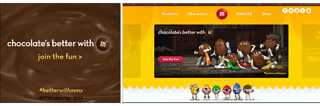
13. Consider using animation

Animated ads usually out-perform static banner ads, and can be very effective in banner design, but you have to make sure that they don’t distract from the message of your ad.
Use simple animations that last no more than 15 sec. and make sure that they don’t loop more than 3-10 times. Also, the last frame of your animation should be a call to action.
14. Make your ad complimentary to, but stands out from the background website
If your ad visually blends into the sites that it will be featured on, you’re more likely to earn your viewers trust. However don’t make it blend in too much – the ad still needs to be visible and clickable.
And there you have it. These are just some general design guidelines, and there’s definitely room for experimentation with each. It’s also important to note that a good banner ad is not judged on how good it looks, it’s judged on its performance. It could be the ugliest thing in the world, but if it performs well than it’s considered to be a successful design. They’re not the most loved form of media, but for now, they’re here to stay.
Resources: 99Designs.com