MarkaDev is a digital marketing and social media agency. The identity needed to reflect innovation, adaptability, and modernity while remaining sleek and professional — ideal for a fast-paced, result-driven environment.
/ Key Features
Logo Concept:
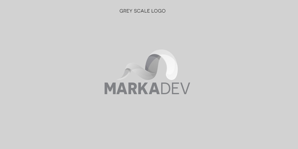
A dynamic “M” constructed from a smooth ribbon form, symbolizing flexibility and digital motion
Gradient transitions from orange to green to blue reflect creativity, growth, and trust
Typography:
Bold, geometric sans-serif typeface to contrast with the flowing icon
“MARKA” in bold black, “DEV” in lighter grey for brand hierarchy
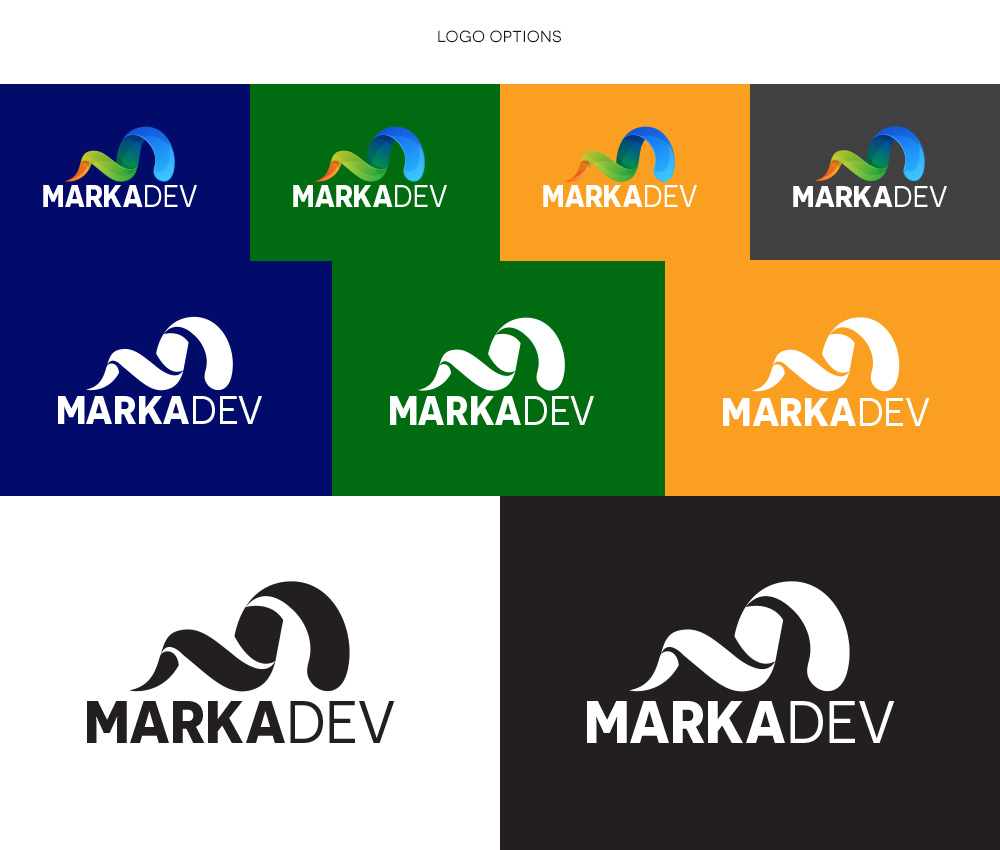
Color System:
Core palette: deep blue, vibrant green, warm yellow, energetic orange
Designed for both light and dark backgrounds for consistent scalability
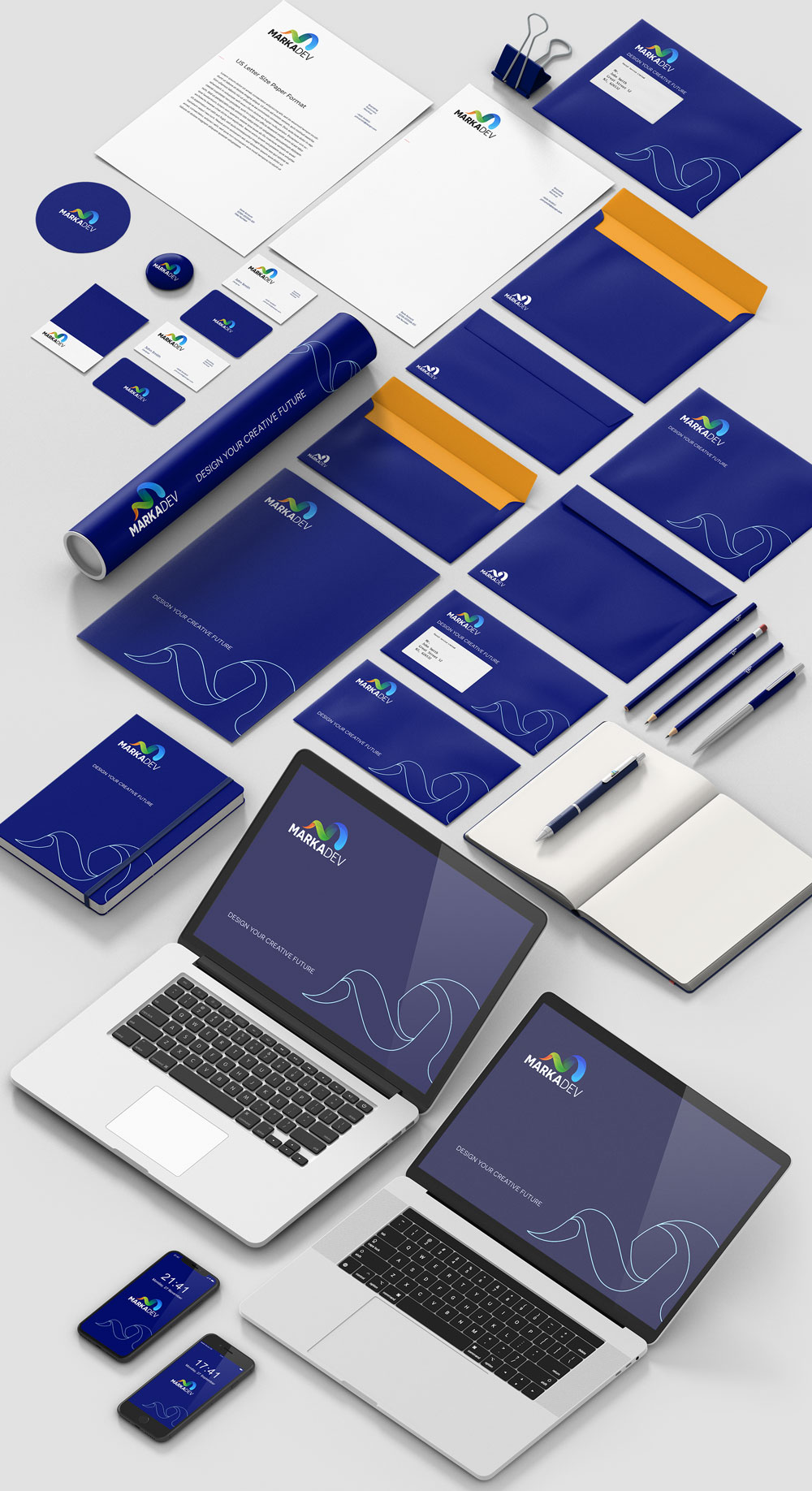
Application Mockups:
Full suite of brand materials including letterhead, notebook, presentation deck, business card, and website grid mockups
Demonstrates flexibility across print and digital environments
/ Design Approach
The emphasis was on balance: artistic but precise, corporate yet creative — aligning with MarkaDev’s goal to be a trusted yet imaginative marketing partner.