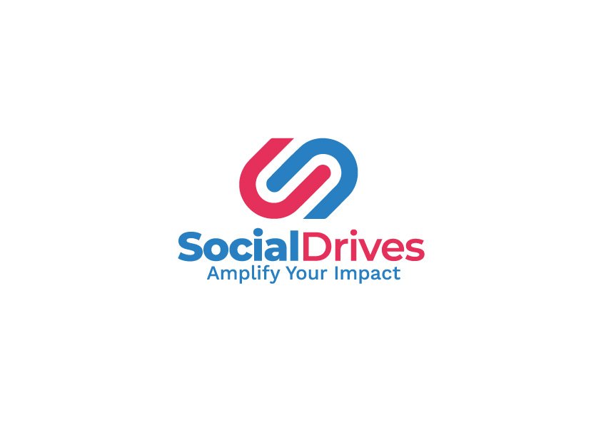
SocialDrives is a nonprofit organization based in Indonesia that supports multi-stakeholder initiatives (MSIs) such as RSPO, Fair Wear Foundation, Fair Labor Association, and Ethical Trade Initiative. The organization needed a versatile and meaningful visual identity that communicates trust, collaboration, and global impact.
/ Key Features
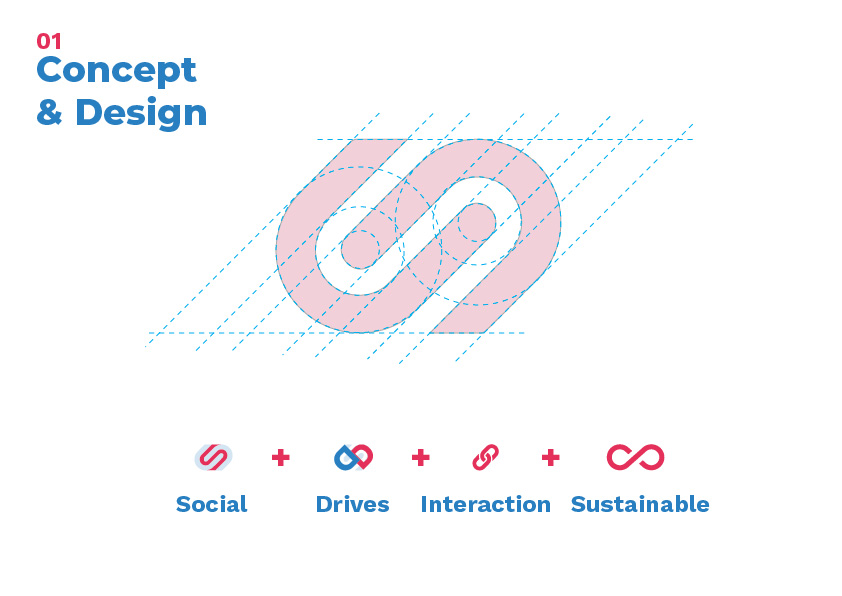
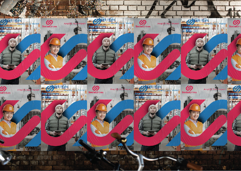
Logo Concept & Symbolism:
The mark fuses the letter “S” and “D” into an interlocking shape to represent partnership and social integration.
The infinity-inspired loop echoes continuity, growth, and sustainable development.
Color Palette & Typography:
Bright blue and coral red: a combination that balances professionalism with approachability.
Typeface: Clean, modern sans-serif fonts ensure clarity and accessibility across digital and print media.
Visual System:
Custom iconography and textured backgrounds for brand storytelling
Consistent layout patterns for digital documents and reports
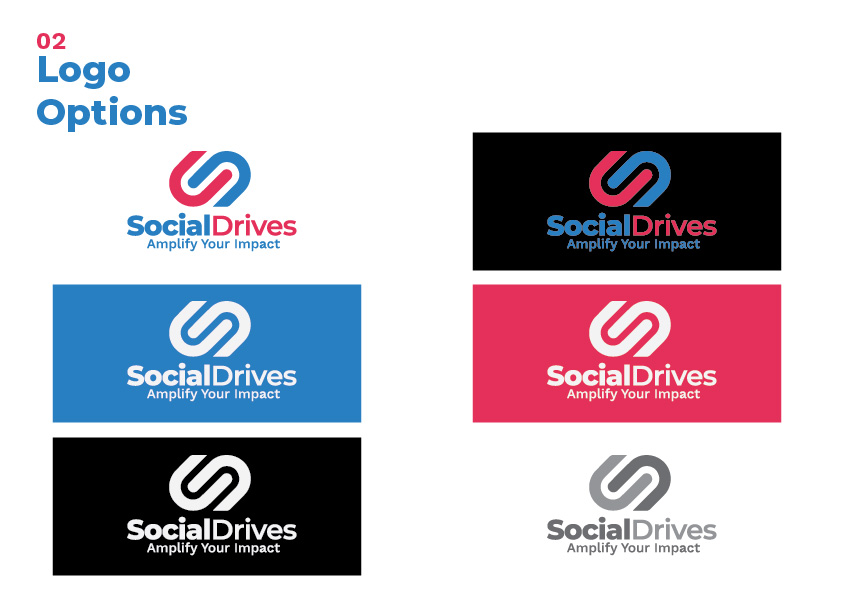
Adaptable logo lockups for dark and light use cases
Brand Applications:
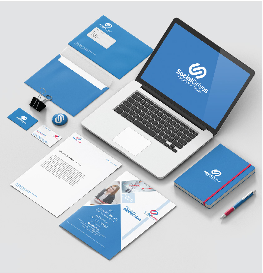
Stationery and business collateral: notepads, folders, letterheads
Event banners and backdrops
Social media templates and email headers
Laptop wallpaper and presentation assets
/ Design Approach
The visual identity is designed to be scalable and multicultural — suitable for use across continents, languages, and mediums. The design subtly communicates integrity, harmony, and action, aligning with the organization’s advocacy-driven mission.