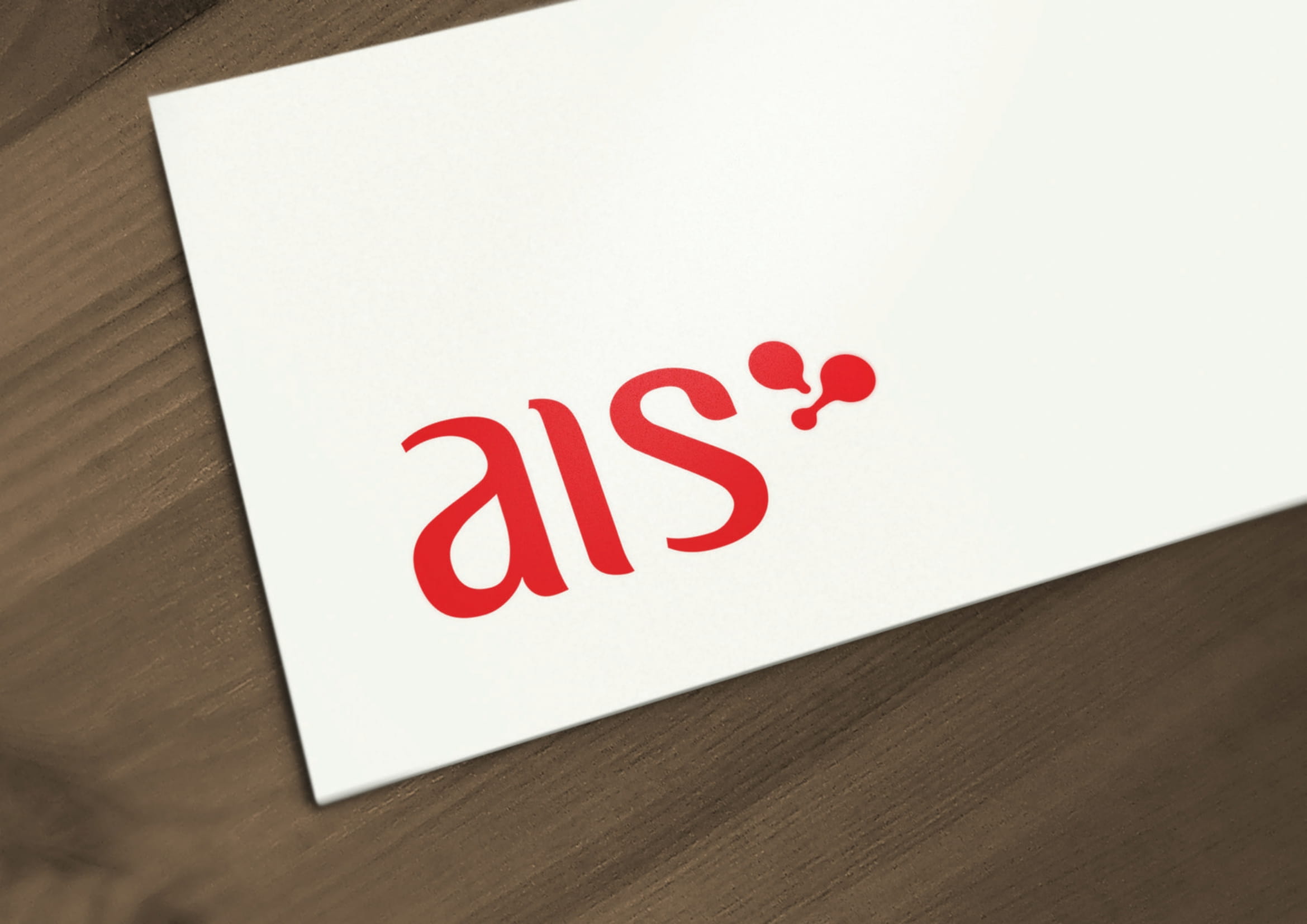
AIS is a Health, Safety & Environment (HSE) consultancy specializing in industrial safety and firefighting services. The brand needed a professional identity that reflected trust, protection, and clarity—essential qualities for a firm operating in high-risk sectors.
/ Key Features
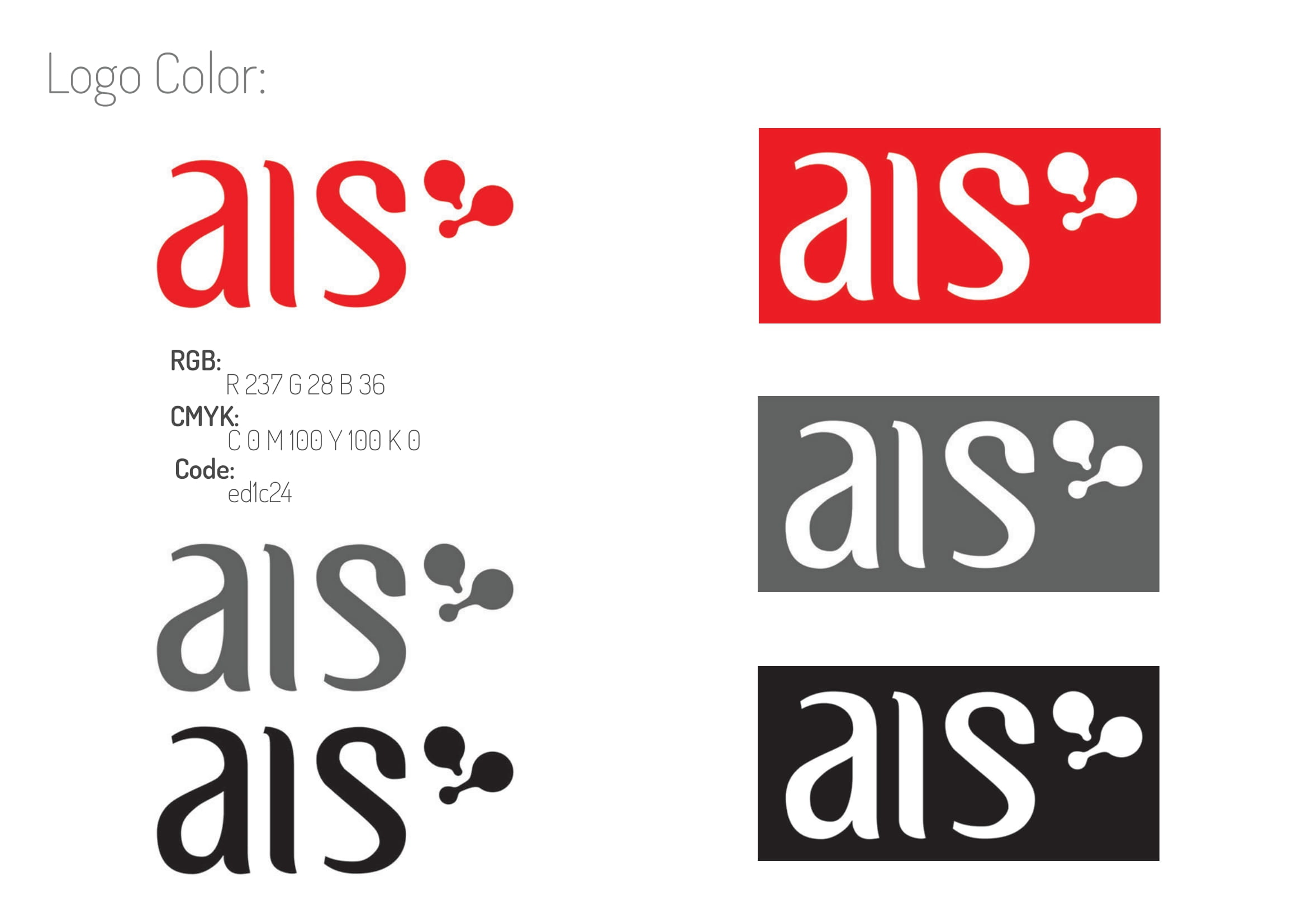
Clean & Bold Typography: The custom type conveys authority and clarity, suitable for technical consultancy
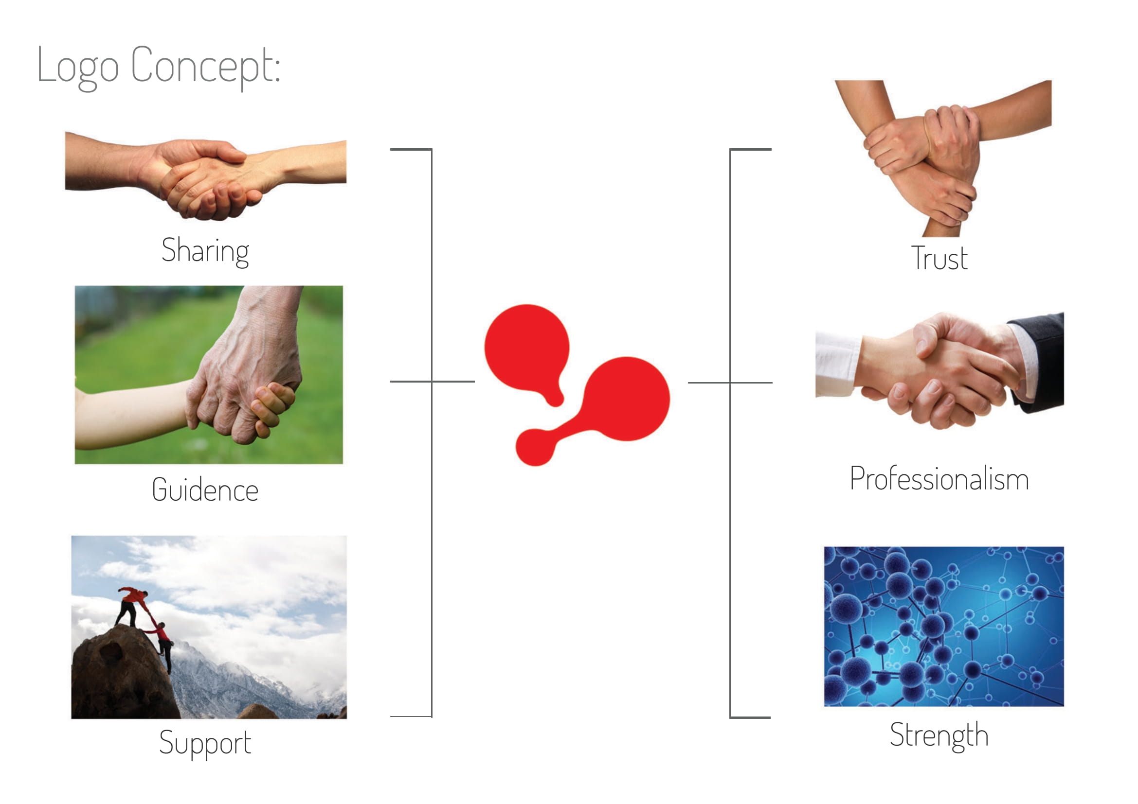
Flame-Dot Symbol: The abstract flame-inspired droplets subtly represent both fire and protection without being aggressive
Color Psychology: Red was selected for its association with urgency, fire, and safety response
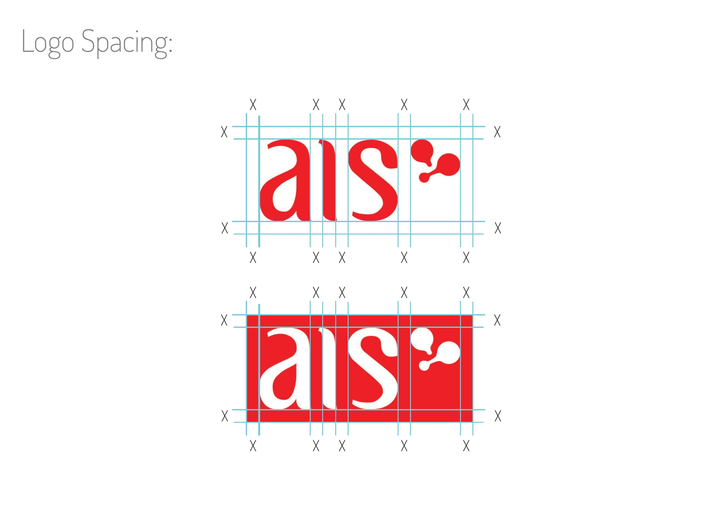
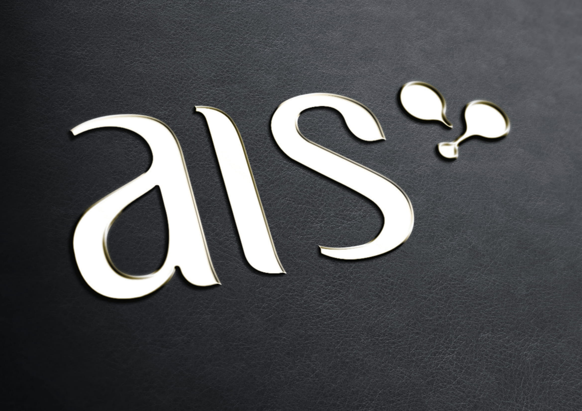
Scalability & Flexibility: Designed to adapt cleanly across print, web, safety wearables, and signage
/ Design Approach
Explored typographic balance with soft curves and distinct spacing to reflect precision and responsiveness
The droplets add symbolic context without overwhelming the logotype—ideal for cross-cultural interpretation
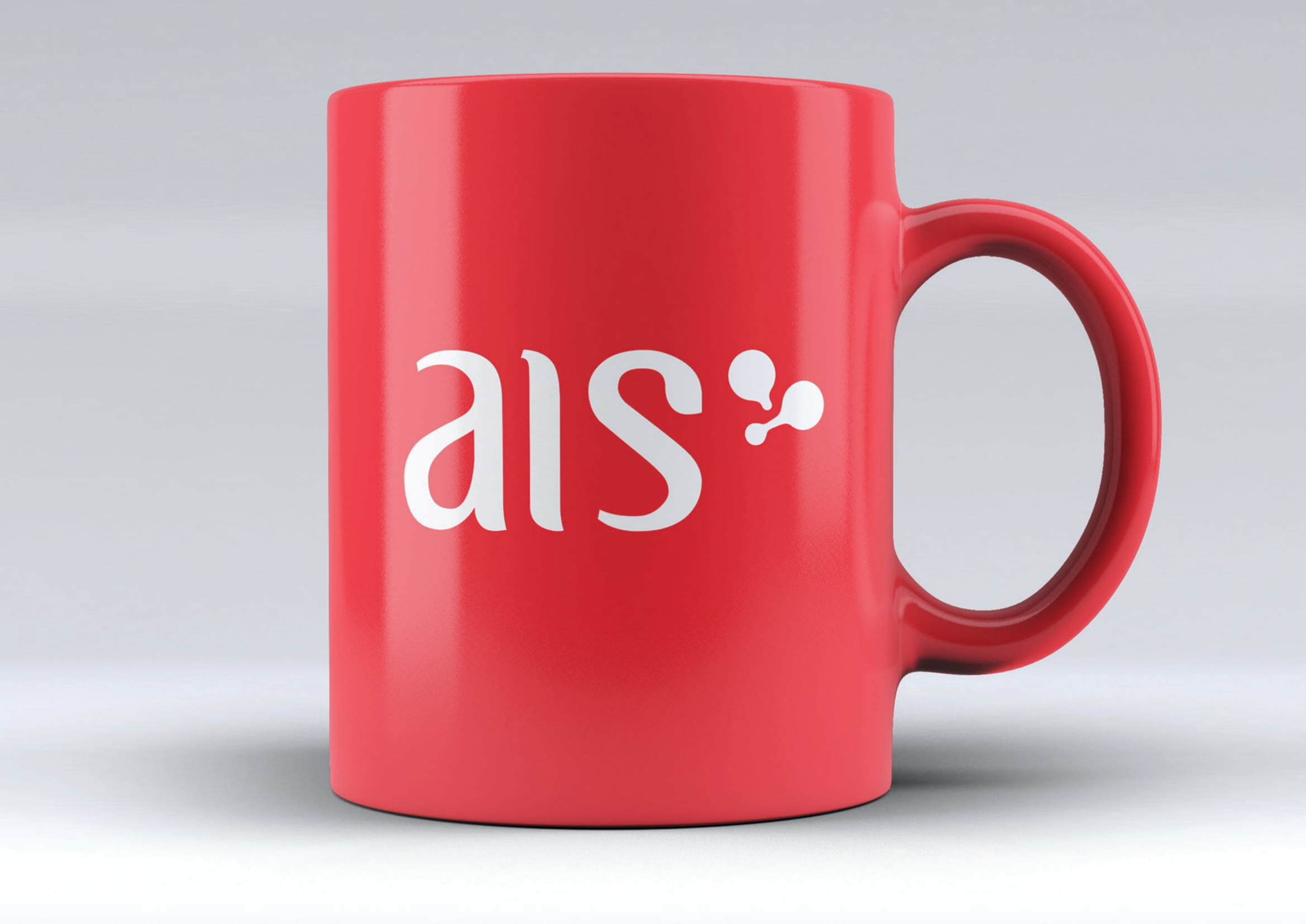
Delivered a comprehensive visual system: logo grid, color palettes, monochrome variants, and mockups on brand materials including mugs, stationery, and PPE